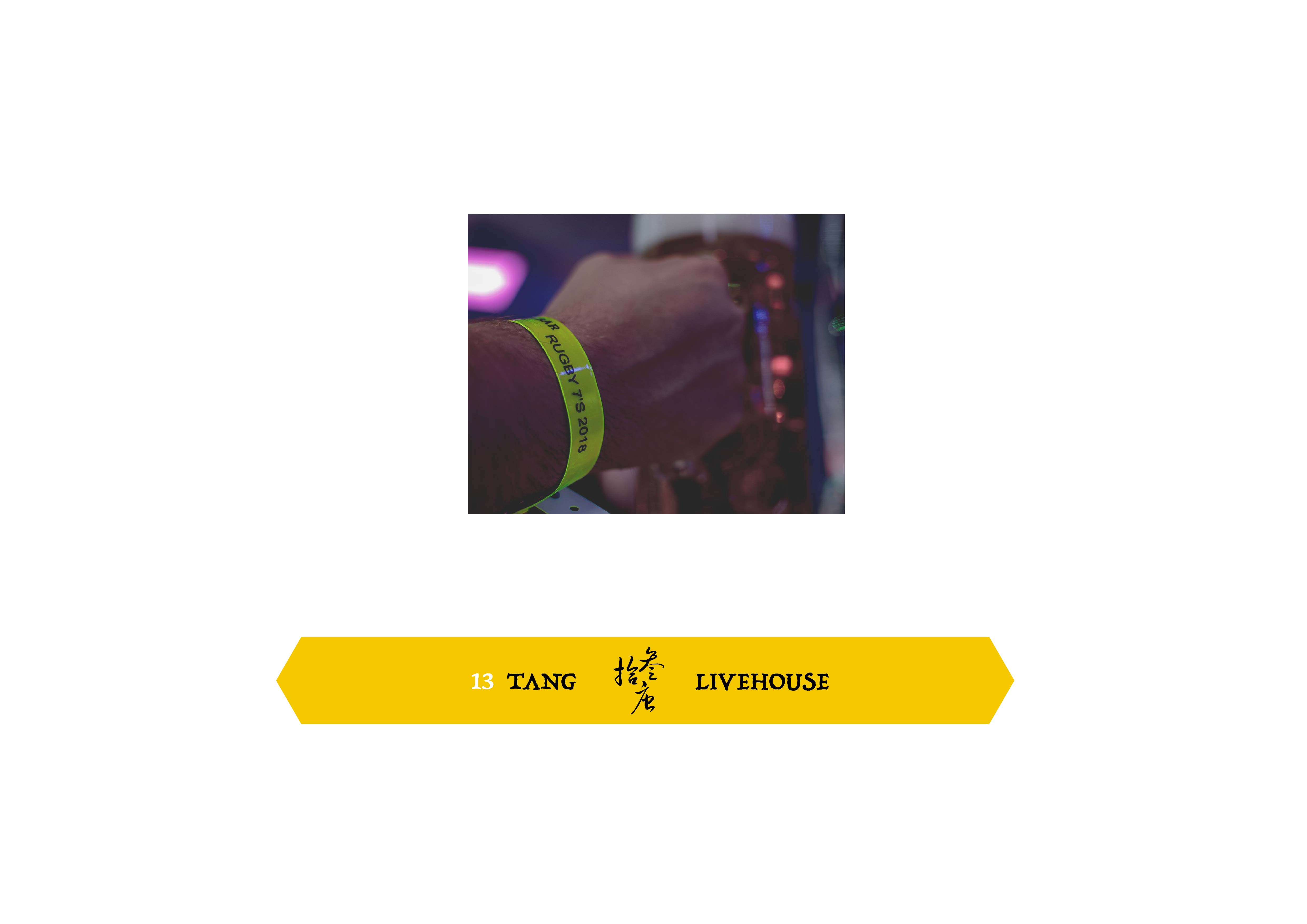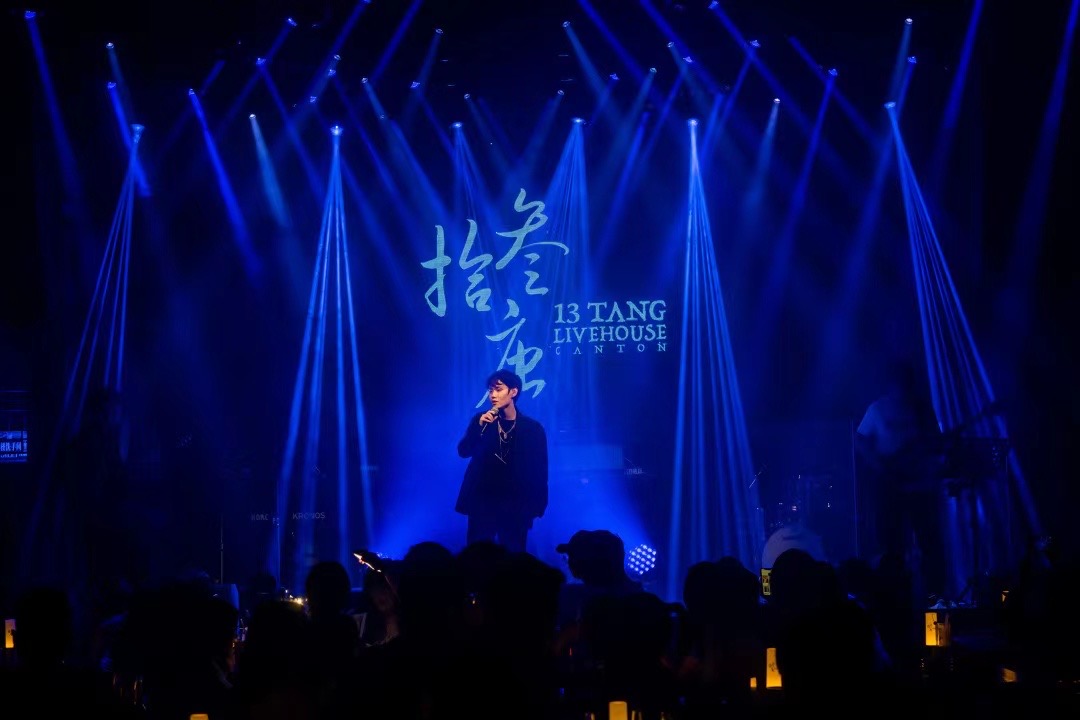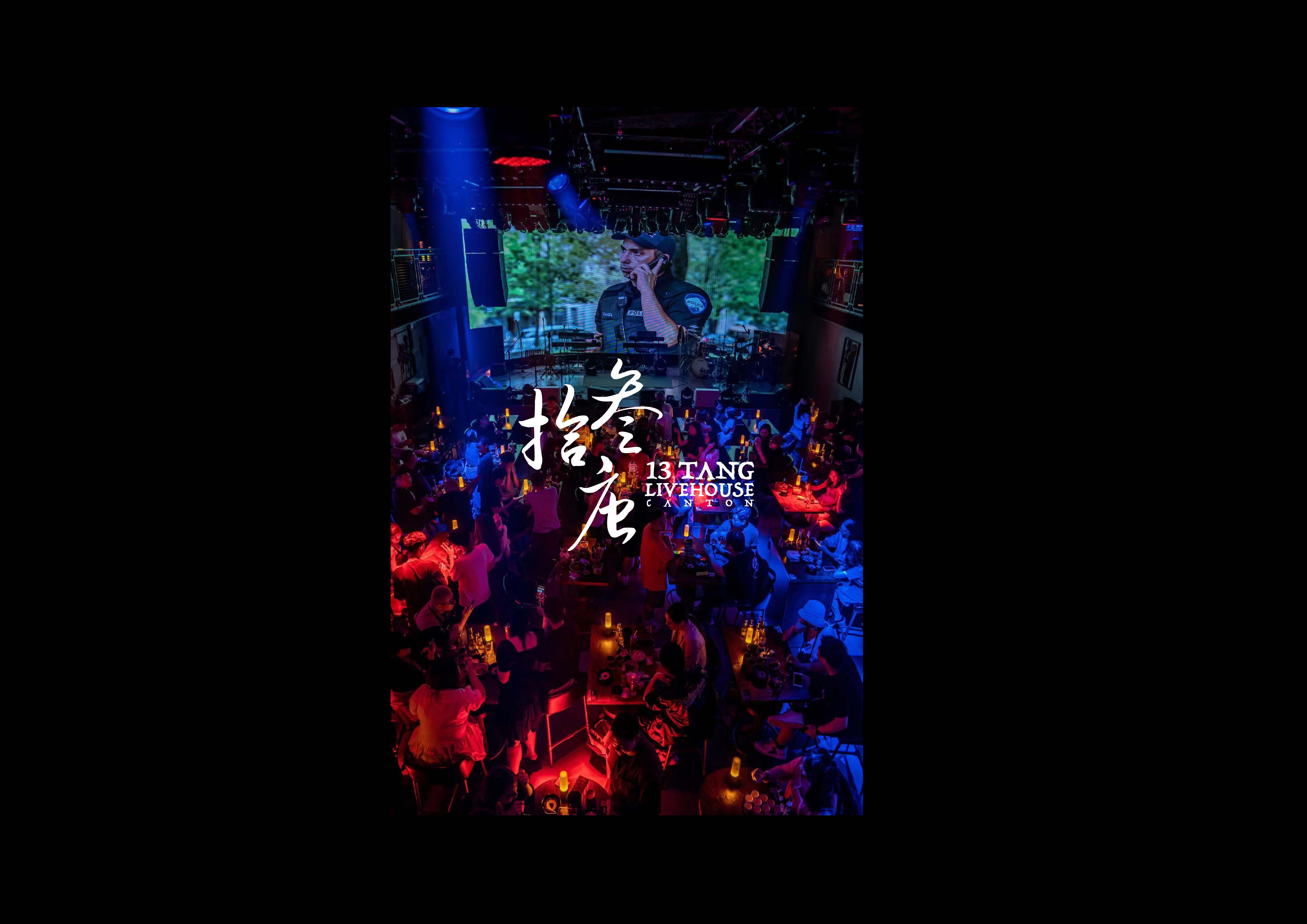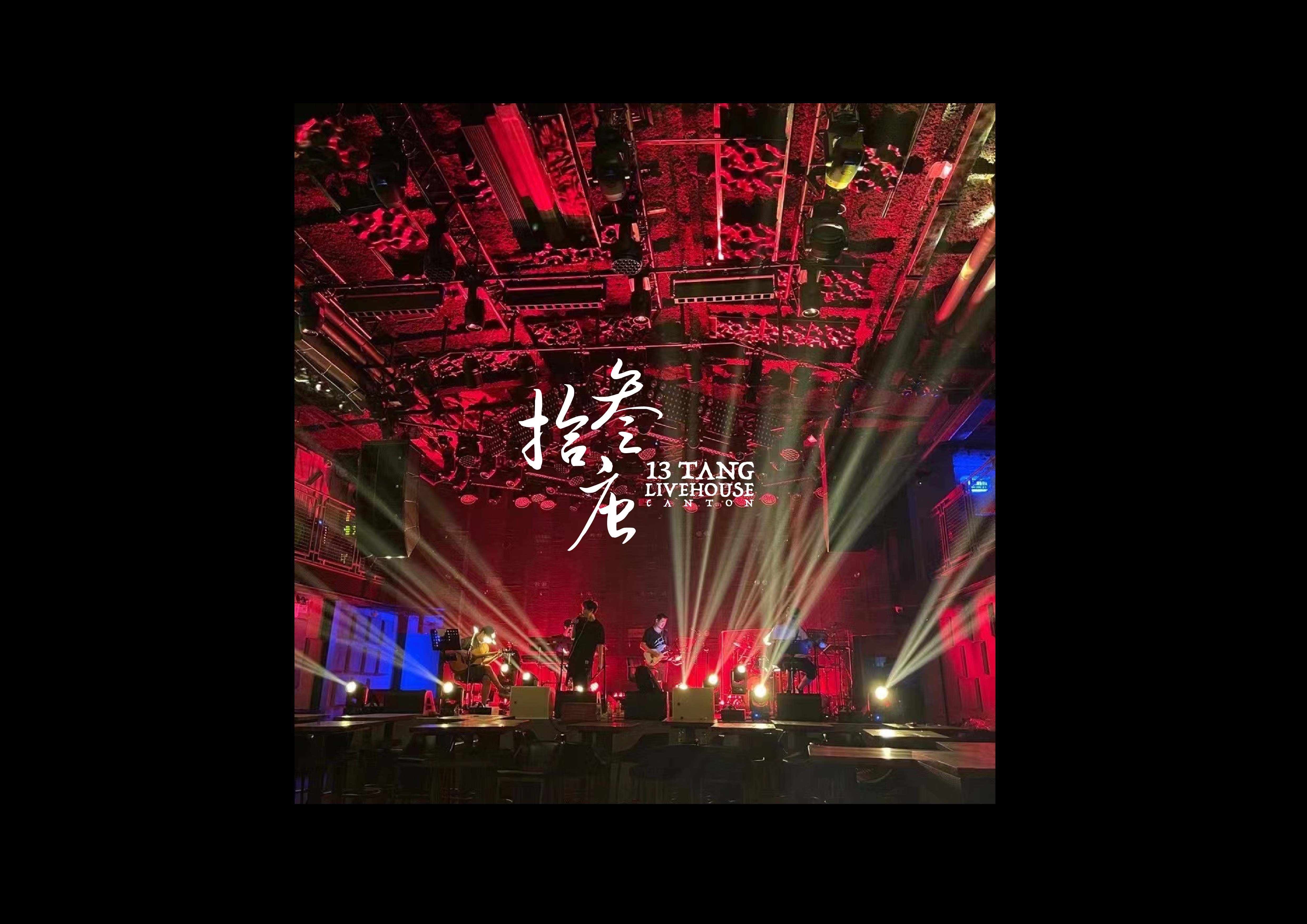
13 TANG Livehouse | 拾叁唐 酒吧與演出場所
Branding Design 2021 | 品牌形象設計 2021
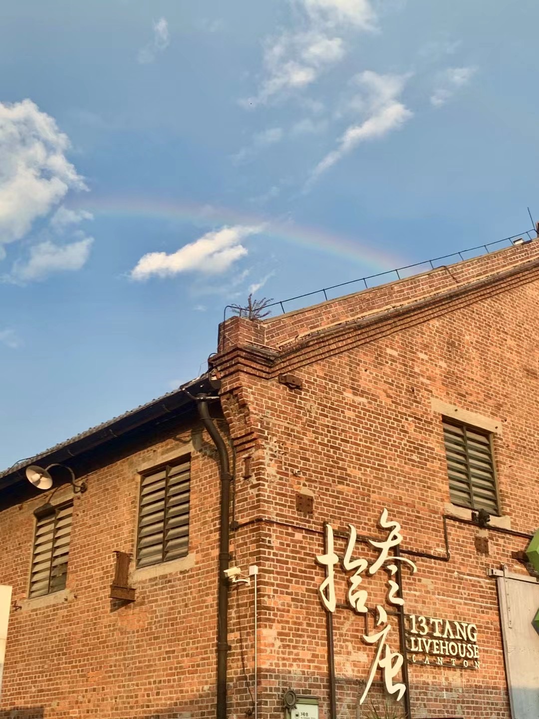
Hoi Zyu, Canton | 廣州,海珠
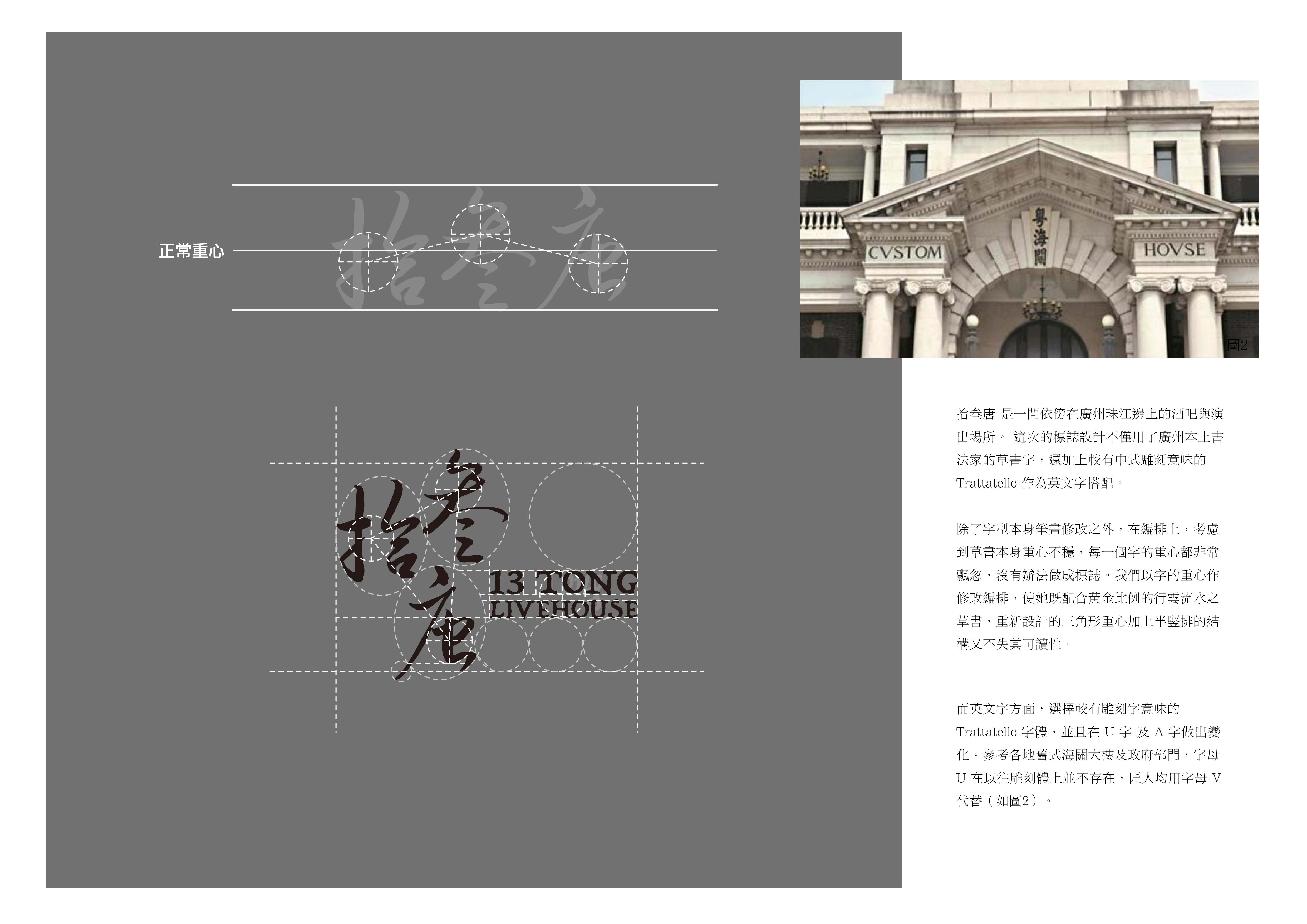
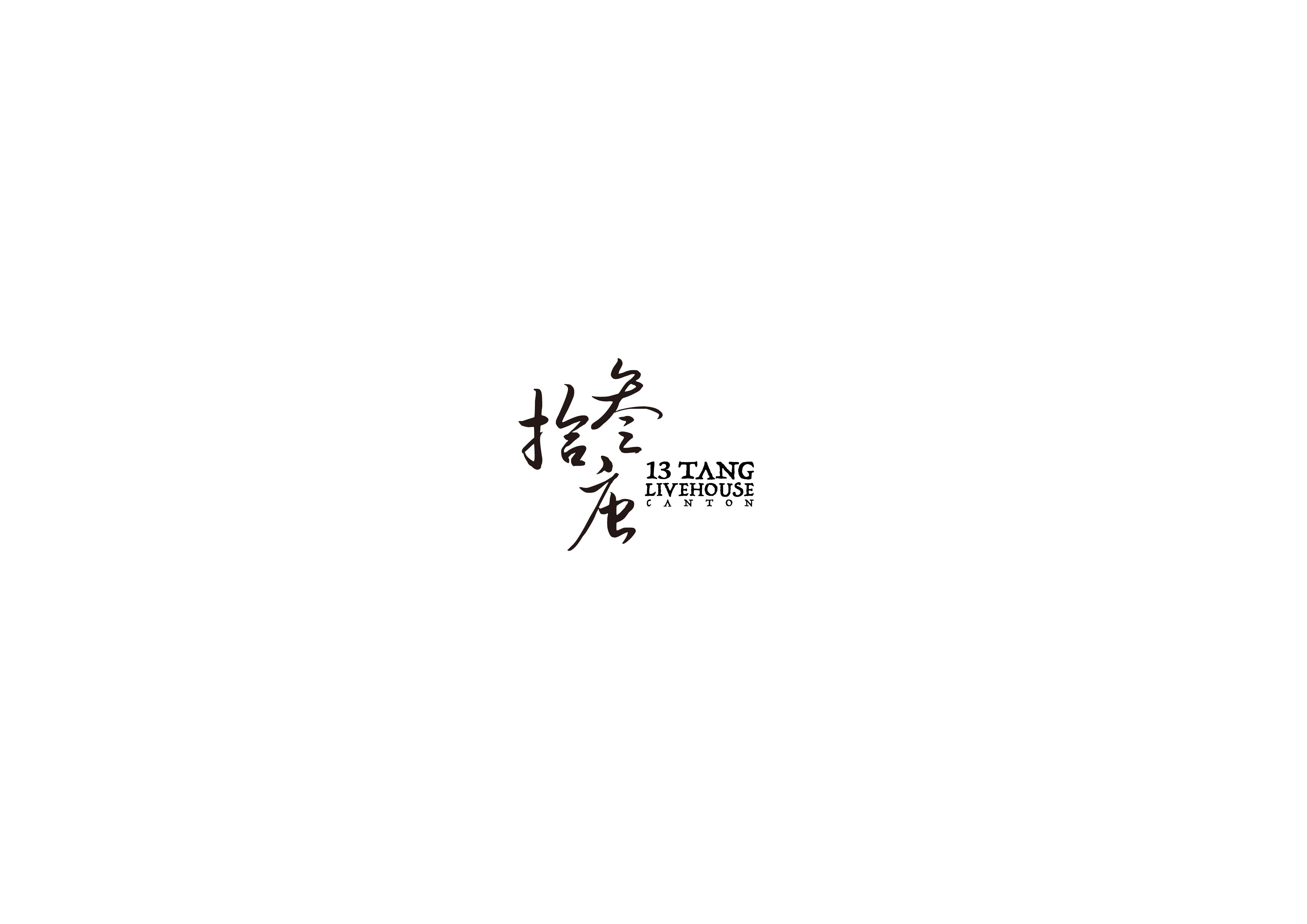
拾叁唐 是一間依傍在廣州珠江邊上的酒吧與演出場所。 這次的標誌設計不僅用了廣州本土書法家的草書字,還加上較有中式雕刻意味的 Trattatello 作為英文字搭配。
除了字型本身筆畫修改之外,在編排上,考慮到草書本身重心不穩,每一個字的重心都非常飄忽,沒有辦法做成標誌。我們以字的重心作修改編排,使她既配合黃金比例的行雲流水之草書,重新設計的三角形重心加上半竪排的結構又不失其可讀性。
而英文字方面,選擇較有雕刻字意味的 Trattatello 字體,並且在 U 字 及 A 字做出變化。參考各地舊式海關大樓及政府部門,字母 U 在以往雕刻體上並不存在,匠人均用字母 V 代替(如圖2)。
13 TANG Livehouse, nestled alongside Guangzhou/Canton's Pearl River, sought to seamlessly bridge the past with the present in its logo design. Rooted deeply in the rich calligraphic tradition of Canton, the logo employs local cursive script, showcasing the fluidity and dynamism inherent to this art form. To resonate with modern aesthetics and maintain readability, adjustments were made to the strokes and layout, drawing inspiration from the golden ratio principles.
The traditional cursive script's center of gravity can often be perceived as unstable, with each character bearing an ephemeral weight. To address this, the logo's design shifted and balanced these centers of gravity, introducing a triangular foundation coupled with a semi-vertical structure.
For the English representation, the Trattatello font was chosen for its carved essence, reminiscent of traditional Chinese engravings. To further establish the connection between traditional craftsmanship and contemporary design, modifications were made to the letters 'U' and 'A'. Historically, engraved scripts often replaced the letter 'U' with 'V', a nod to practices in old customs houses and government emblems.
In essence, 13 TANG Livehouse's logo is a harmonious blend of typography and design, where age-old traditions meet modern sensibilities.
*使用新 logo 及品牌視覺以來不到一個季度即達到廣州前三,截至目前為止已發展成擁有全國幾十家門店的企業。
*Since adopting the new logo and brand visuals, in less than a quarter, it has ranked among the top three in Guangzhou. To date, it has grown into a company with dozens of stores nationwide.
Branding Design 2021 | 品牌形象設計 2021
Hoi Zyu, Canton | 廣州,海珠
拾叁唐 是一間依傍在廣州珠江邊上的酒吧與演出場所。 這次的標誌設計不僅用了廣州本土書法家的草書字,還加上較有中式雕刻意味的 Trattatello 作為英文字搭配。
除了字型本身筆畫修改之外,在編排上,考慮到草書本身重心不穩,每一個字的重心都非常飄忽,沒有辦法做成標誌。我們以字的重心作修改編排,使她既配合黃金比例的行雲流水之草書,重新設計的三角形重心加上半竪排的結構又不失其可讀性。
而英文字方面,選擇較有雕刻字意味的 Trattatello 字體,並且在 U 字 及 A 字做出變化。參考各地舊式海關大樓及政府部門,字母 U 在以往雕刻體上並不存在,匠人均用字母 V 代替(如圖2)。
13 TANG Livehouse, nestled alongside Guangzhou/Canton's Pearl River, sought to seamlessly bridge the past with the present in its logo design. Rooted deeply in the rich calligraphic tradition of Canton, the logo employs local cursive script, showcasing the fluidity and dynamism inherent to this art form. To resonate with modern aesthetics and maintain readability, adjustments were made to the strokes and layout, drawing inspiration from the golden ratio principles.
The traditional cursive script's center of gravity can often be perceived as unstable, with each character bearing an ephemeral weight. To address this, the logo's design shifted and balanced these centers of gravity, introducing a triangular foundation coupled with a semi-vertical structure.
For the English representation, the Trattatello font was chosen for its carved essence, reminiscent of traditional Chinese engravings. To further establish the connection between traditional craftsmanship and contemporary design, modifications were made to the letters 'U' and 'A'. Historically, engraved scripts often replaced the letter 'U' with 'V', a nod to practices in old customs houses and government emblems.
In essence, 13 TANG Livehouse's logo is a harmonious blend of typography and design, where age-old traditions meet modern sensibilities.
*使用新 logo 及品牌視覺以來不到一個季度即達到廣州前三,截至目前為止已發展成擁有全國幾十家門店的企業。
*Since adopting the new logo and brand visuals, in less than a quarter, it has ranked among the top three in Guangzhou. To date, it has grown into a company with dozens of stores nationwide.