Cautious Medical | 謙鑒中醫
Branding Design 2022 | 品牌形象設計 2022
Sha Tin, Hong Kong | 香港,沙田
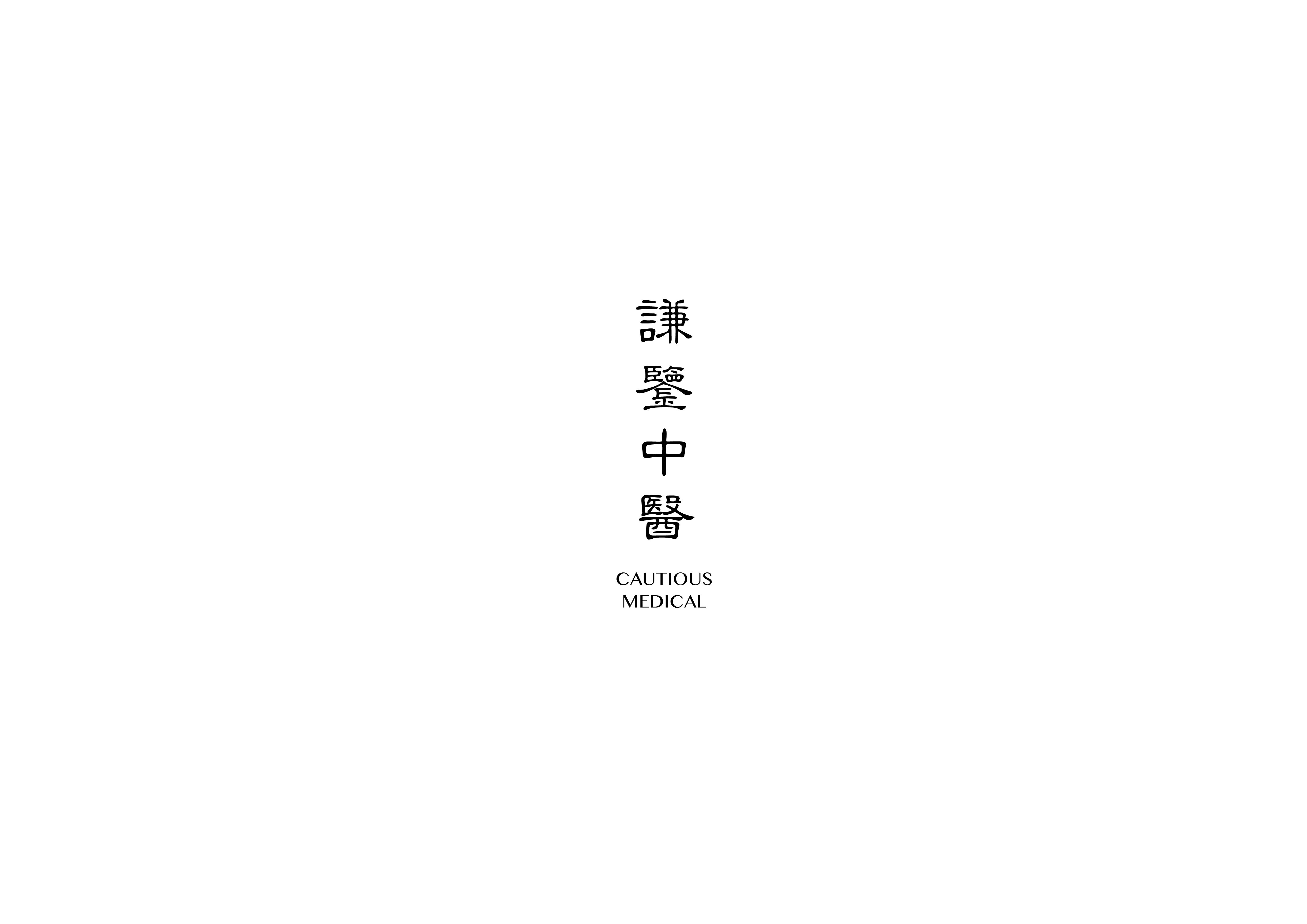
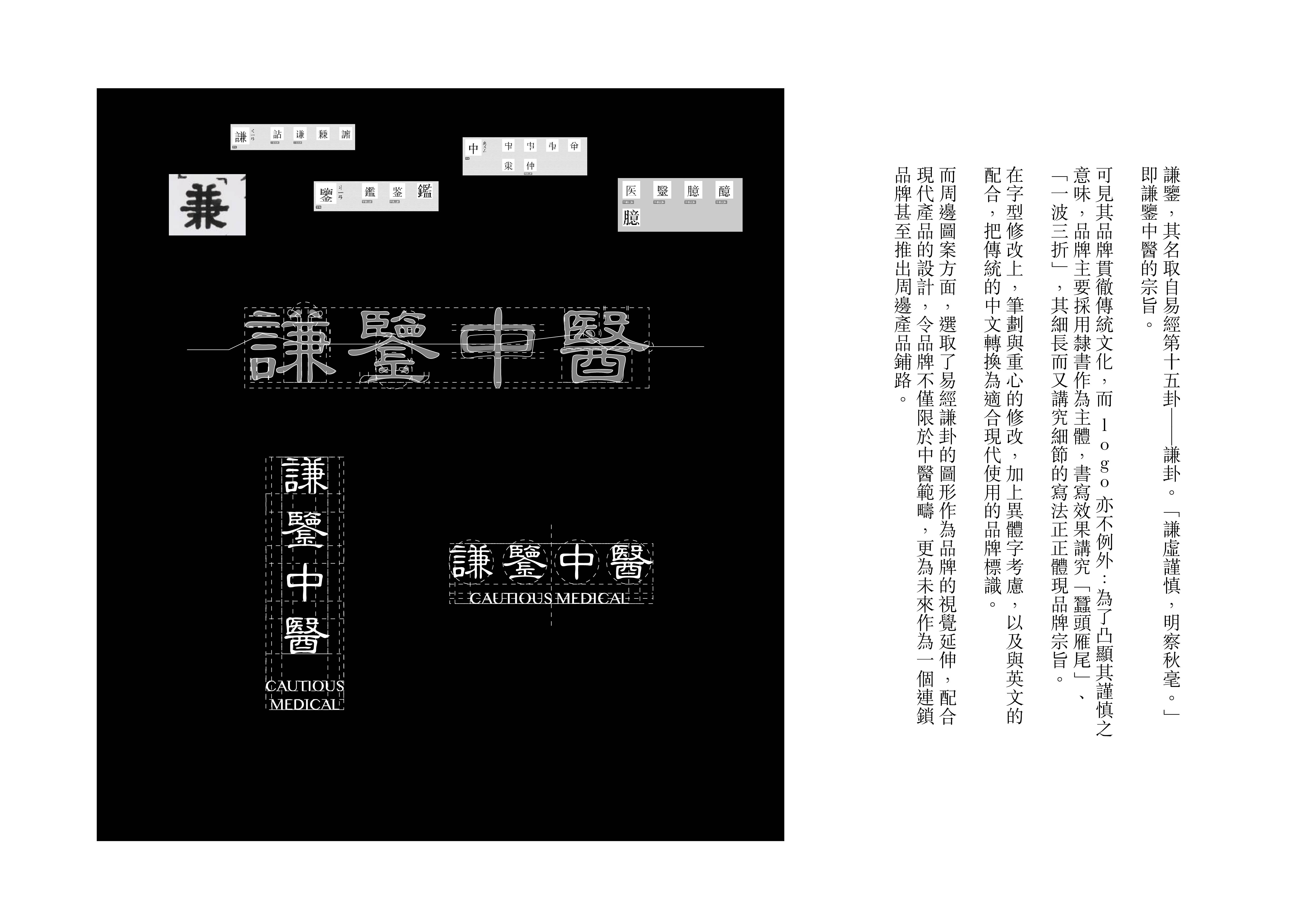
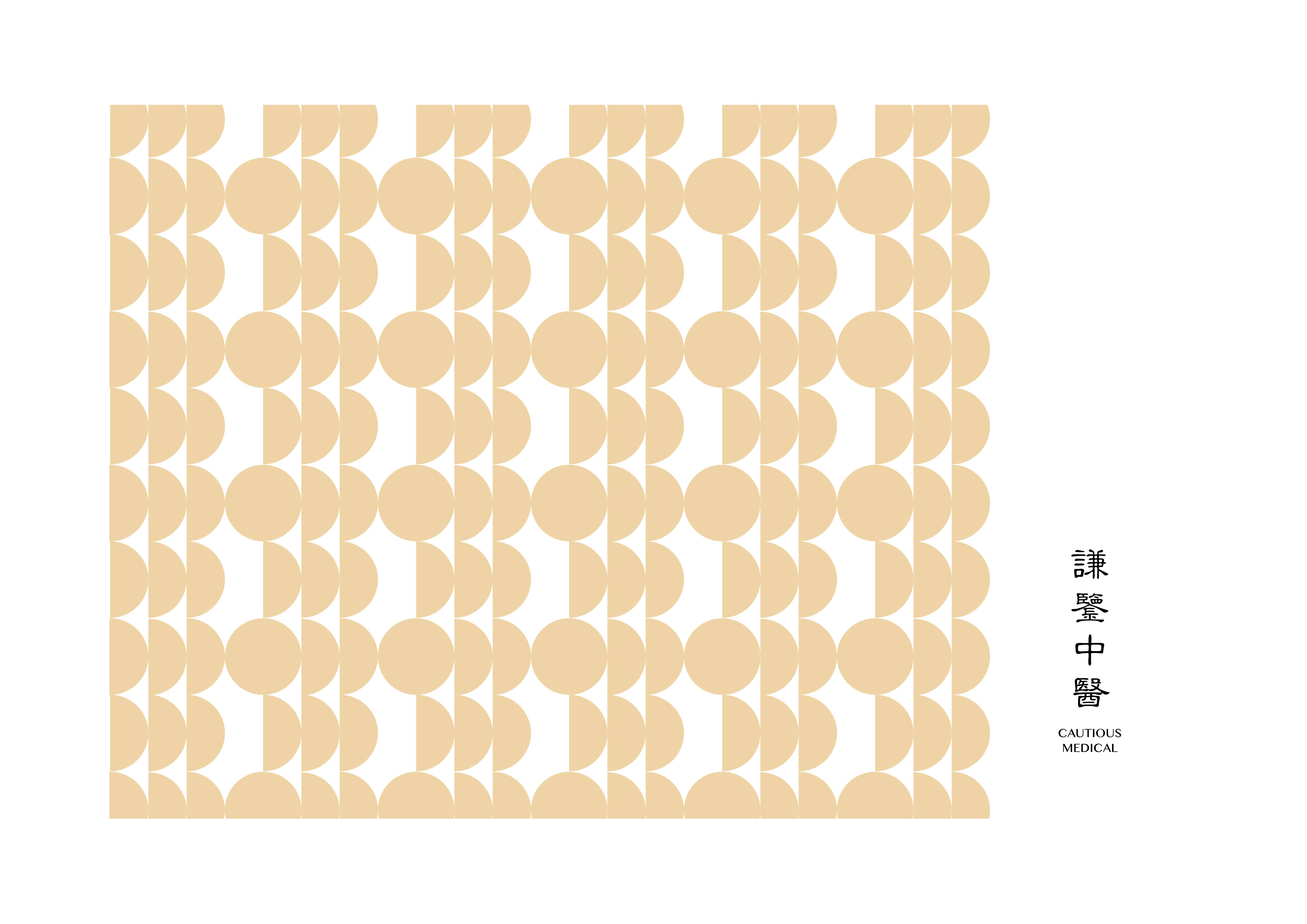
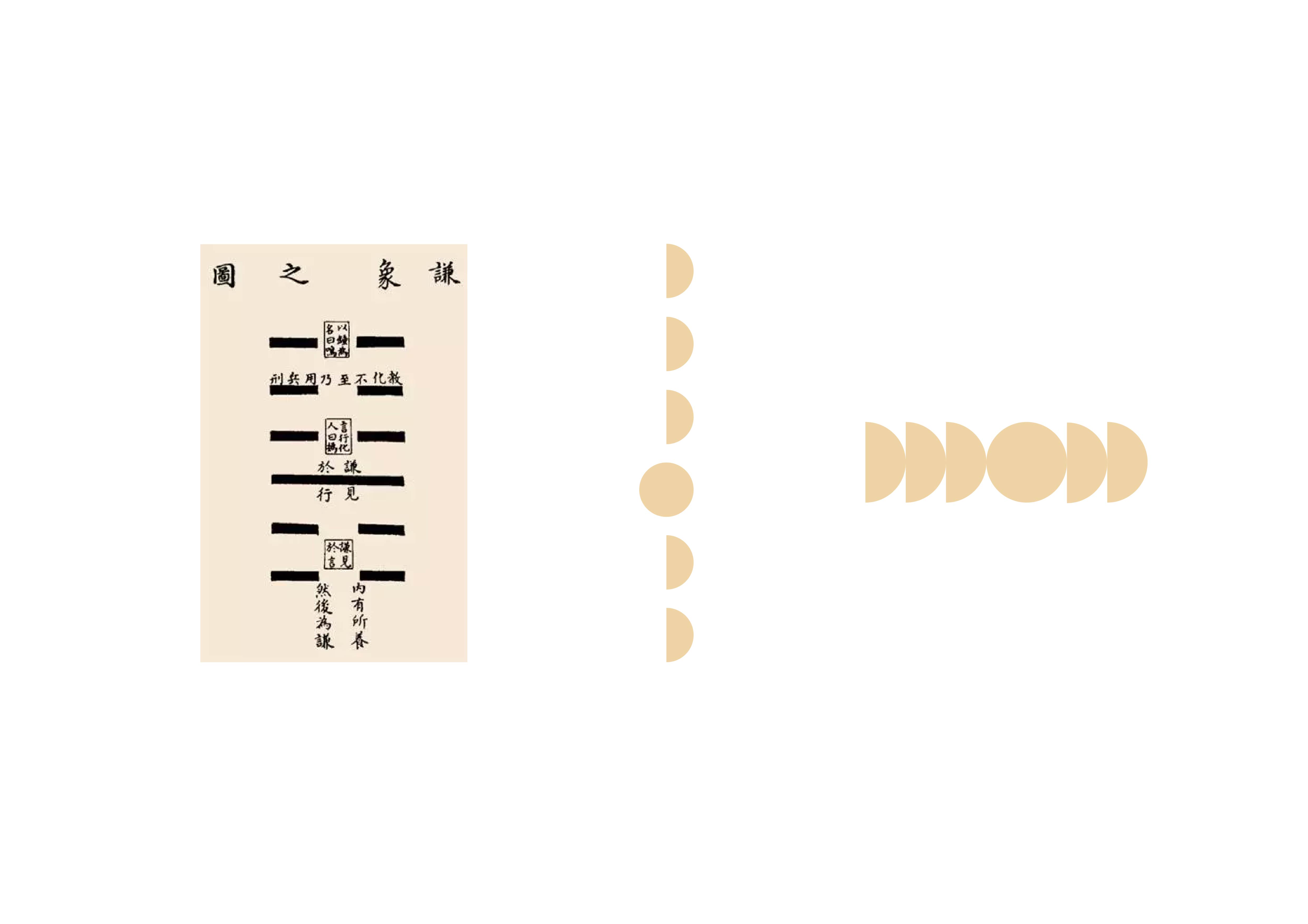
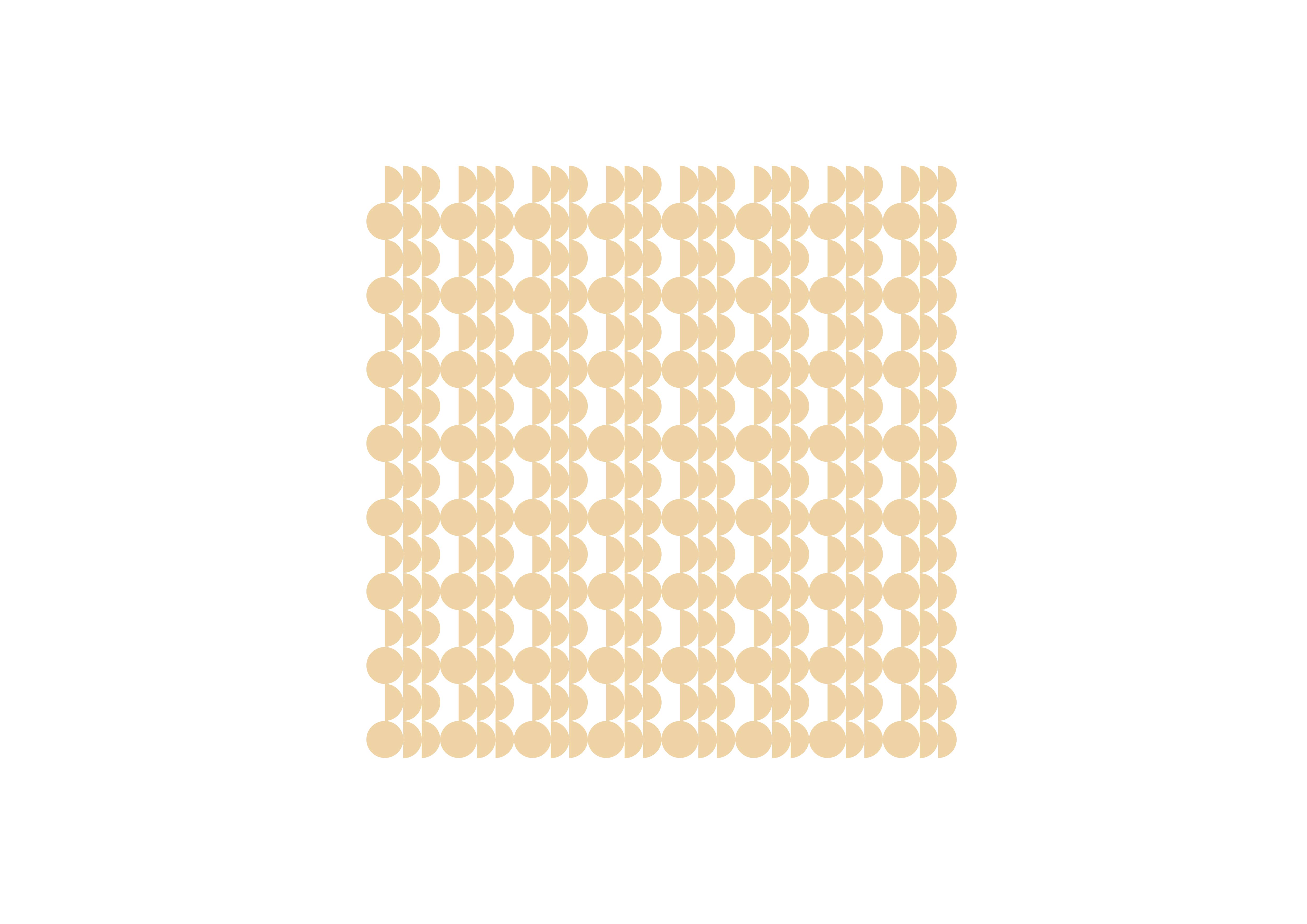
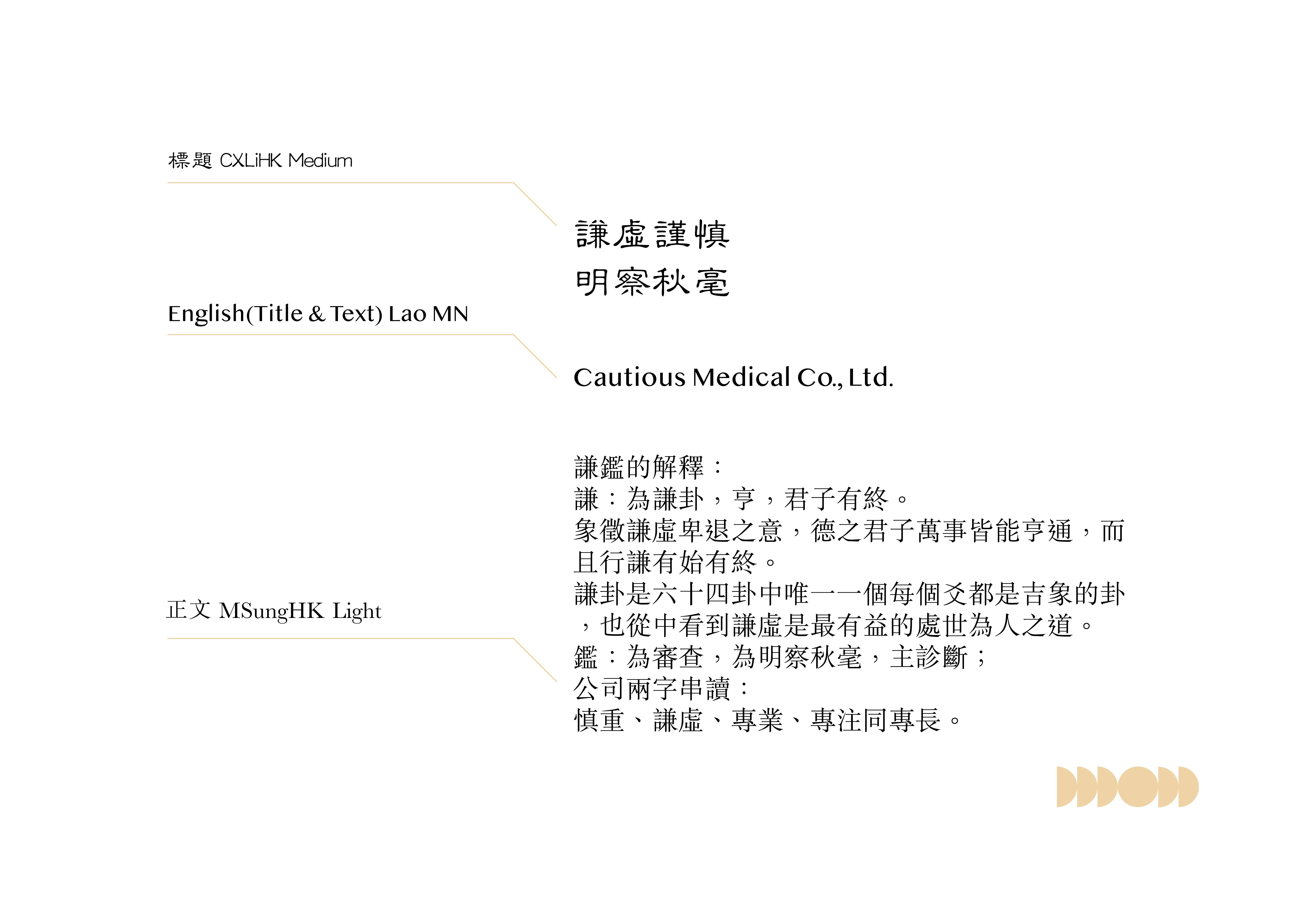
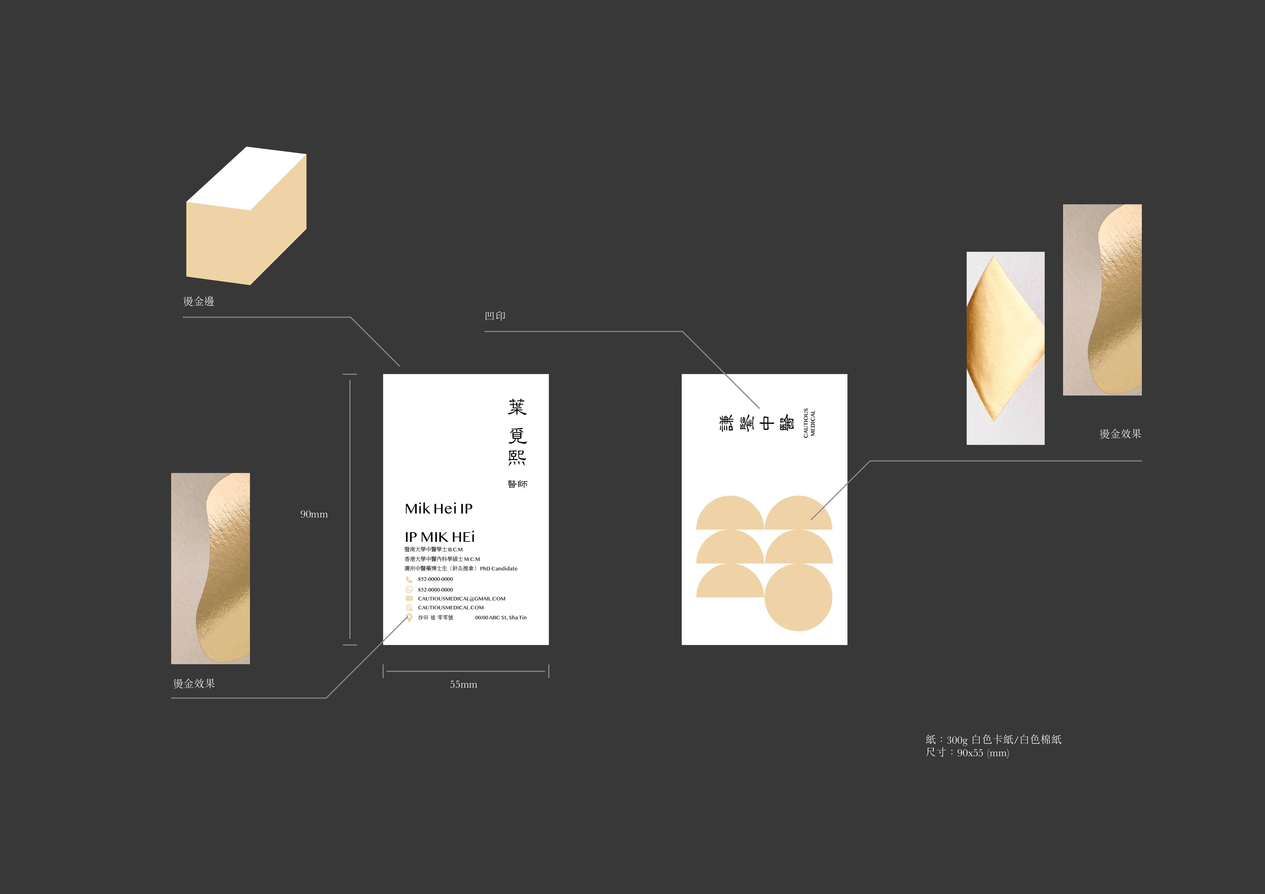
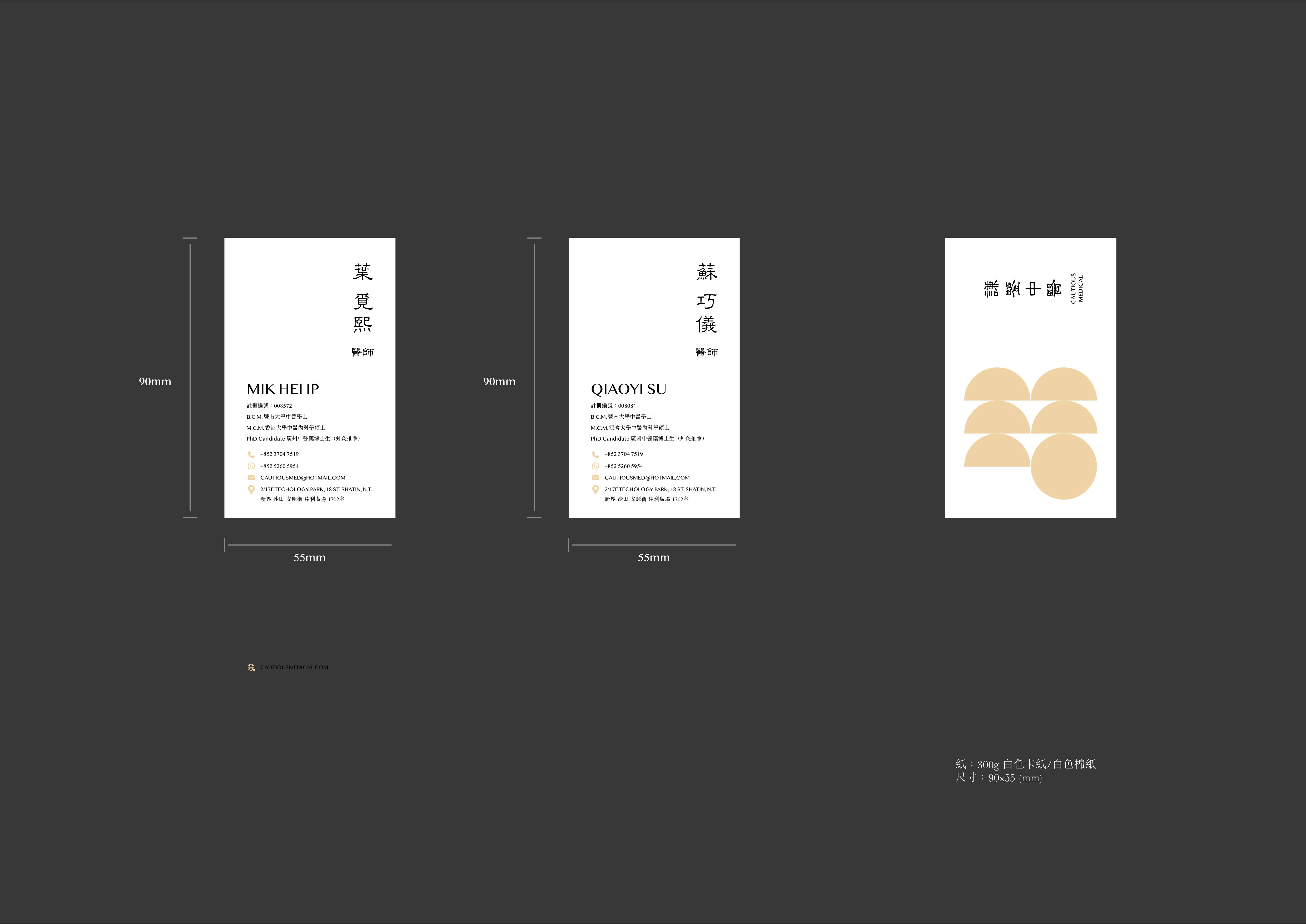
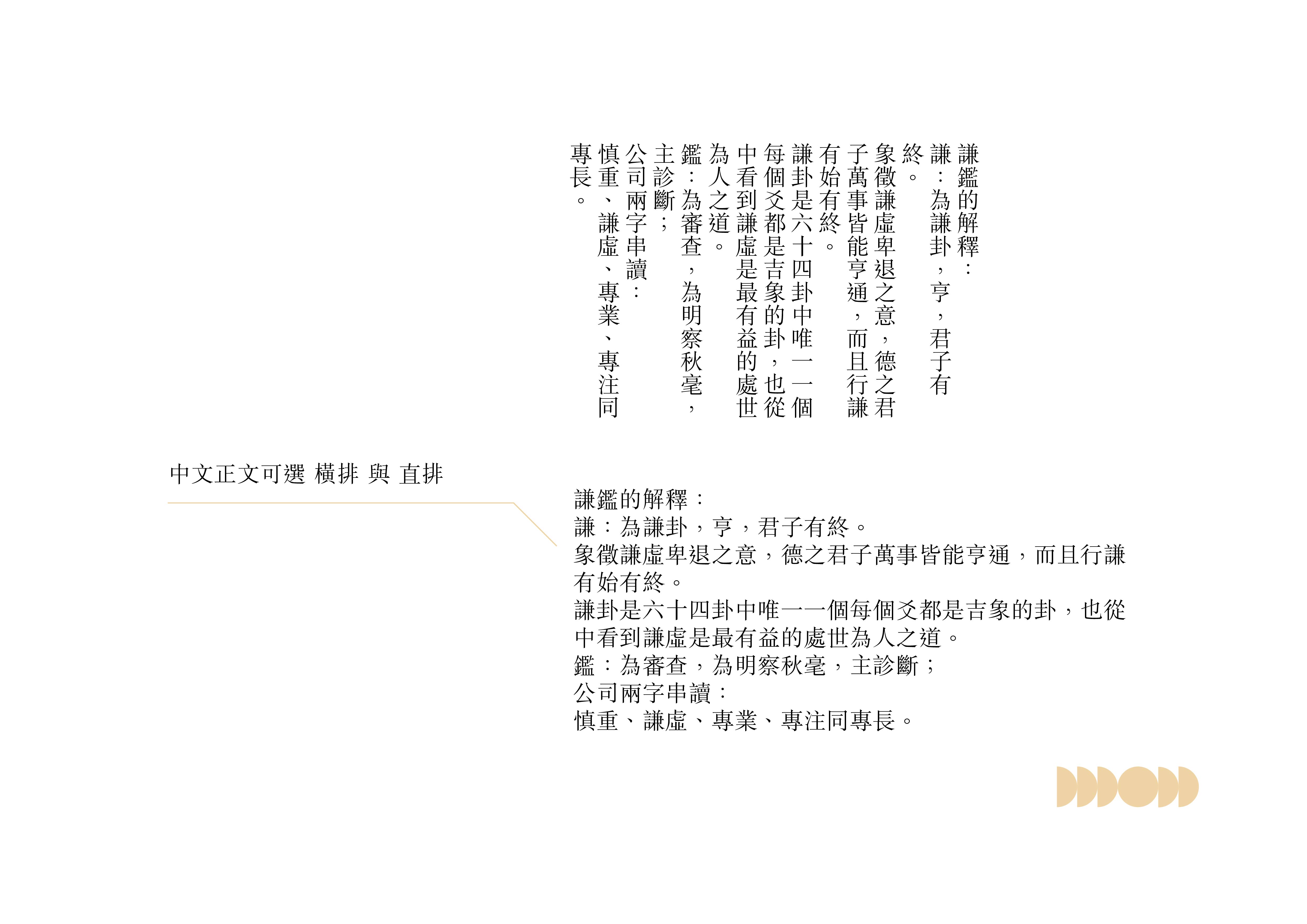
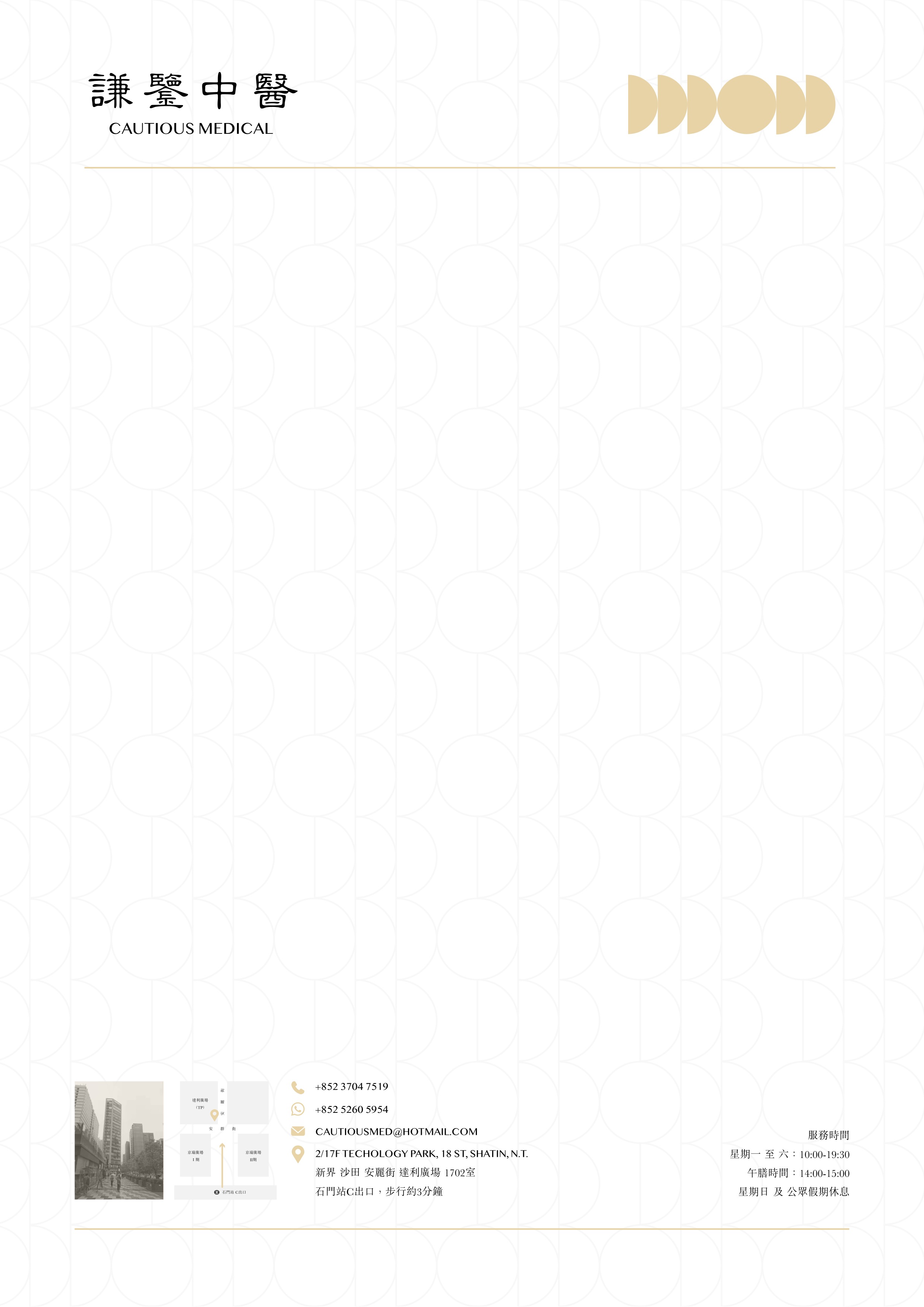
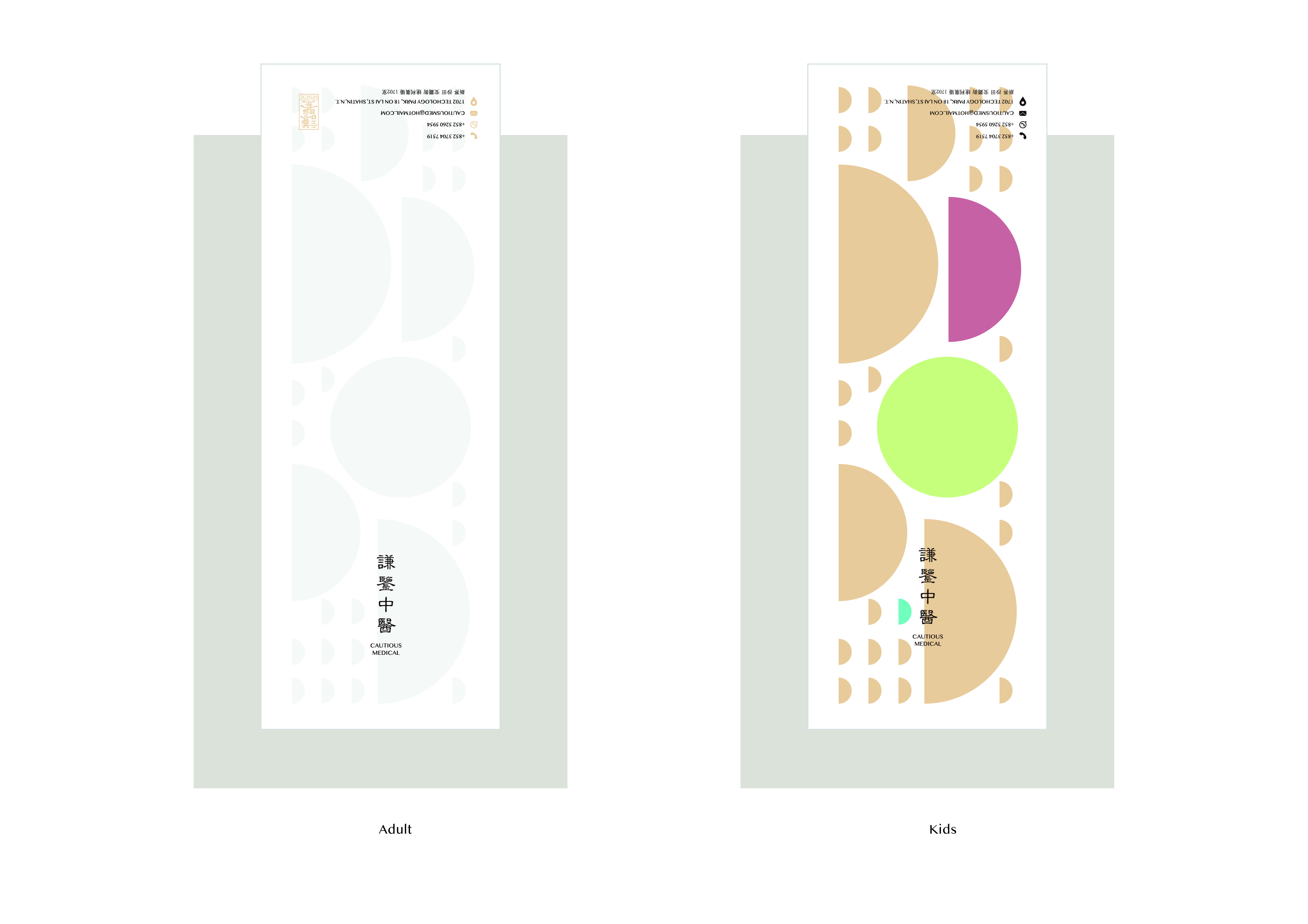
謙鑒,其名取自易經第十五卦——謙卦。「謙虛謹慎,明察秋毫。」即謙鑒中醫的宗旨。可見其品牌貫徹傳統文化,而 logo 亦不例外:為了凸顯其謹慎之意味,品牌主要採用隸書作為主體,書寫效果講究「蠶頭雁尾」、「一波三折」,其細長而又講究細節的寫法正正體現品牌宗旨。在字型修改上,筆劃與重心的修改,加上異體字考慮,以及與英文的配合,把傳統的中文轉換為適合現代使用的品牌標識。而周邊圖案方面,選取了易經謙卦的圖形作為品牌的視覺延伸,配合現代產品的設計,令品牌不僅限於中醫範疇,更為未來作為一個連鎖品牌甚至推出周邊產品鋪路。
The Cautious Medical 謙鑒中醫 Branding Design 2022 project showcases a harmonious blend of traditional Chinese culture and contemporary aesthetics. Utilizing graphic design elements such as elegant calligraphy, logo design, and typography modifications, the brand effectively communicates its core values of humility and attentiveness. The incorporation of the I Ching hexagram in the visual design extends the brand's reach beyond traditional medicine, paving the way for potential expansion into a chain brand and the development of related products in the future.
Branding Design 2022 | 品牌形象設計 2022
Sha Tin, Hong Kong | 香港,沙田
謙鑒,其名取自易經第十五卦——謙卦。「謙虛謹慎,明察秋毫。」即謙鑒中醫的宗旨。可見其品牌貫徹傳統文化,而 logo 亦不例外:為了凸顯其謹慎之意味,品牌主要採用隸書作為主體,書寫效果講究「蠶頭雁尾」、「一波三折」,其細長而又講究細節的寫法正正體現品牌宗旨。在字型修改上,筆劃與重心的修改,加上異體字考慮,以及與英文的配合,把傳統的中文轉換為適合現代使用的品牌標識。而周邊圖案方面,選取了易經謙卦的圖形作為品牌的視覺延伸,配合現代產品的設計,令品牌不僅限於中醫範疇,更為未來作為一個連鎖品牌甚至推出周邊產品鋪路。
The Cautious Medical 謙鑒中醫 Branding Design 2022 project showcases a harmonious blend of traditional Chinese culture and contemporary aesthetics. Utilizing graphic design elements such as elegant calligraphy, logo design, and typography modifications, the brand effectively communicates its core values of humility and attentiveness. The incorporation of the I Ching hexagram in the visual design extends the brand's reach beyond traditional medicine, paving the way for potential expansion into a chain brand and the development of related products in the future.
]