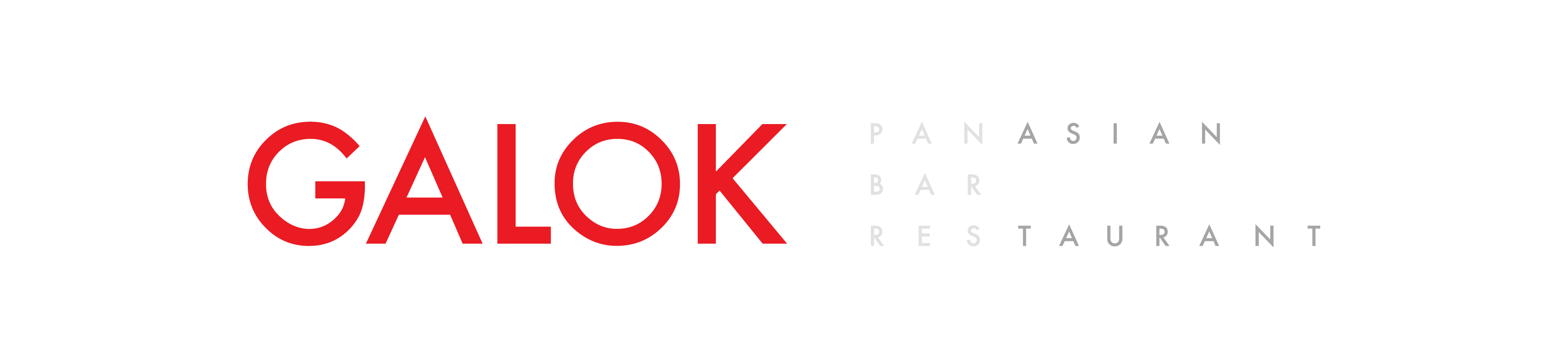
GALOK · 泛亞洲 酒吧 與 餐廳
品牌形象設計 2022-2024
墨爾本,溫莎
GALOK 餐廳,酒吧 與 蒸餾所,位於墨爾本的溫莎區,是一個同時擁有維多利亞式連排建築與現代高尚中高密度住宅,並以大量優質時尚,家具,文化,復古商店以及特色酒吧夜店著名的區域。
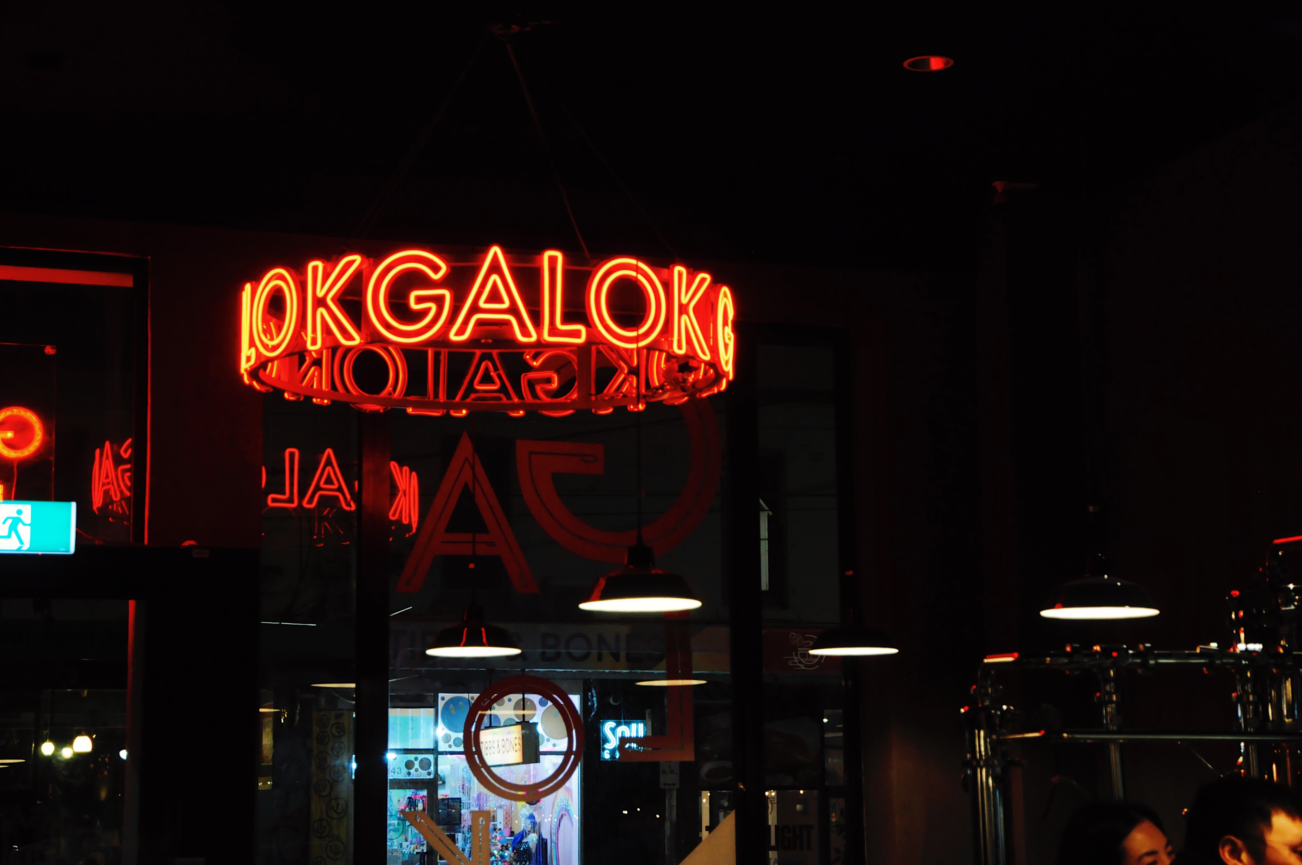
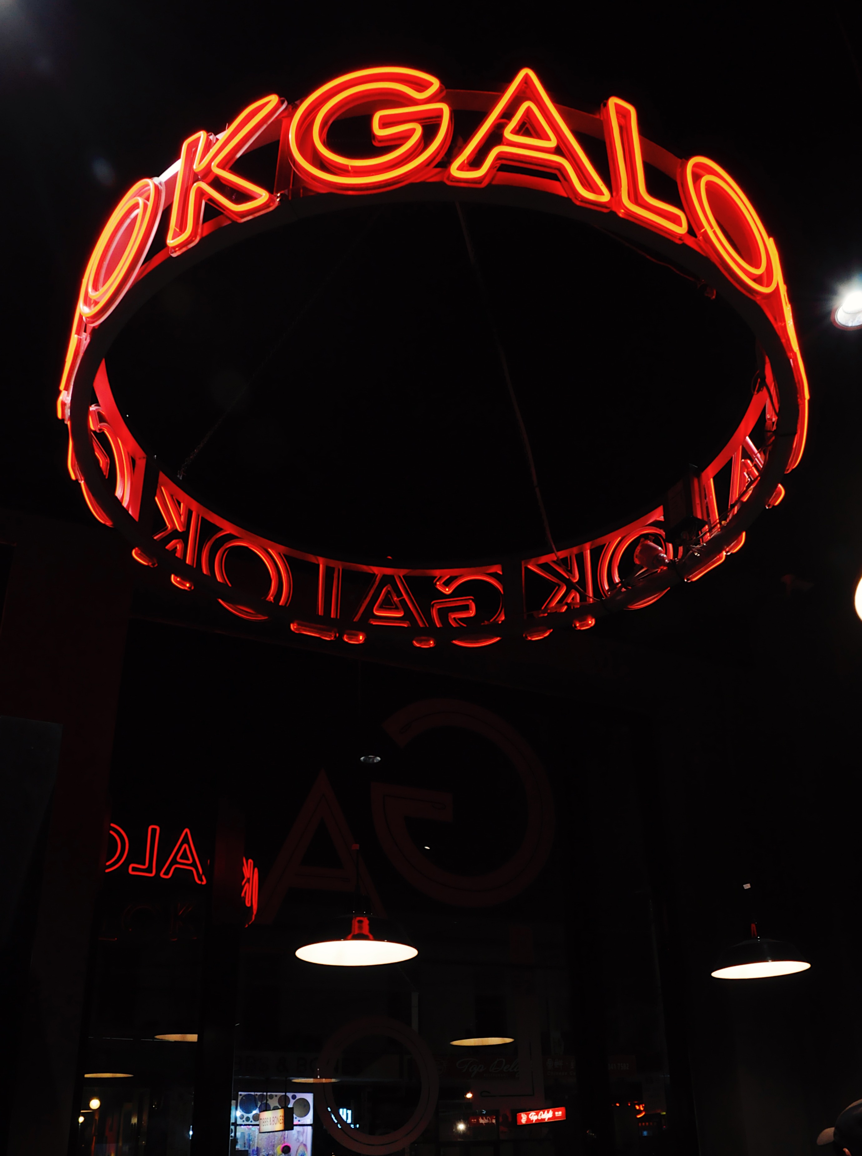
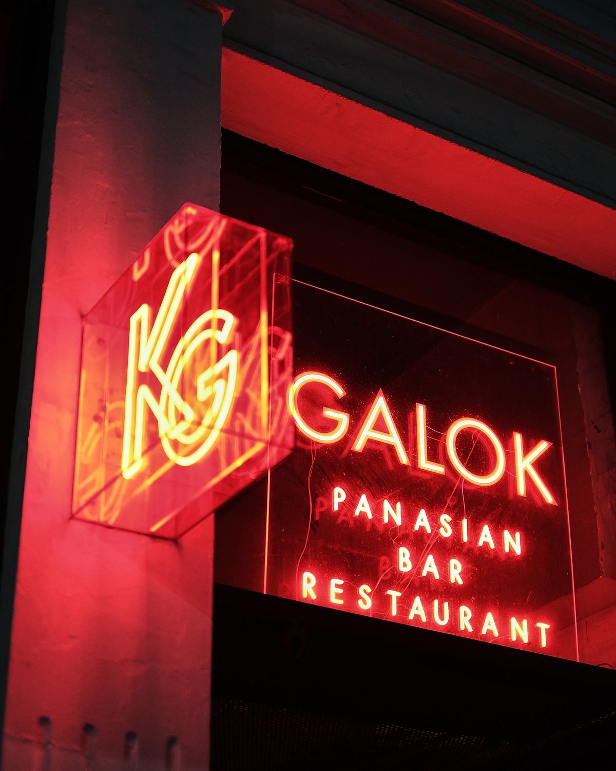
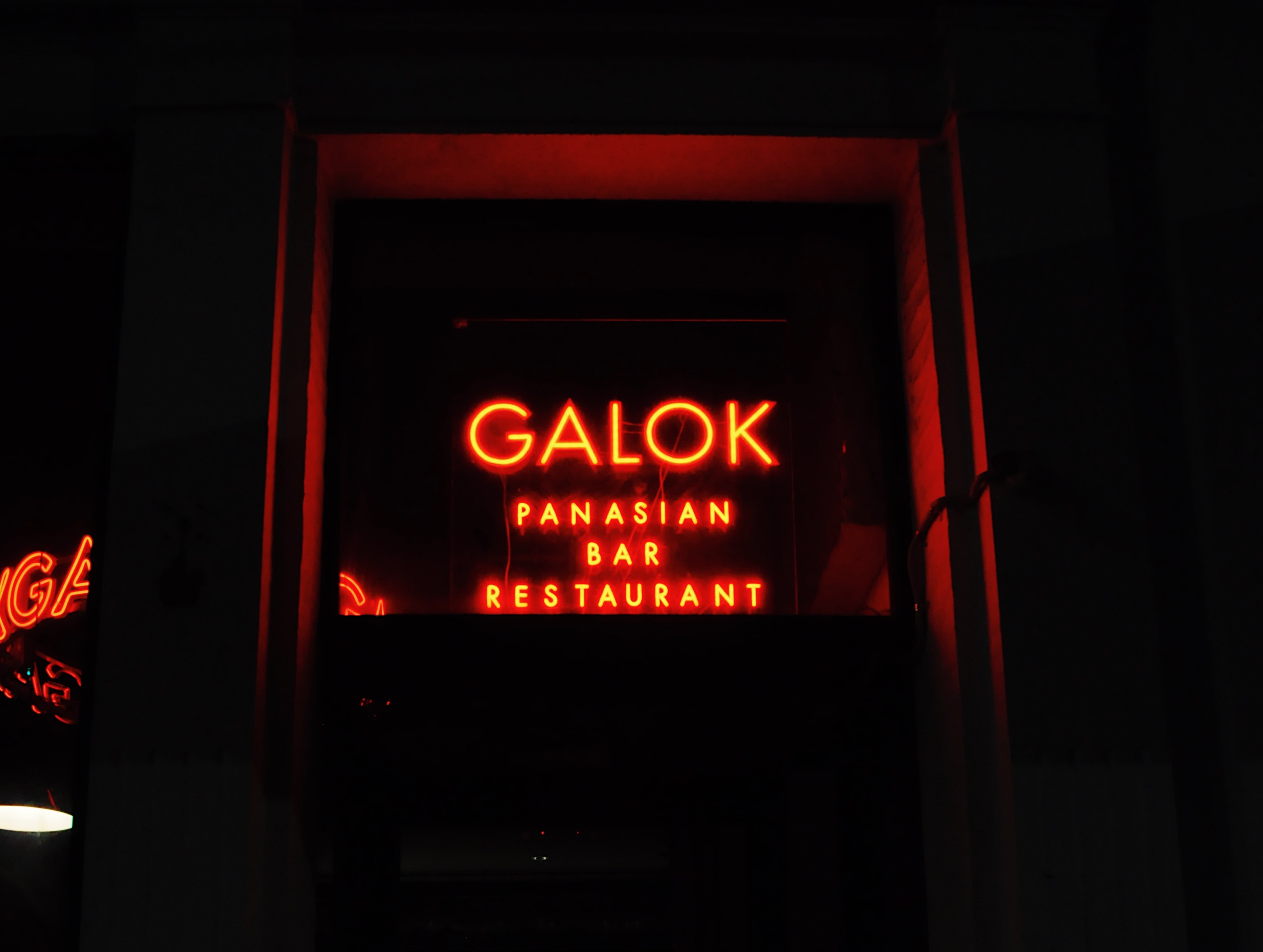
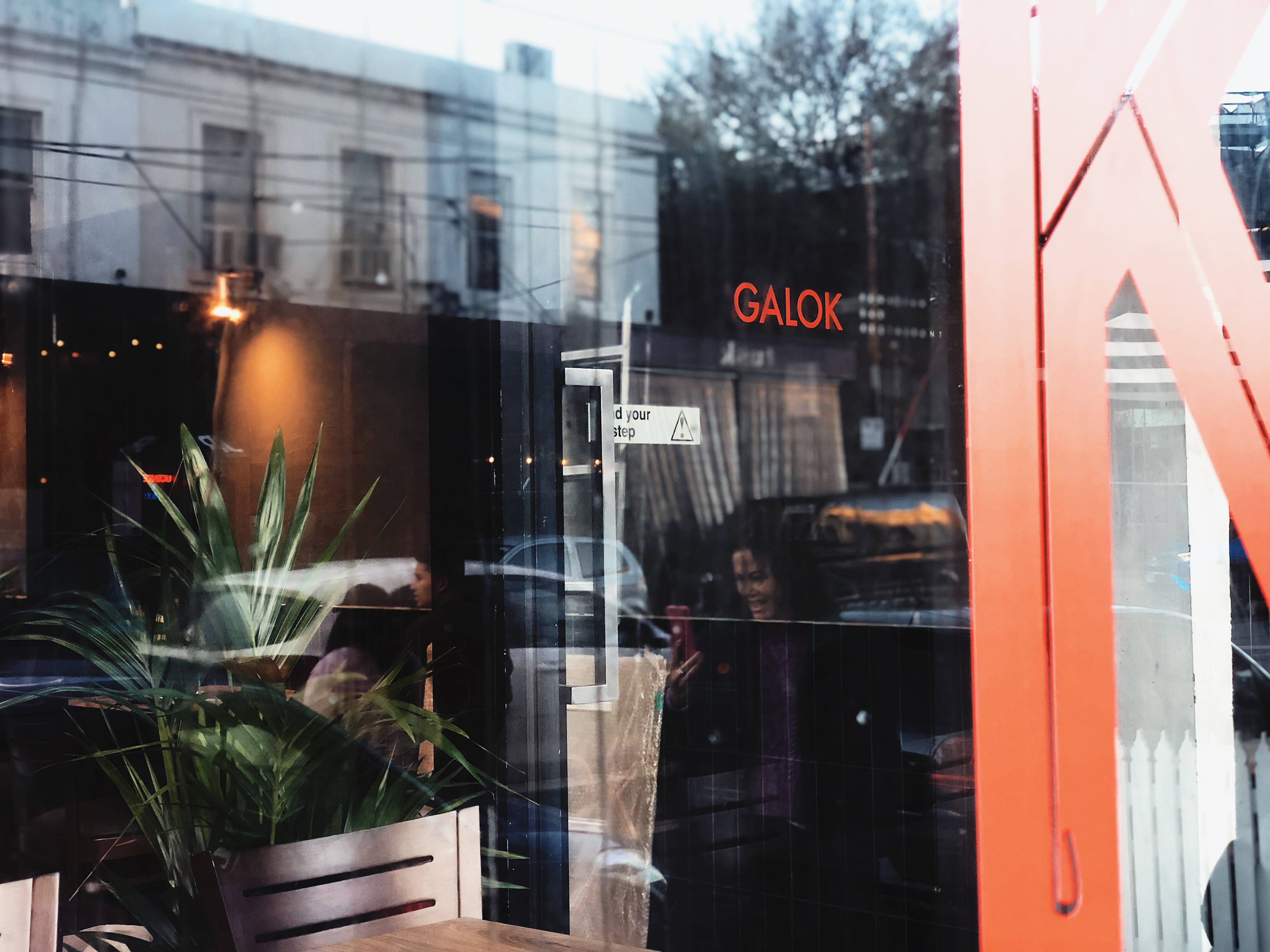
品牌主視覺以水泥,霓虹紅帶出。另外,用 Futra 字體帶出幹練的風格,字體中專門修 正的尖角令字更有性格,搭配霓虹燈填滿的 字更令其在繁忙的街道鶴立雞群。
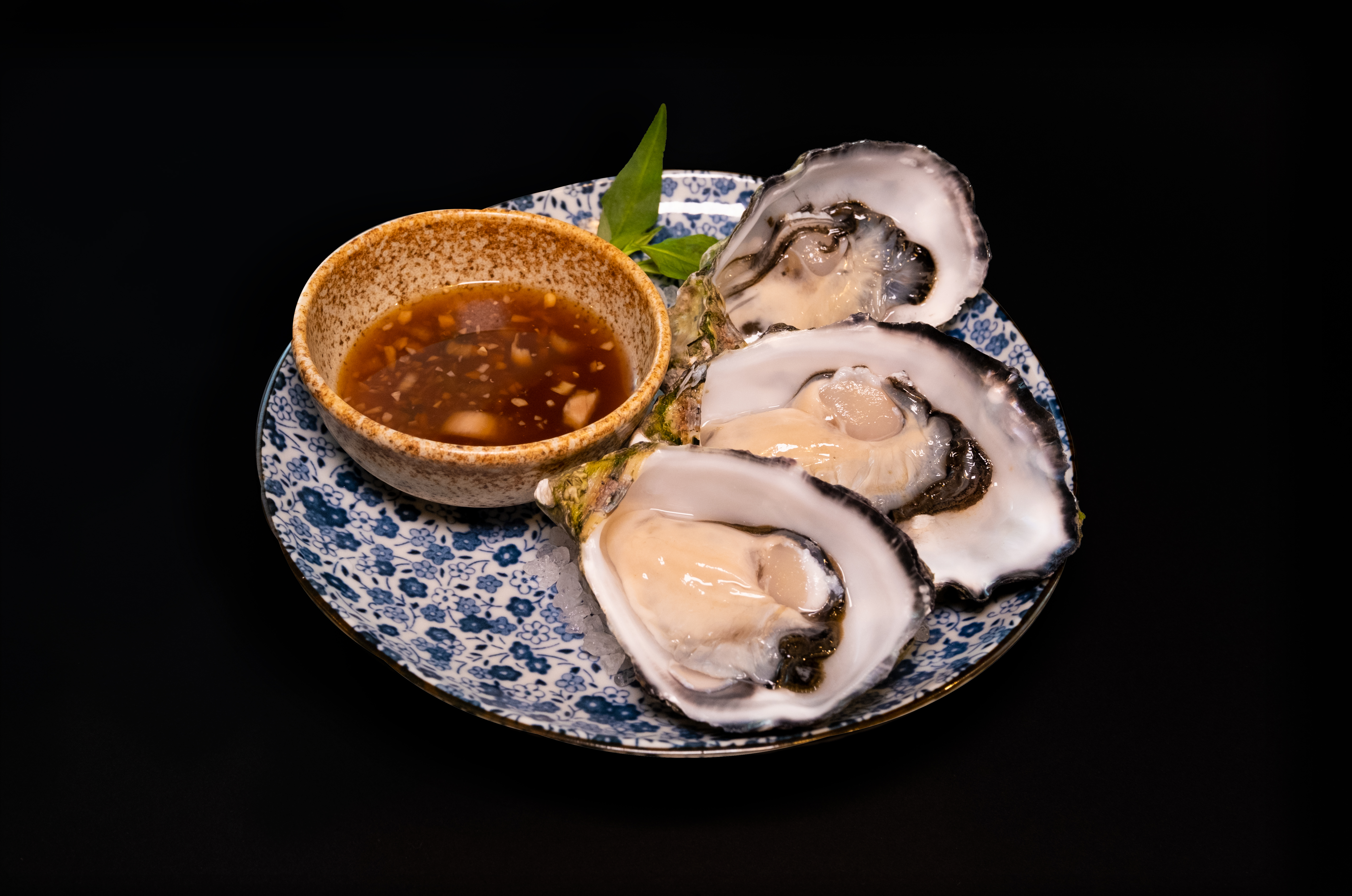
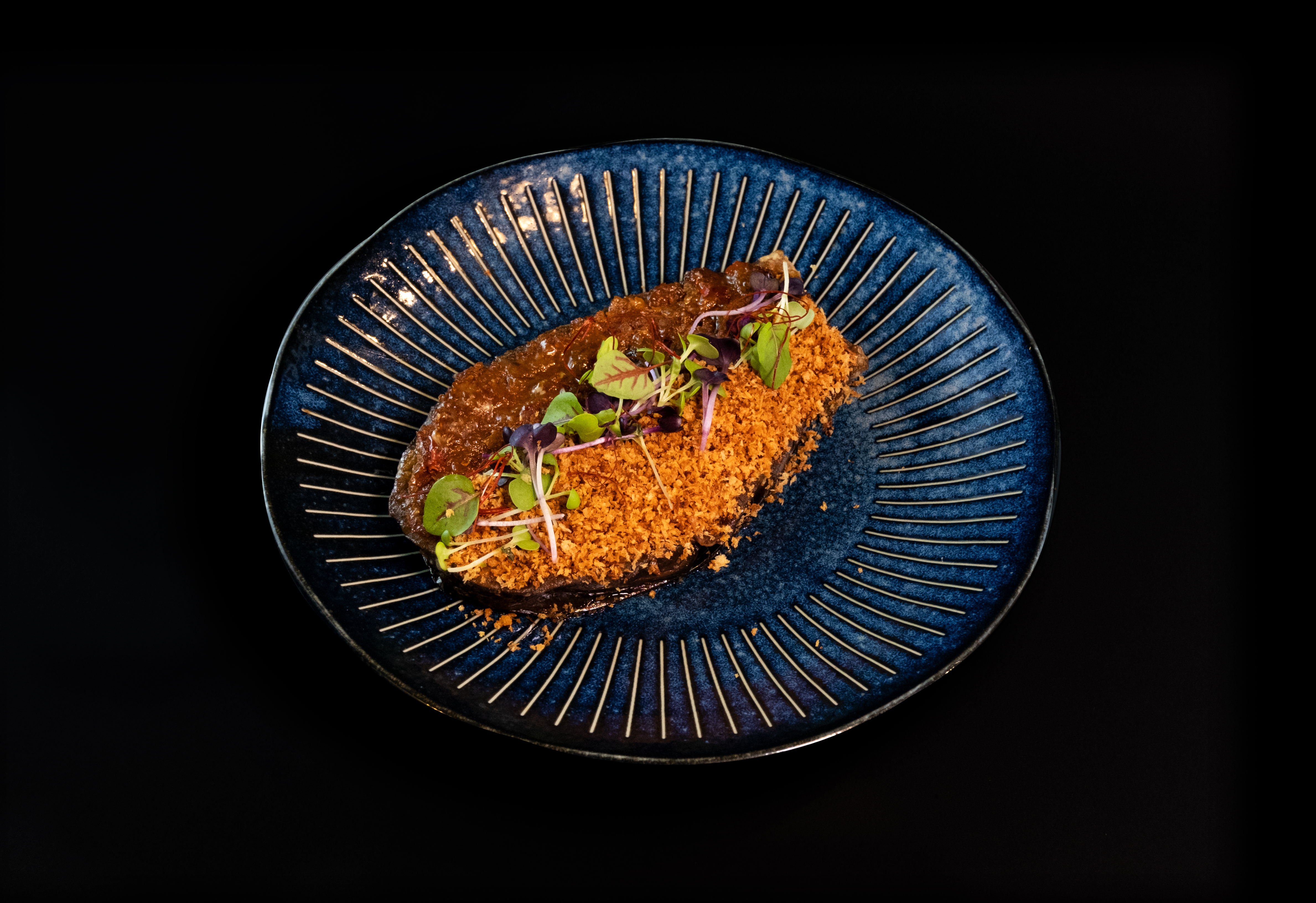
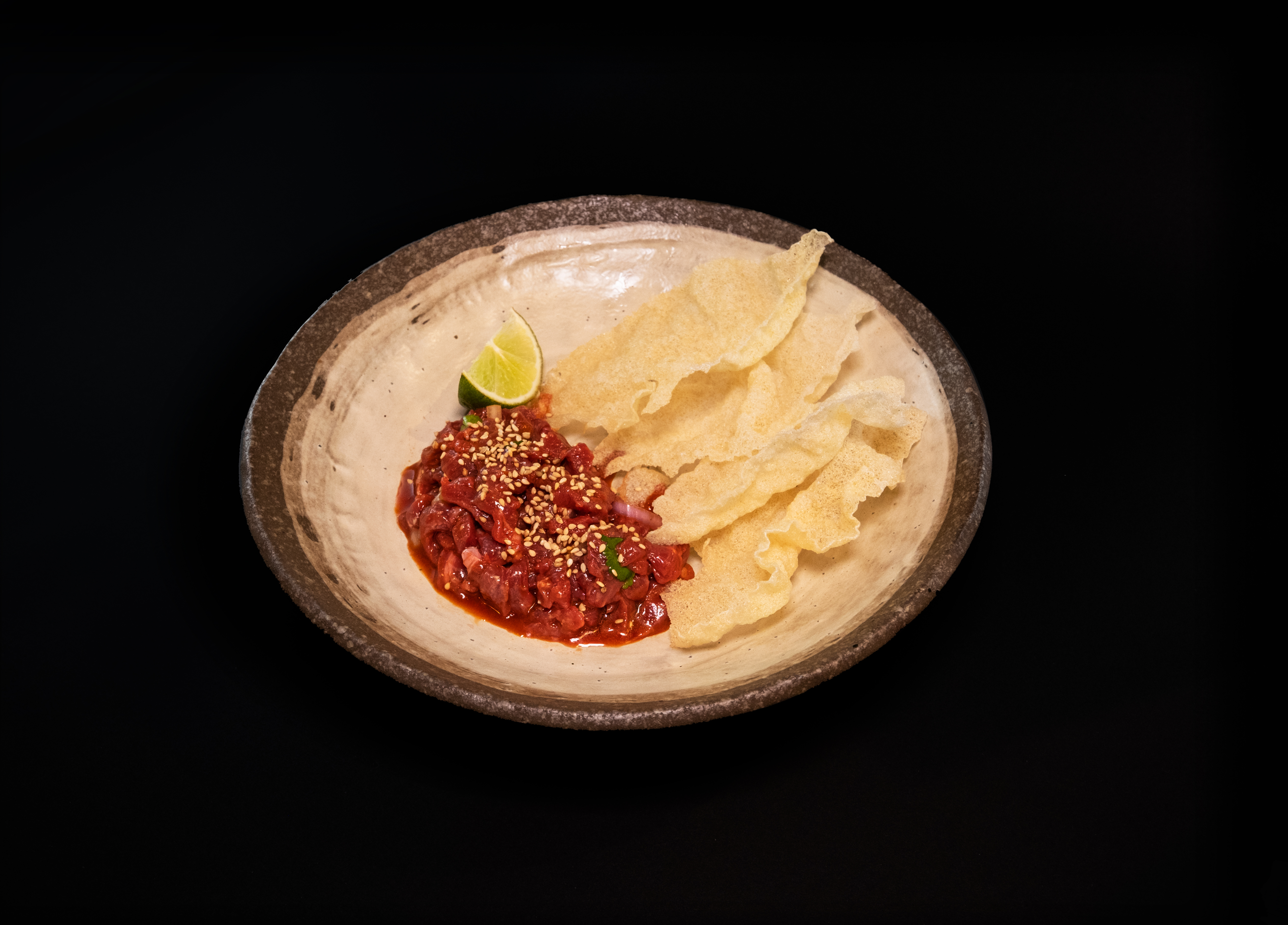
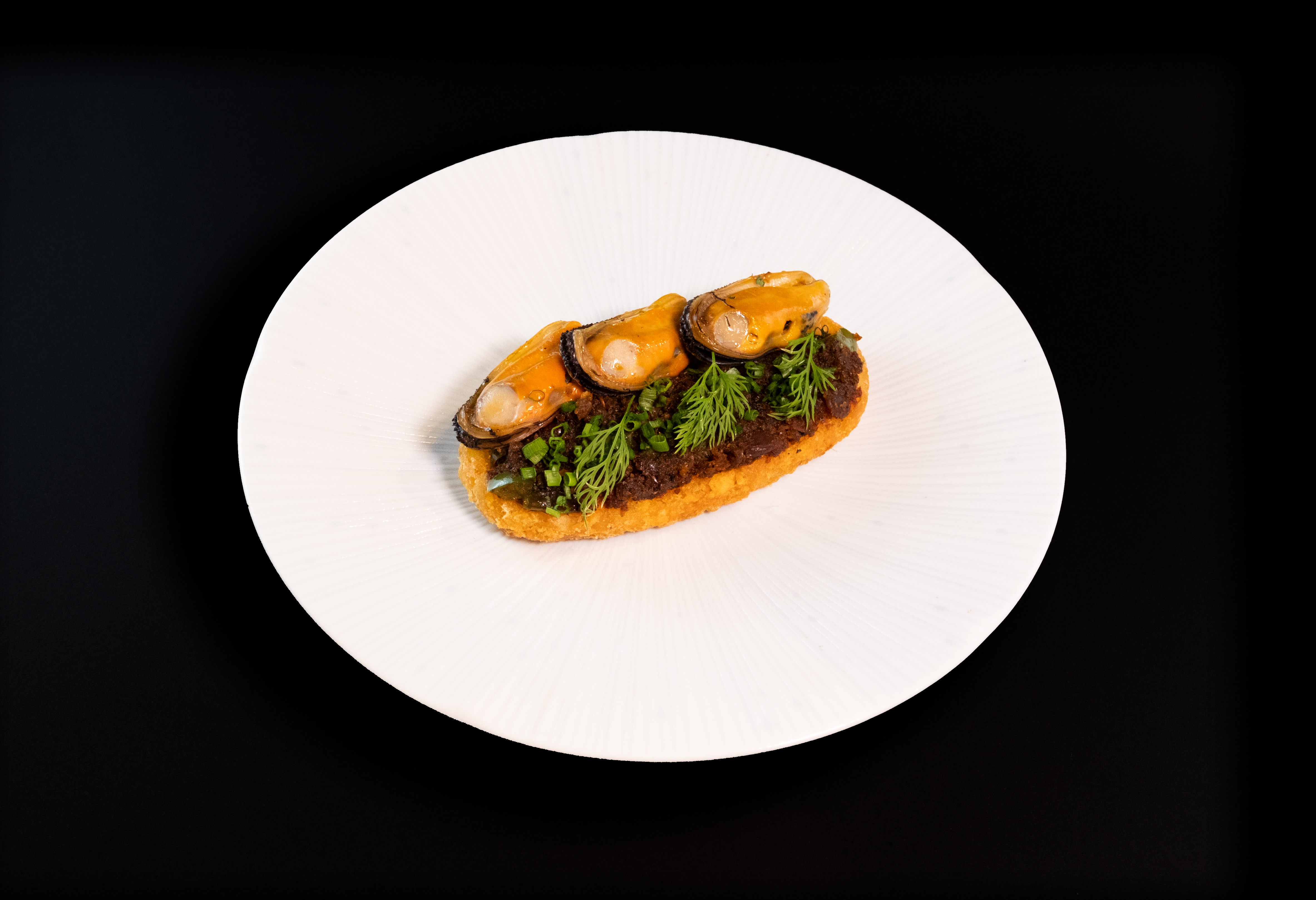
在副視覺方面,貫徹紅灰之餘,品牌下的餐 廳,酒吧 與 蒸餾所 三個主要的範疇亦能完 美融合。從店外延伸到店內,「紅」即代表 了品牌,從菜單,到每一個細小的指示牌。 即使不需要標明標誌,只需要一個小紅點, 顧客即心領神會,同時亦在顧客內心留下難 以忘記的印象。
品牌形象設計 2022-2024
墨爾本,溫莎
GALOK 餐廳,酒吧 與 蒸餾所,位於墨爾本的溫莎區,是一個同時擁有維多利亞式連排建築與現代高尚中高密度住宅,並以大量優質時尚,家具,文化,復古商店以及特色酒吧夜店著名的區域。
品牌主視覺以水泥,霓虹紅帶出。另外,用 Futra 字體帶出幹練的風格,字體中專門修 正的尖角令字更有性格,搭配霓虹燈填滿的 字更令其在繁忙的街道鶴立雞群。
在副視覺方面,貫徹紅灰之餘,品牌下的餐 廳,酒吧 與 蒸餾所 三個主要的範疇亦能完 美融合。從店外延伸到店內,「紅」即代表 了品牌,從菜單,到每一個細小的指示牌。 即使不需要標明標誌,只需要一個小紅點, 顧客即心領神會,同時亦在顧客內心留下難 以忘記的印象。
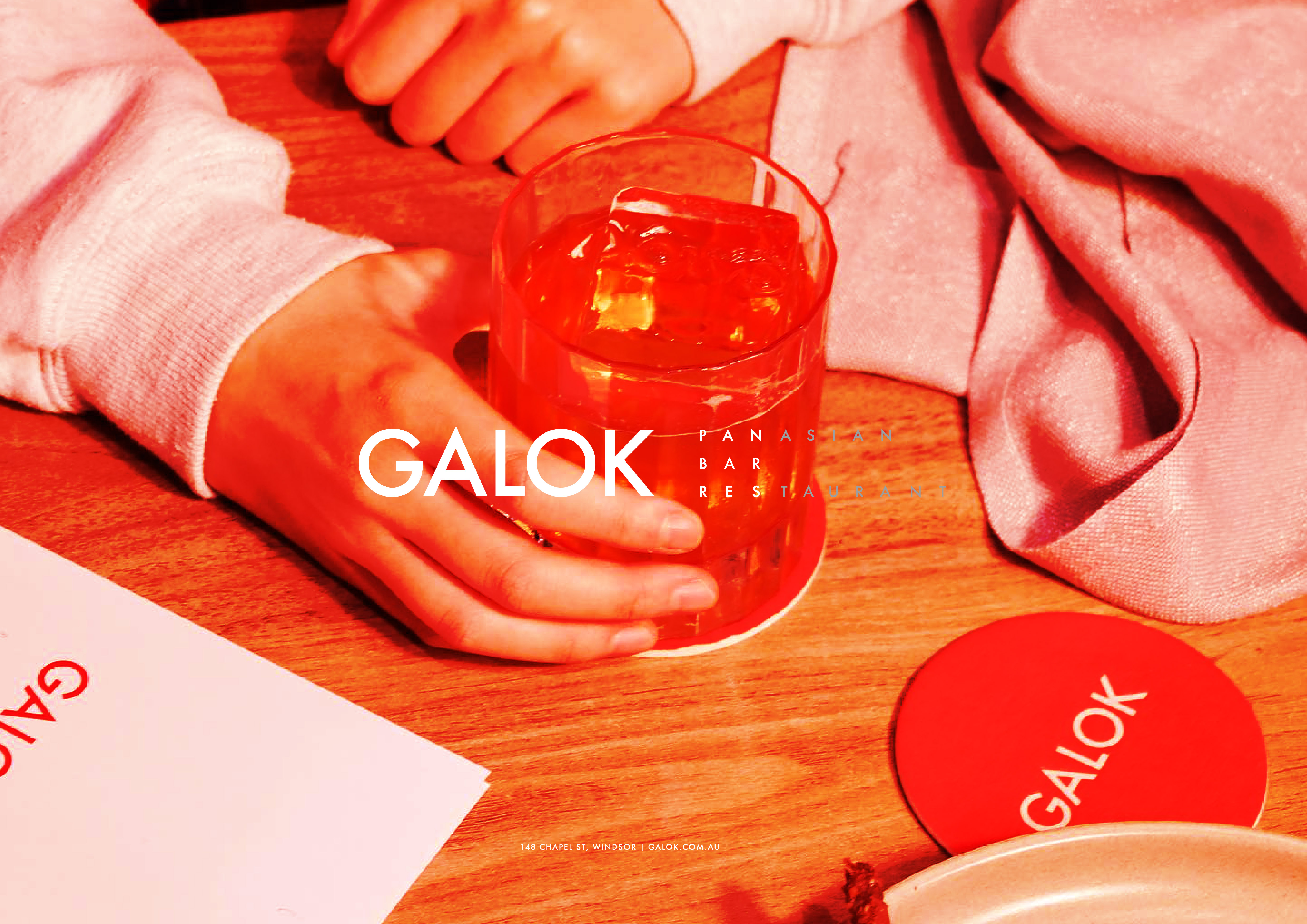
GALOK Pan-Asian Bar & Restaurant
Branding Design 2022-2024
Windsor, Melbourne, Victoria
GALOK Restaurant, Bar, and Distillery is located in Windsor, Melbourne. This area is known for its blend of Victorian-style terraced buildings and modern, upscale medium-density housing. It features a wealth of high-quality fashion, furniture, culture, vintage shops, and unique bars and nightclubs.
The main visual branding of GALOK utilizes cement and neon red elements. The use of Futra font adds a sleek style, with specially modified sharp angles giving the text more character. The neon-filled text stands out prominently on busy streets.
For the secondary visual aspects, the red and gray color scheme is consistently applied across the restaurant, bar, and distillery sections of the brand, ensuring a perfect blend. Extending from the exterior to the interior of the establishment, "red" represents the brand. From the menu to every small sign, even without a logo, a small red dot immediately signifies the brand to customers, leaving a memorable impression.
Website Design | 網頁設計
︎GALOK.COM.AU
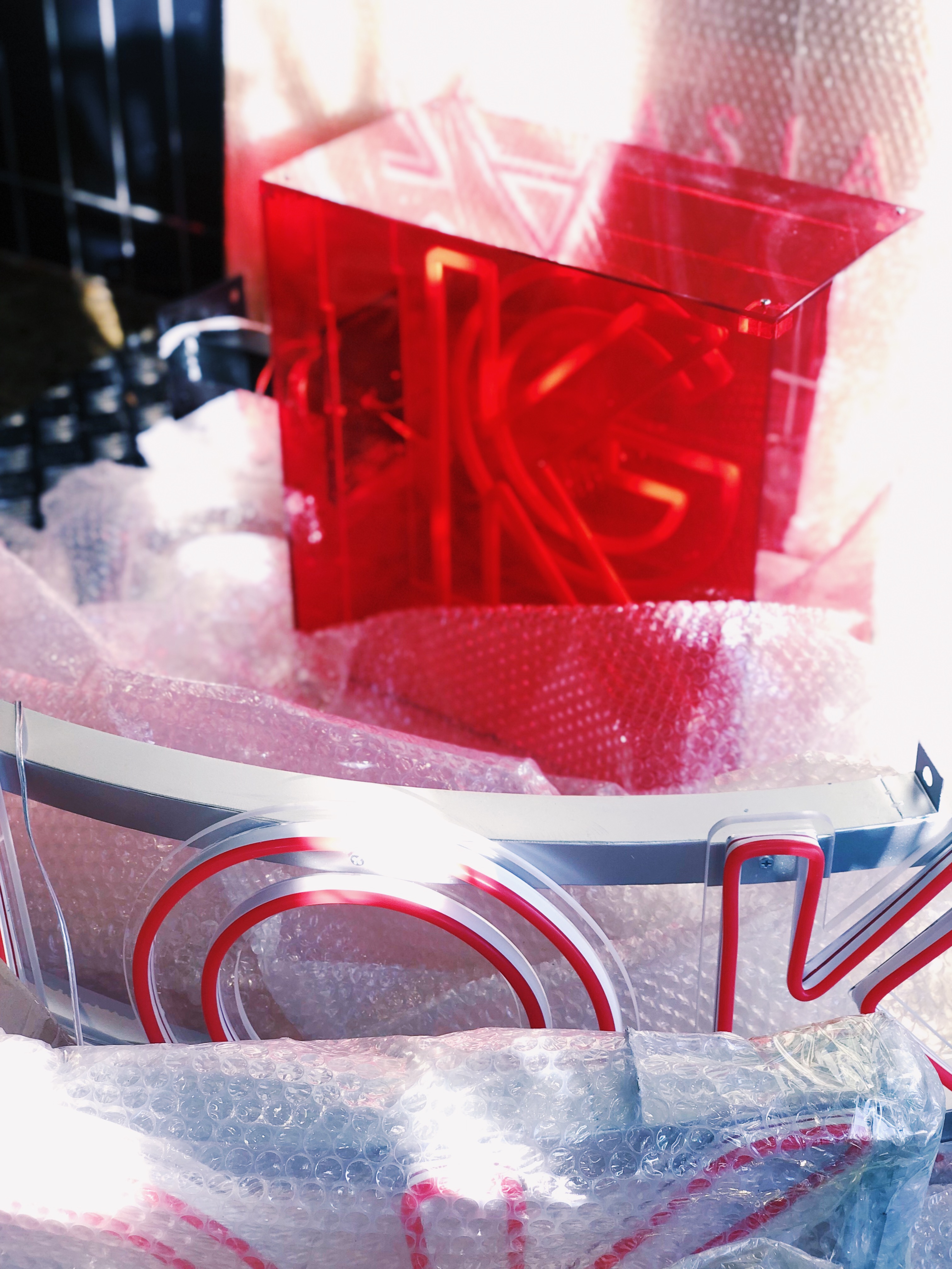
Neon Signs design | 霓虹燈設計
Branding Design 2022-2024
Windsor, Melbourne, Victoria
GALOK Restaurant, Bar, and Distillery is located in Windsor, Melbourne. This area is known for its blend of Victorian-style terraced buildings and modern, upscale medium-density housing. It features a wealth of high-quality fashion, furniture, culture, vintage shops, and unique bars and nightclubs.
The main visual branding of GALOK utilizes cement and neon red elements. The use of Futra font adds a sleek style, with specially modified sharp angles giving the text more character. The neon-filled text stands out prominently on busy streets.
For the secondary visual aspects, the red and gray color scheme is consistently applied across the restaurant, bar, and distillery sections of the brand, ensuring a perfect blend. Extending from the exterior to the interior of the establishment, "red" represents the brand. From the menu to every small sign, even without a logo, a small red dot immediately signifies the brand to customers, leaving a memorable impression.
Website Design | 網頁設計
︎GALOK.COM.AU
Neon Signs design | 霓虹燈設計


LOGOS
SELECTED LOGOS
Creative Director & Art Director
Jon Ho / Yetta Lee / Fezzy Chan
Designer
Candy Chan / Sebastian Zhao / Link Lin / Yan Tse

EUNORAU E BIKE - Retail Identity Designer Guideline
Retail Identity Designer Guideline 2024
Worldwide: Australia, USA, Canada, China, etc
A retial identity system aimed at global store unification, with the goal of creating a universally applicable, easy-to-install, highly efficient, and even modular, portable design. At the same time, it ensures the extension of the brand's unique aesthetics and identity.
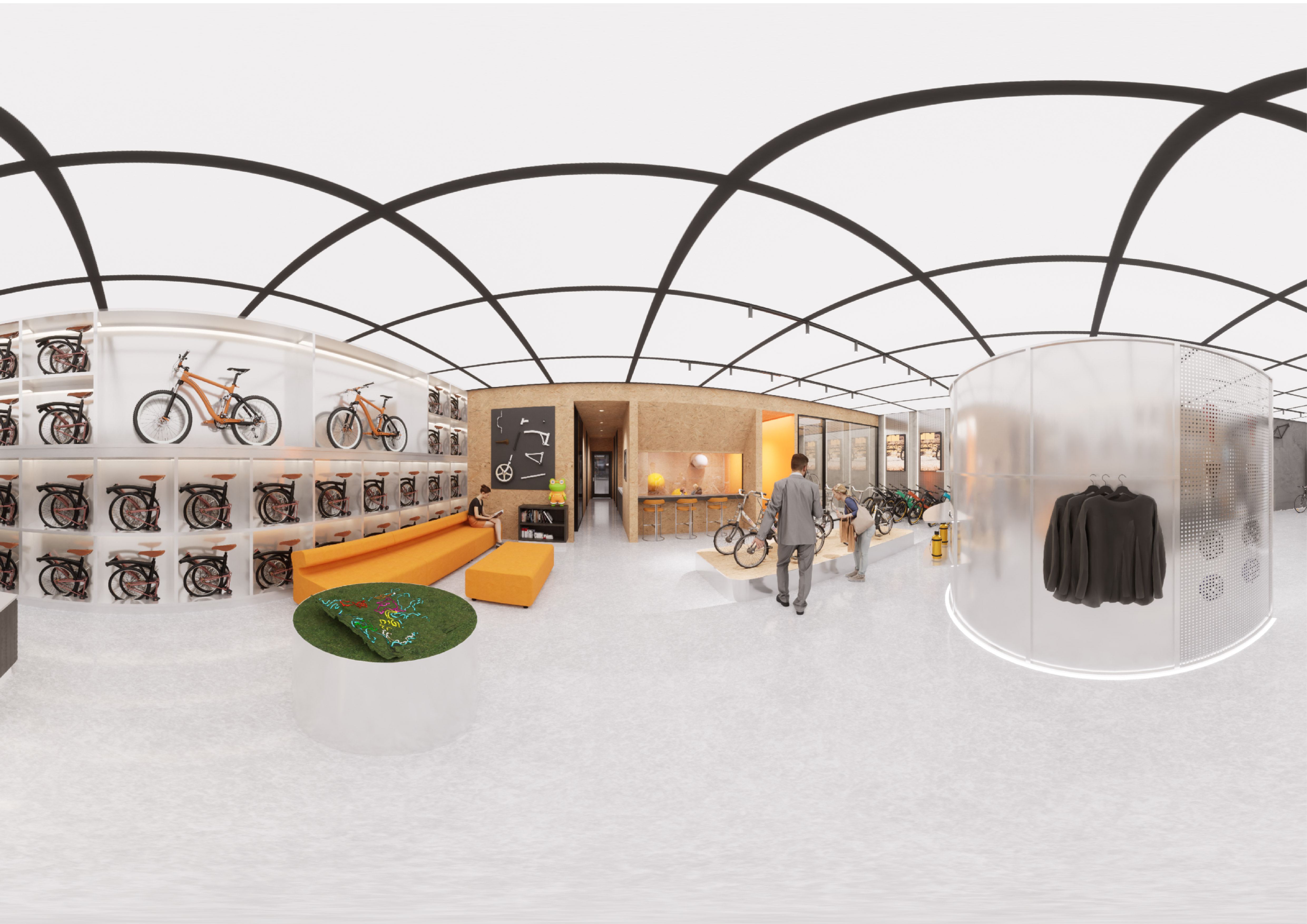
Display
Explore our brand new bicycle series, meticulously crafted for cycling enthusiasts who pursue excellence. Each bike incorporates cutting-edge technology and superior craftsmanship, designed to offer an unparalleled riding experience. From lightweight carbon fiber frames to precise shifting systems, every detail is carefully engineered to ensure optimal performance and comfort. Whether navigating city streets or rugged trails, our bicycles make every ride enjoyable and challenging. Discover our products, find your perfect companion, and embark on your cycling journey!
Customer Service
This article provides an in-depth introduction to the various details of the bicycle, highlighting the professionalism of the design and a deep understanding of rider needs. It aims to help potential customers better understand the product's features.
Physical Interaction
The physical interaction segment is focused on bicycle customization and immersive virtual reality experiences. This customization feature highlights an extensive selection of materials, colors, textures, and the superior build quality of the products. Additionally, the virtual reality experience offers users the opportunity to sit on a bicycle equipped with VR glasses, providing a deeply engaging and immersive experience.
Worldwide: Australia, USA, Canada, China, etc
A retial identity system aimed at global store unification, with the goal of creating a universally applicable, easy-to-install, highly efficient, and even modular, portable design. At the same time, it ensures the extension of the brand's unique aesthetics and identity.
Display
Explore our brand new bicycle series, meticulously crafted for cycling enthusiasts who pursue excellence. Each bike incorporates cutting-edge technology and superior craftsmanship, designed to offer an unparalleled riding experience. From lightweight carbon fiber frames to precise shifting systems, every detail is carefully engineered to ensure optimal performance and comfort. Whether navigating city streets or rugged trails, our bicycles make every ride enjoyable and challenging. Discover our products, find your perfect companion, and embark on your cycling journey!
Customer Service
This article provides an in-depth introduction to the various details of the bicycle, highlighting the professionalism of the design and a deep understanding of rider needs. It aims to help potential customers better understand the product's features.
Physical Interaction
The physical interaction segment is focused on bicycle customization and immersive virtual reality experiences. This customization feature highlights an extensive selection of materials, colors, textures, and the superior build quality of the products. Additionally, the virtual reality experience offers users the opportunity to sit on a bicycle equipped with VR glasses, providing a deeply engaging and immersive experience.
有諾 電動車 - 店铺终端形象系统 (SI)
Retail Identity Designer Guideline 2024
全球門店:美國,加拿大,澳洲,中國,以及未來門店
以全球門店統一為目標的形象系統,目標是製作全球通用,裝修簡易高效,甚至模組化可搬運的設計,同時兼顧延伸自身品牌美學與形象。
在功能上分為以下三大類:
展示區域
探索我們全新系列的電動自行車,為追求卓越的騎行愛好者精心打造。每一款自行車都融合了尖端技術與卓越工藝,旨在提供無與倫比的騎行體驗。
顧客服務
本文全面介紹了電動自行車的各項細節,展現設計專業性及對騎行者需求的深入理解,幫助潛在顧客更好地了解產品特性與功能。
實體互動
實體互動區域著重於電動自行車的個性化定制與沉浸式虛擬現實體驗。定制功能包括廣泛的材料、顏色及質感選擇,充分展現產品的卓越品質。同時,虛擬現實體驗讓用戶佩戴VR眼鏡坐上自行車,體驗深度互動及沉浸式的感官旅程。


Retail Store Design Guideline
門店設計指引
門店設計指引
Display, Service, Interaction - 3 Key Elements
展示、服務、互動 - 三區連動
展示、服務、互動 - 三區連動


Universial Pop-Up Store Design Guideline
快閃店設計指引
快閃店設計指引
Display, Service, Interaction - 3 Key Elements
展示、服務、互動 - 三區連動


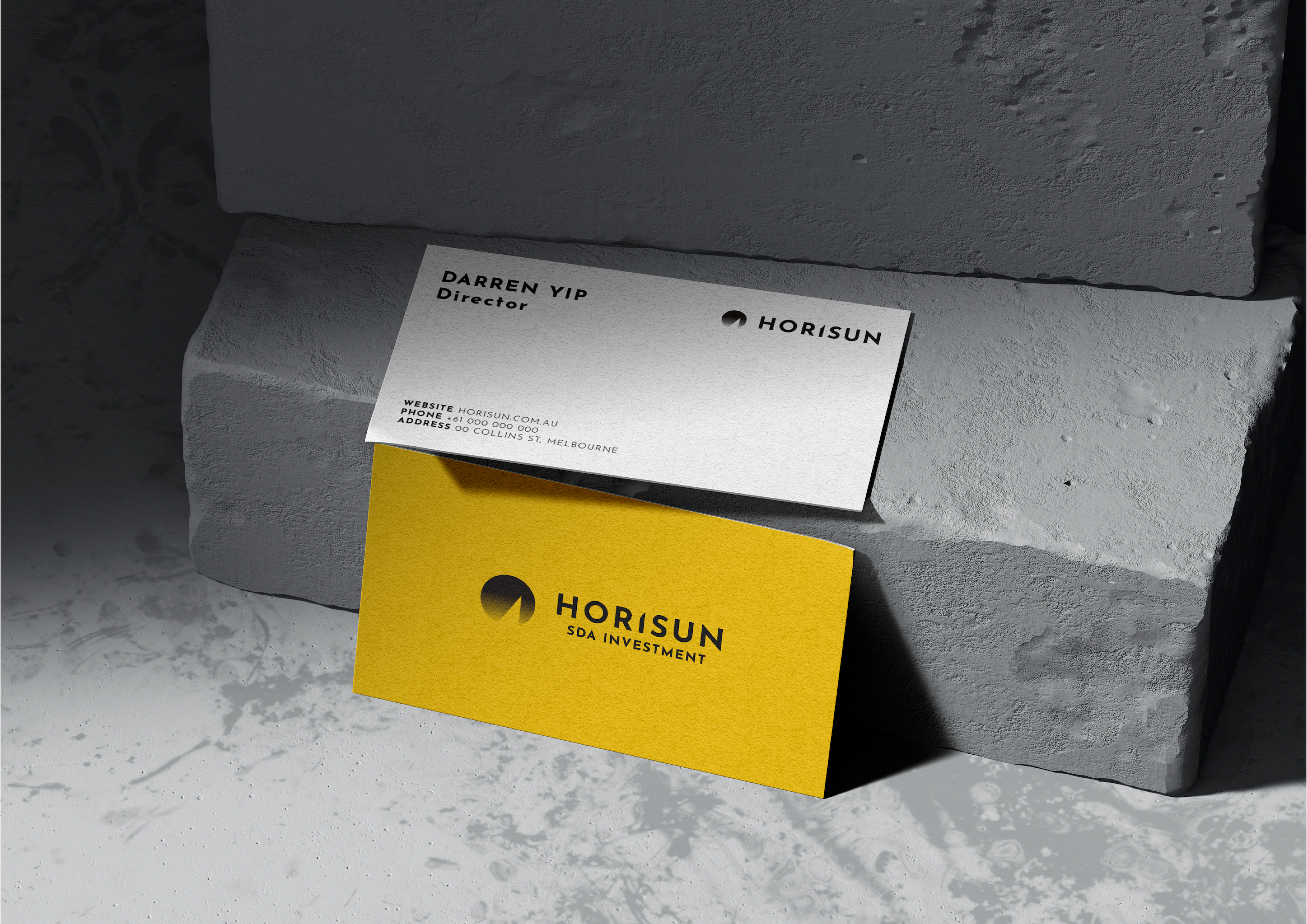
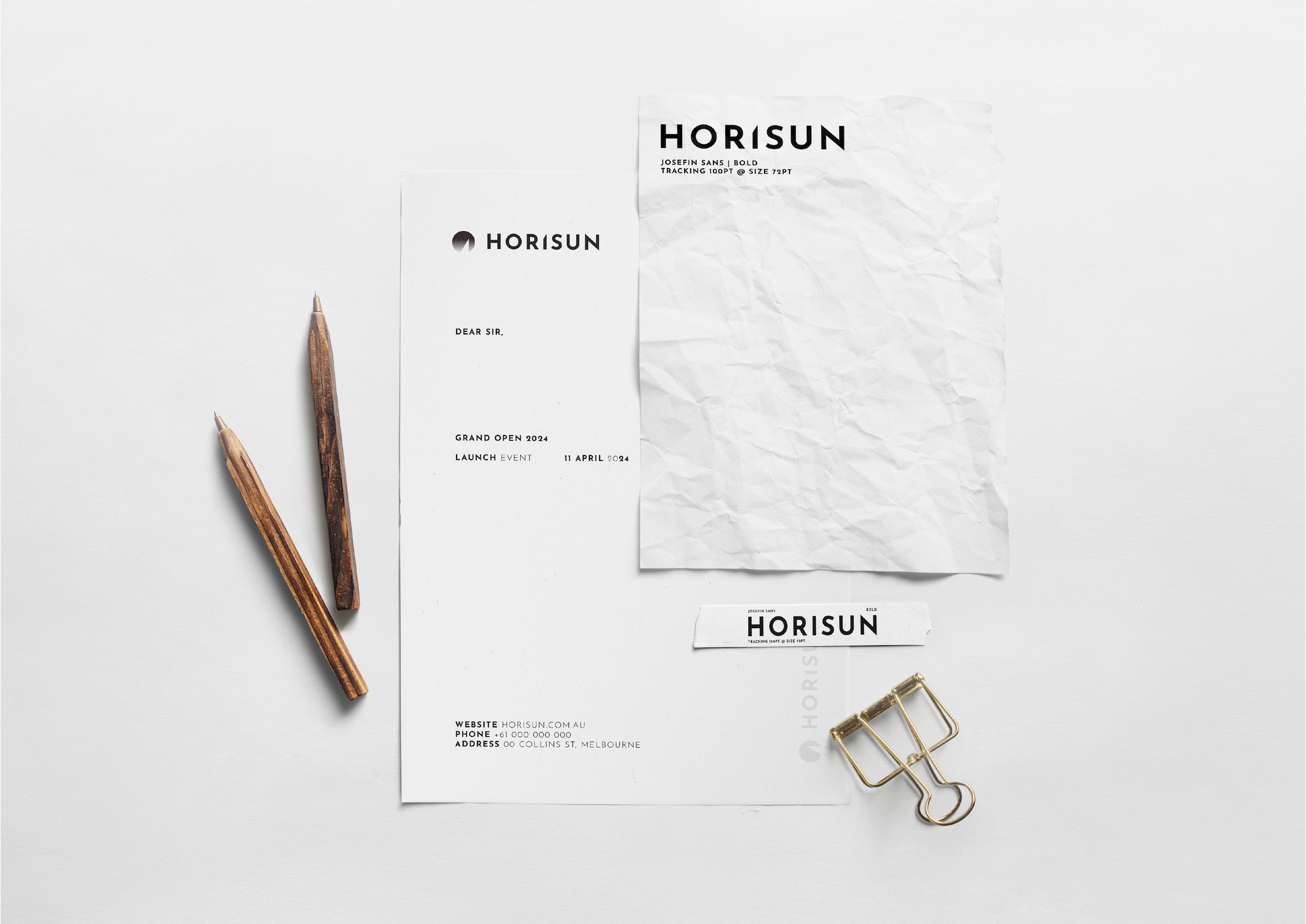
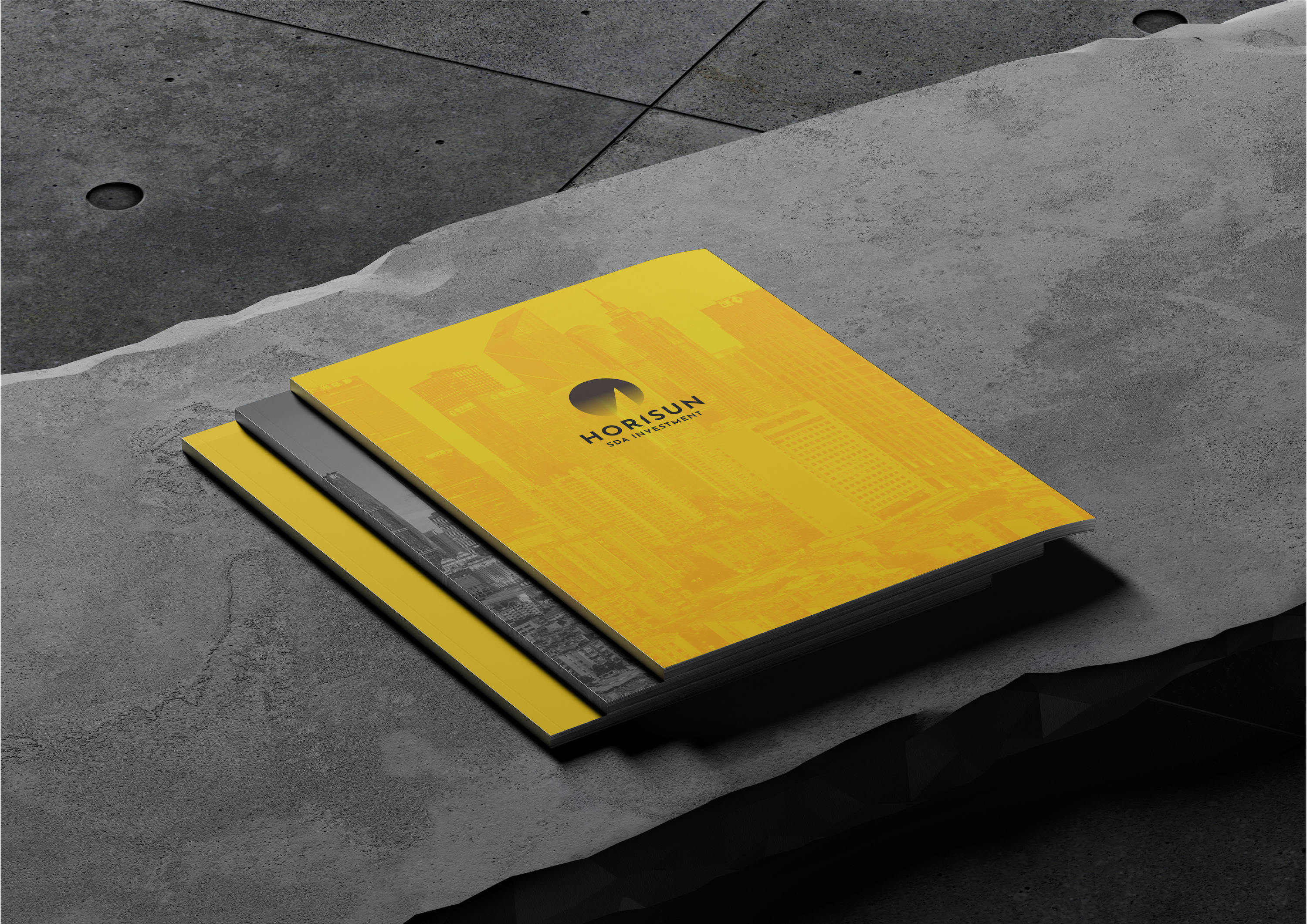
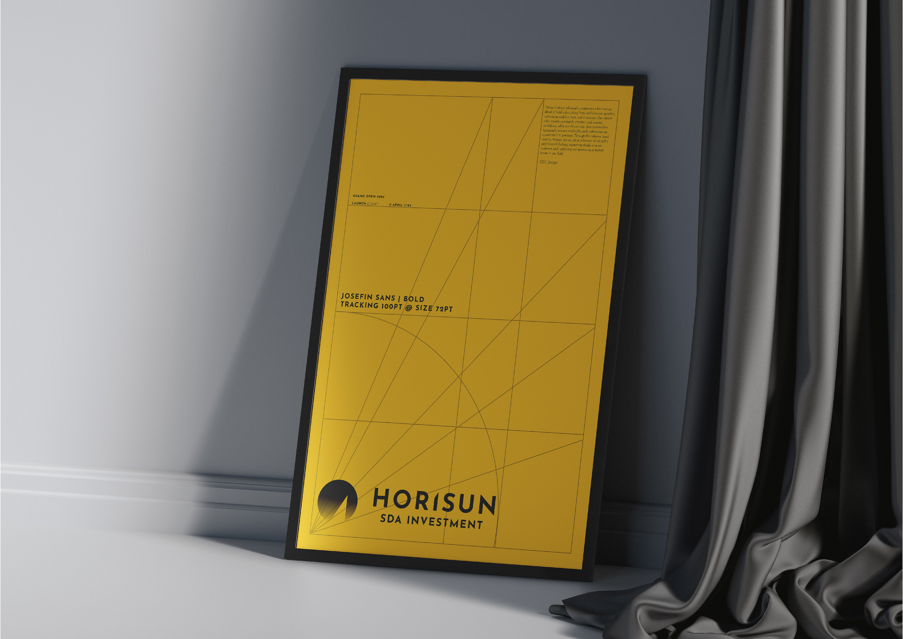
Horisun SDA
Branding Design 2024
Melbourne, Australia
Branding Design 2024
Melbourne, Australia
The brand design for "HORISUN" features a bold, modern logo with a yellow circle symbolizing the sun, and the company name in a sans-serif typeface. The color palette includes black, yellow (#FFC200), and white, with a gradient transition. The design integrates black and white cityscape imagery to convey an urban feel, with the yellow accent highlighting the brand name. The stationery set, including letterheads and business cards, maintains a clean, minimalist aesthetic, emphasizing professionalism and simplicity.


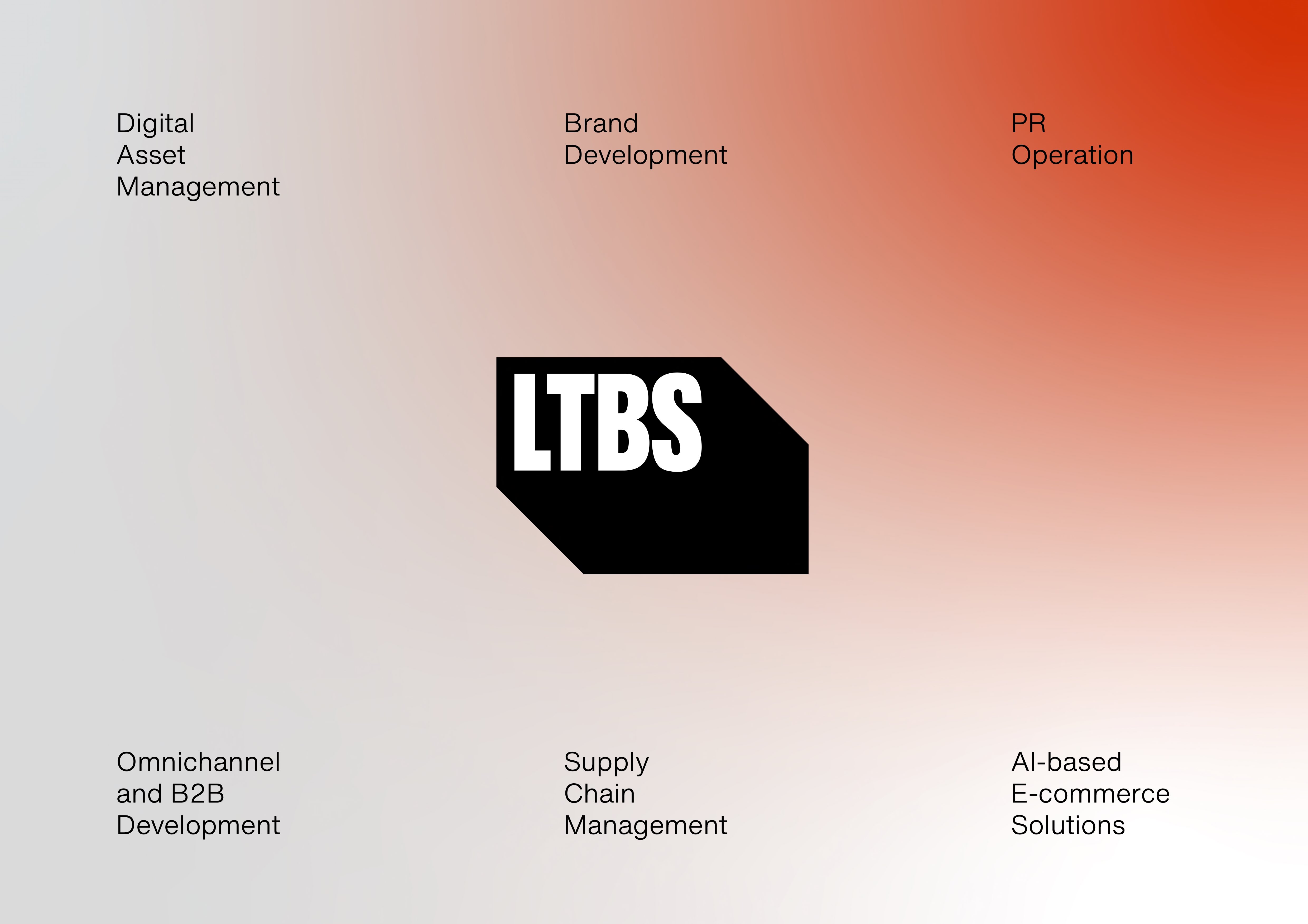
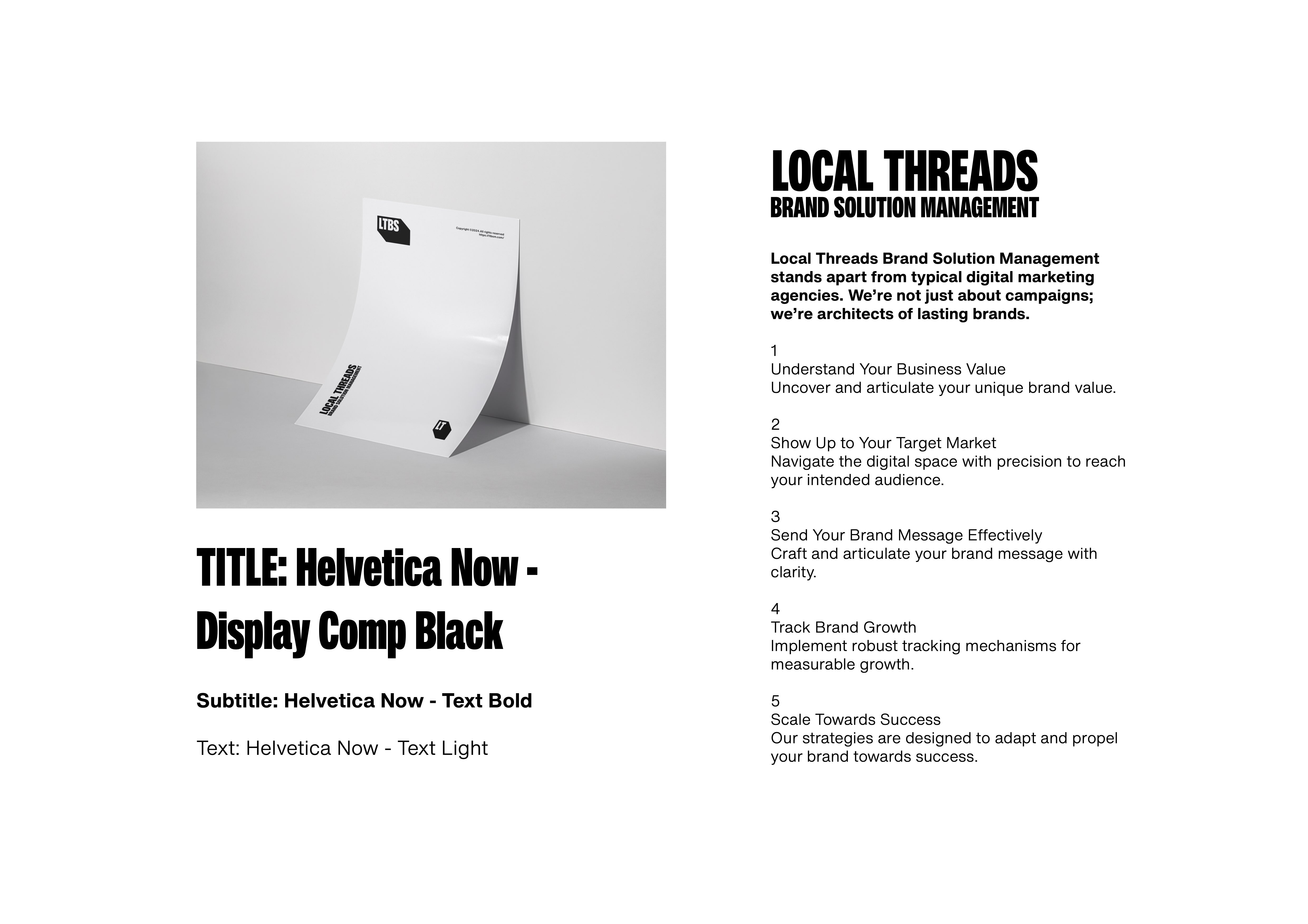
LTBS Marketing
Branding Design 2024
Melbourne, Australia
Branding Design 2024
Melbourne, Australia