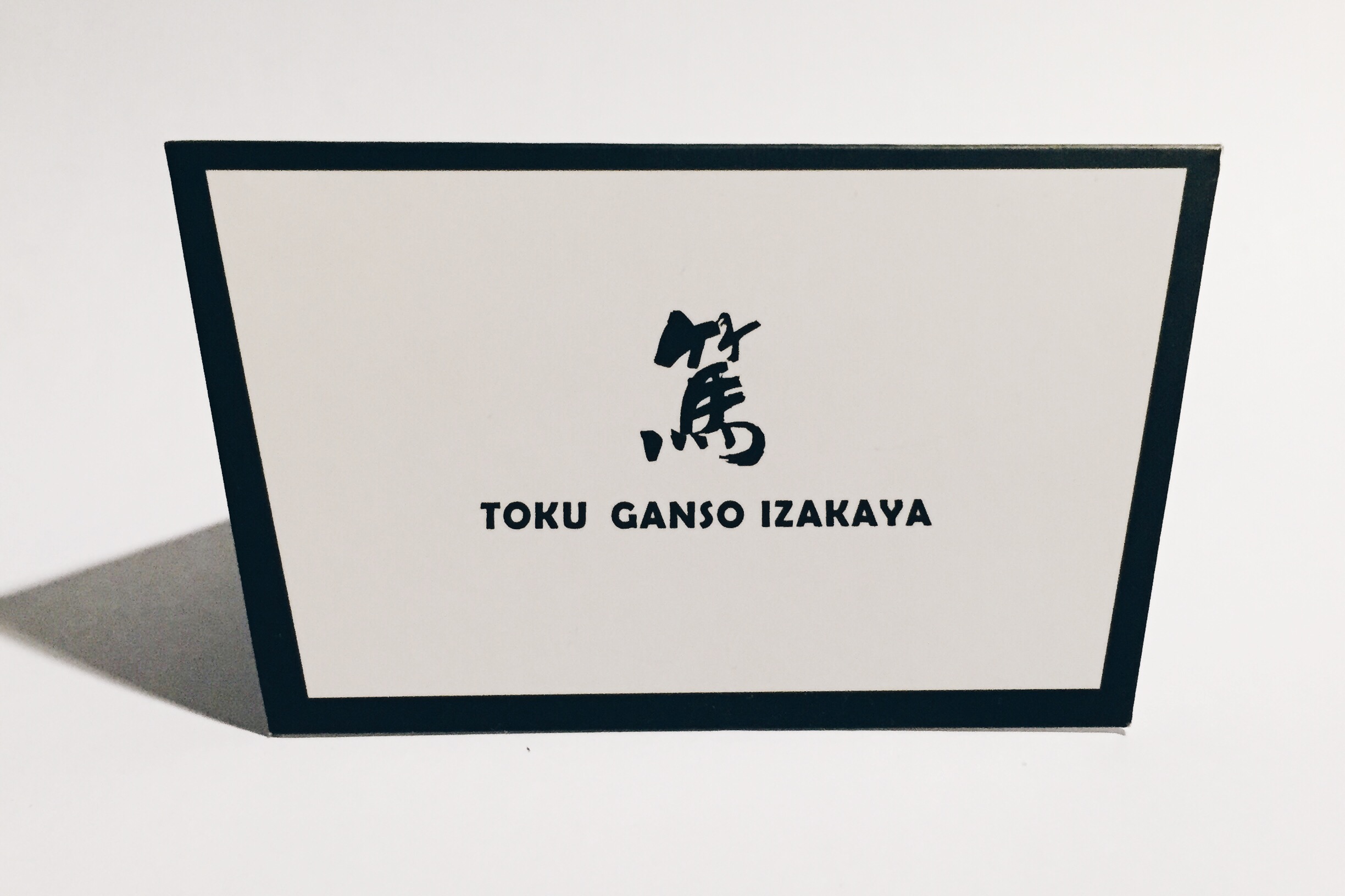
Toku Ganso Izakaya | 篤 · 元祖居酒屋
Branding Design 2015 | 品牌形象設計 2015
Tin Ho, Canton | 廣州,天河
Tin Ho, Canton | 廣州,天河
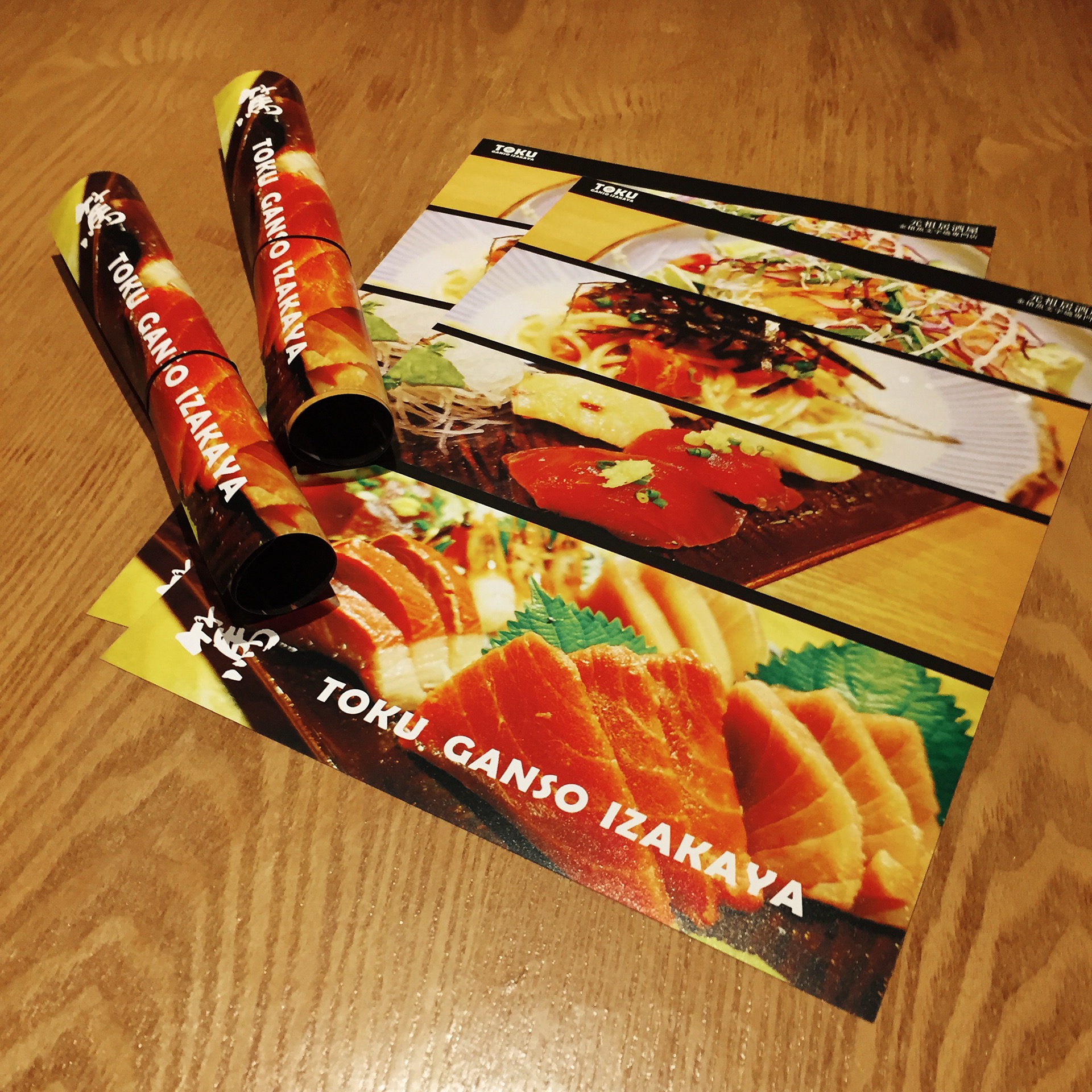
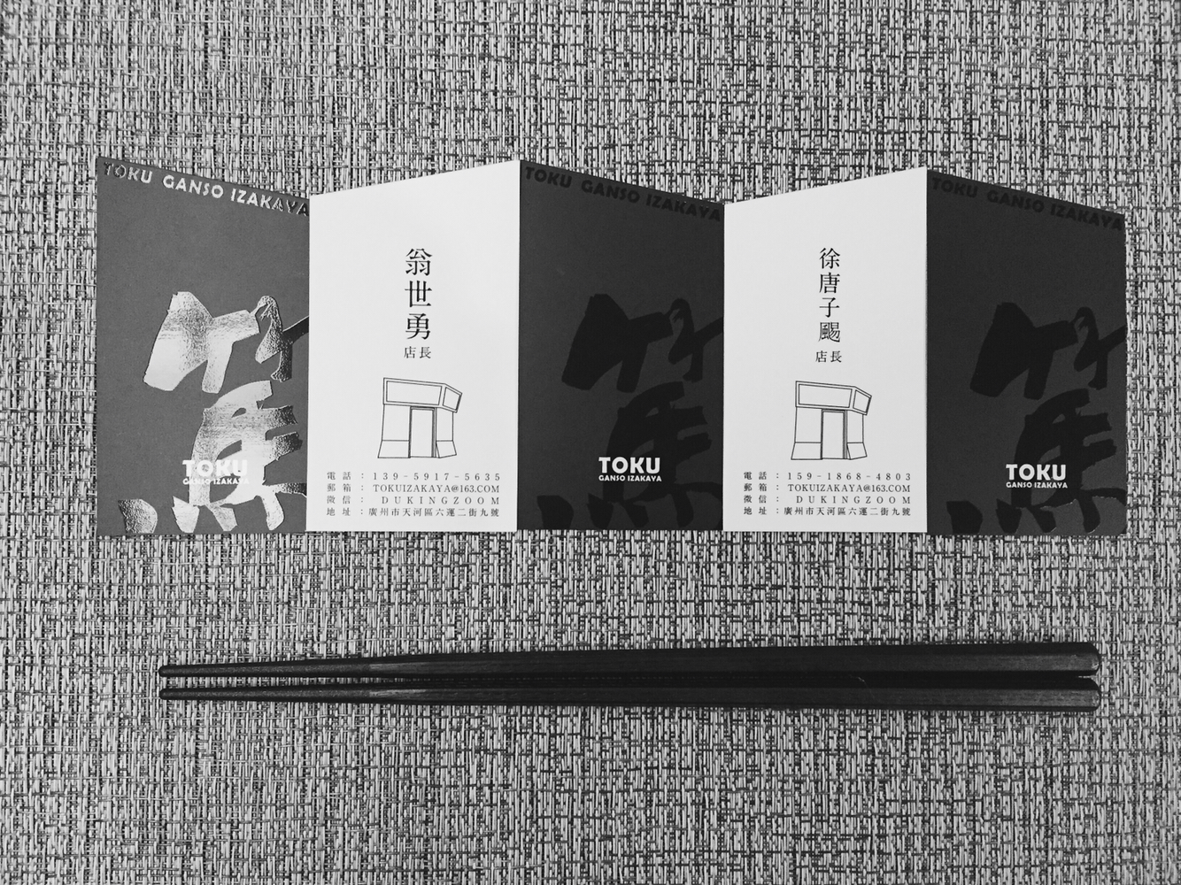
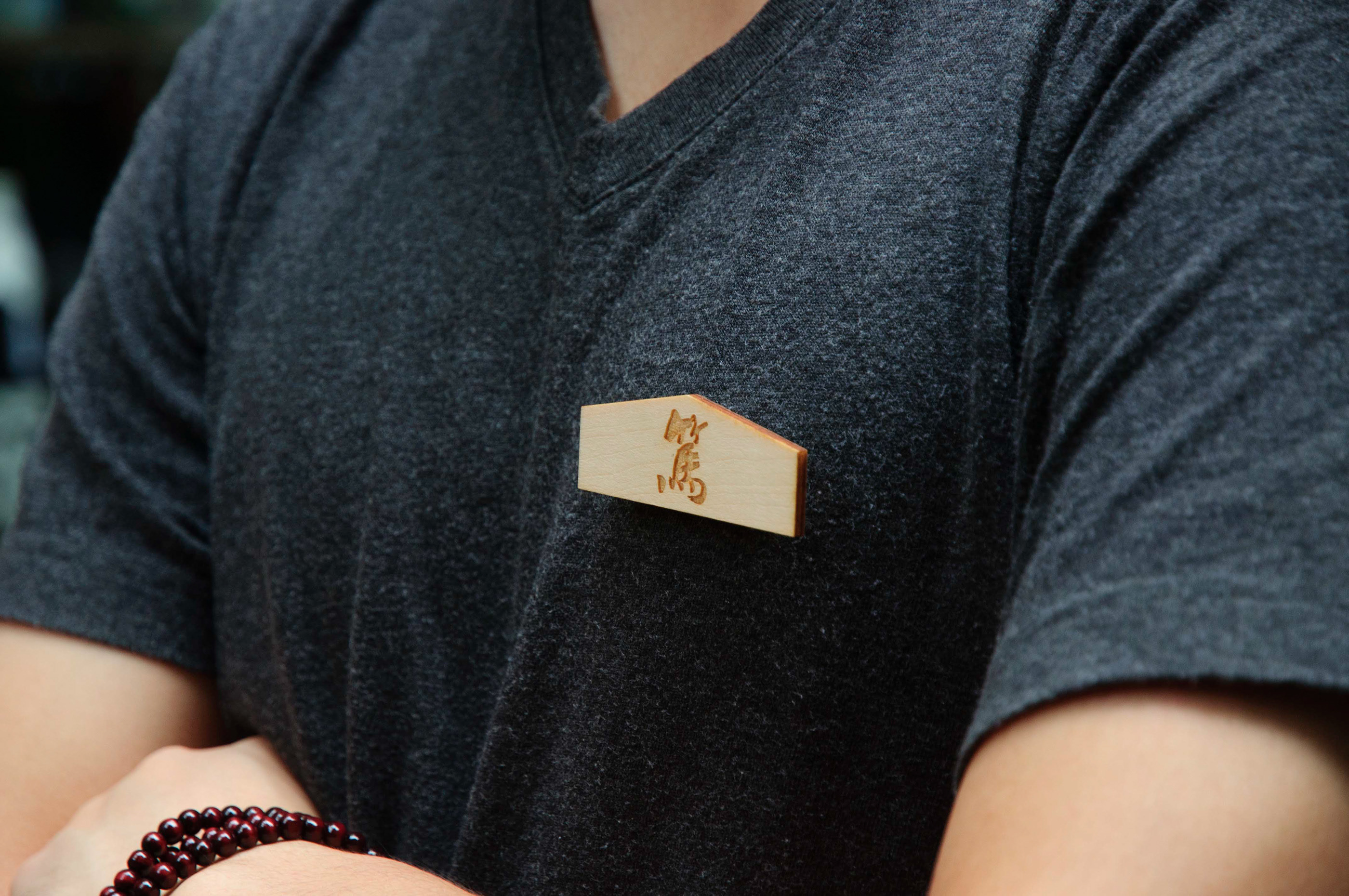
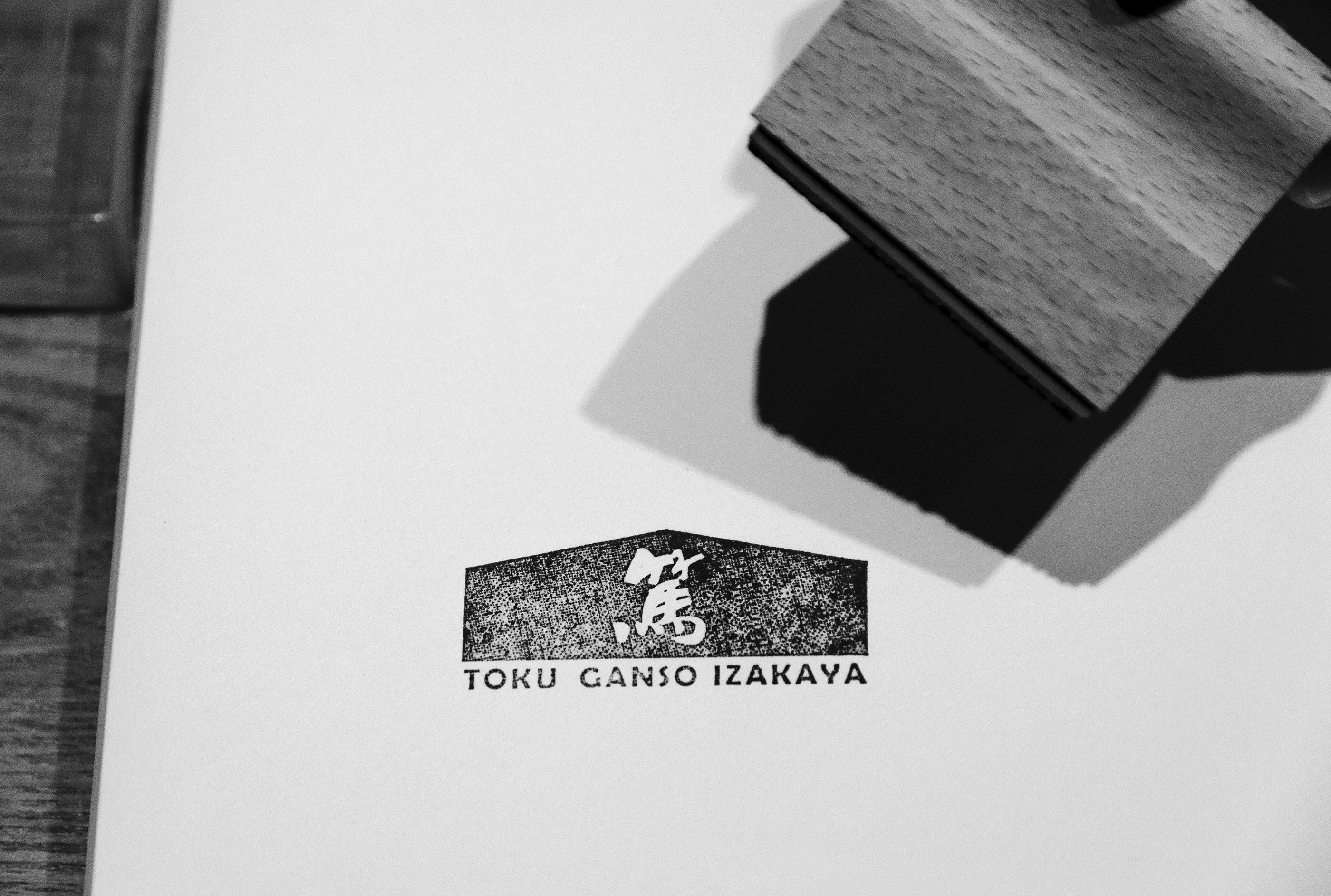
篤 · 元祖居酒屋 是一間以還原元祖日本料理為基礎而建立的居酒屋,篤行正是居酒屋的意志。篤的意思是一直做到底,其偏執的料理風格可以說是不謀而合。以幹練的書法字作為主標識,搭配上棱角分明的周邊視覺,元祖風的物料如:木,麻,布,暖燈光等,帶出一種乾淨利落,一如既往的精神。
The Toku Ganso Izakaya branding design project, created in 2015, is a visually stunning display of graphic design expertise. This authentic Japanese Izakaya's identity is built upon the foundation of traditional culinary craftsmanship, reflected in its striking logo and sharp visuals. The meticulous use of calligraphy, clean lines, and natural materials like wood, hemp, and fabric, evokes a sense of warmth and precision. With this cohesive visual identity, the design effectively captures the essence of the establishment's unwavering commitment to quality and tradition in every detail.
從2015開始,以此品牌,發展成有十餘間分店/加盟店/合作店的成功企業。