YINGFA Queen Bee Royal Jelly Essence | 英發 蜂王乳精
Brand Redesign & Packaging Design 2021 | 品牌形象重塑 與 2021
Kaohsiung, Taiwan | 台灣,高雄
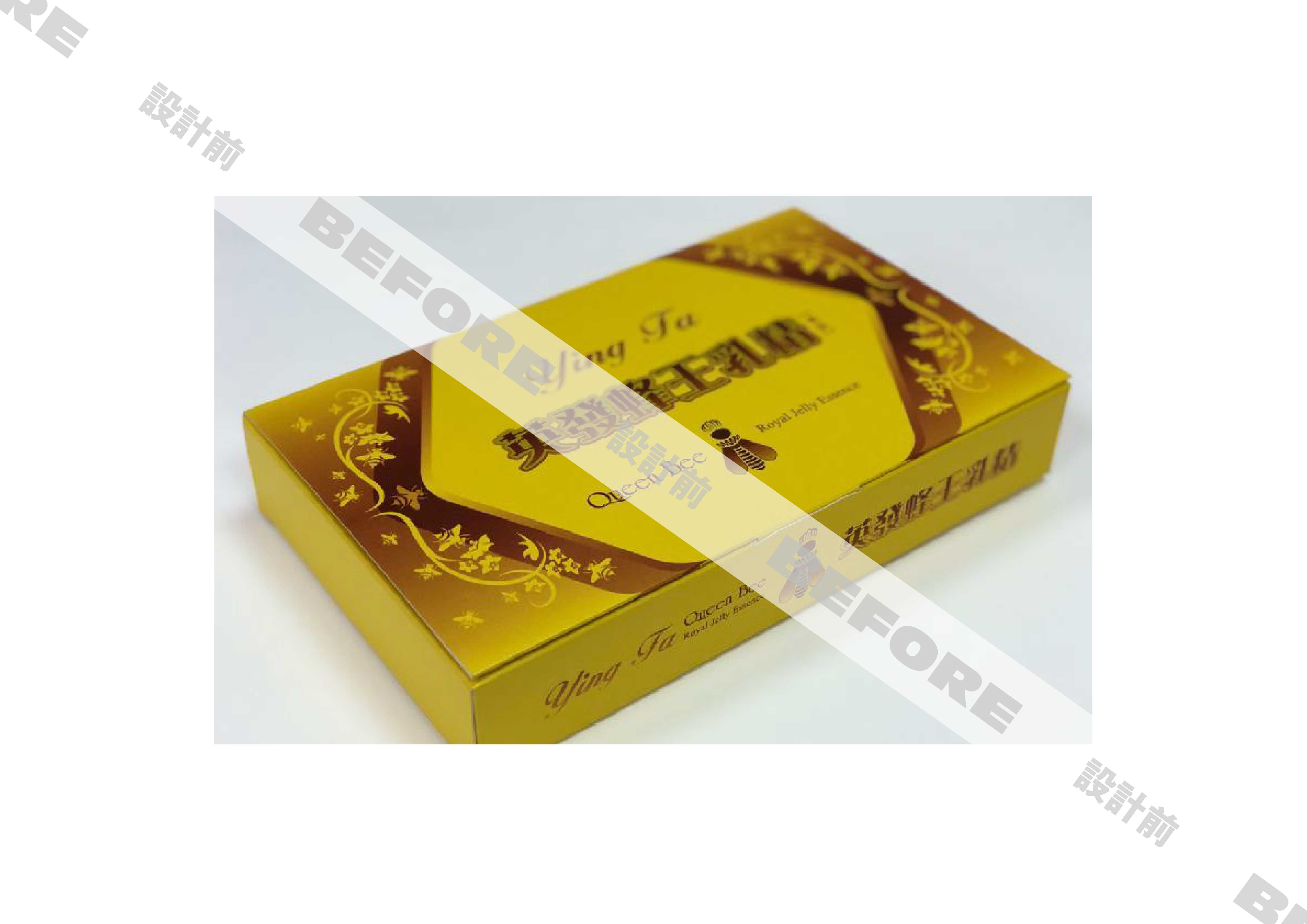
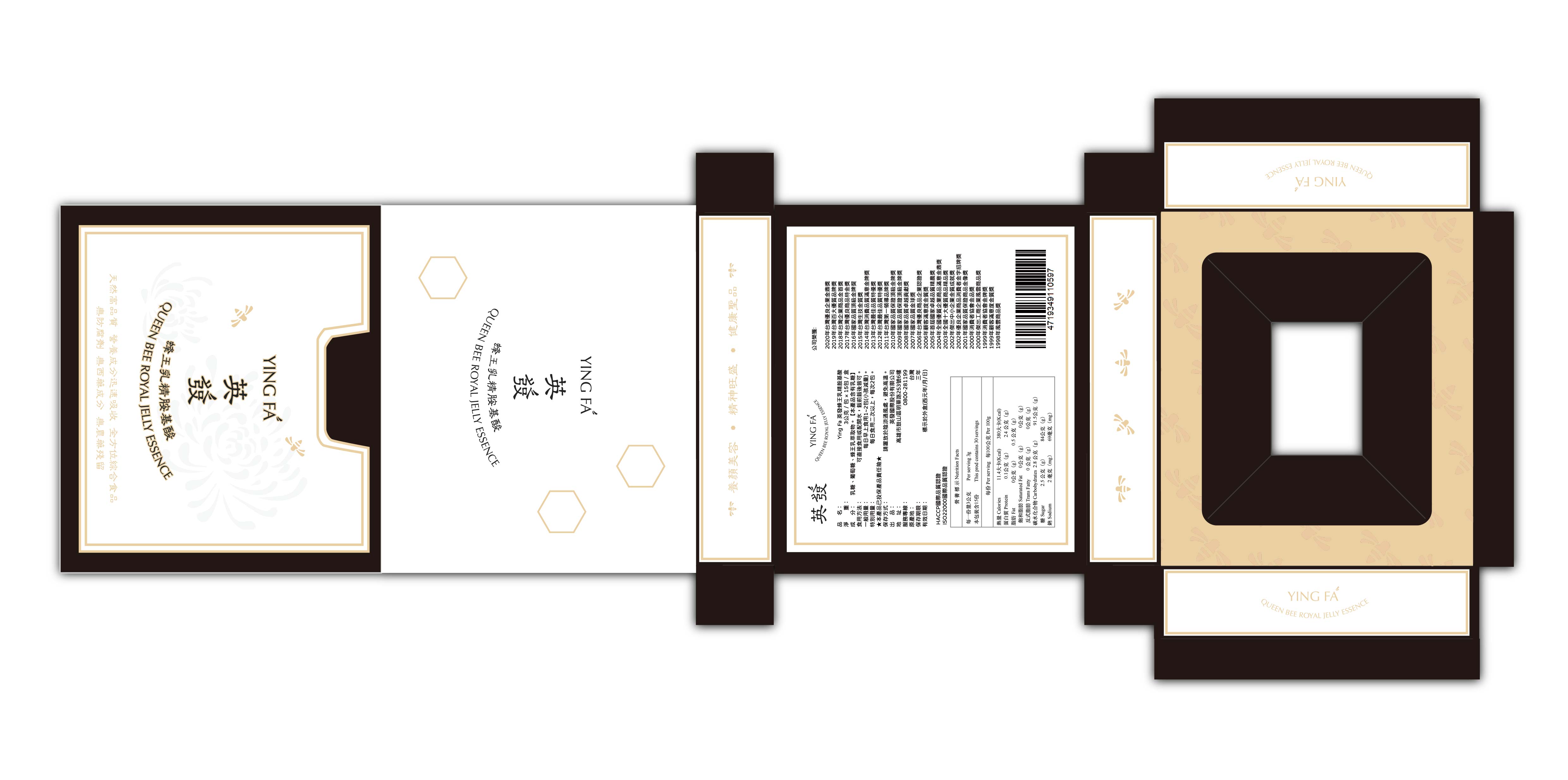
這次的包裝,為了拋棄其「藥品感」,以「Luxury Organic Product」(稍奢華的有機產品),傳統但不古板,作為定位來設計。
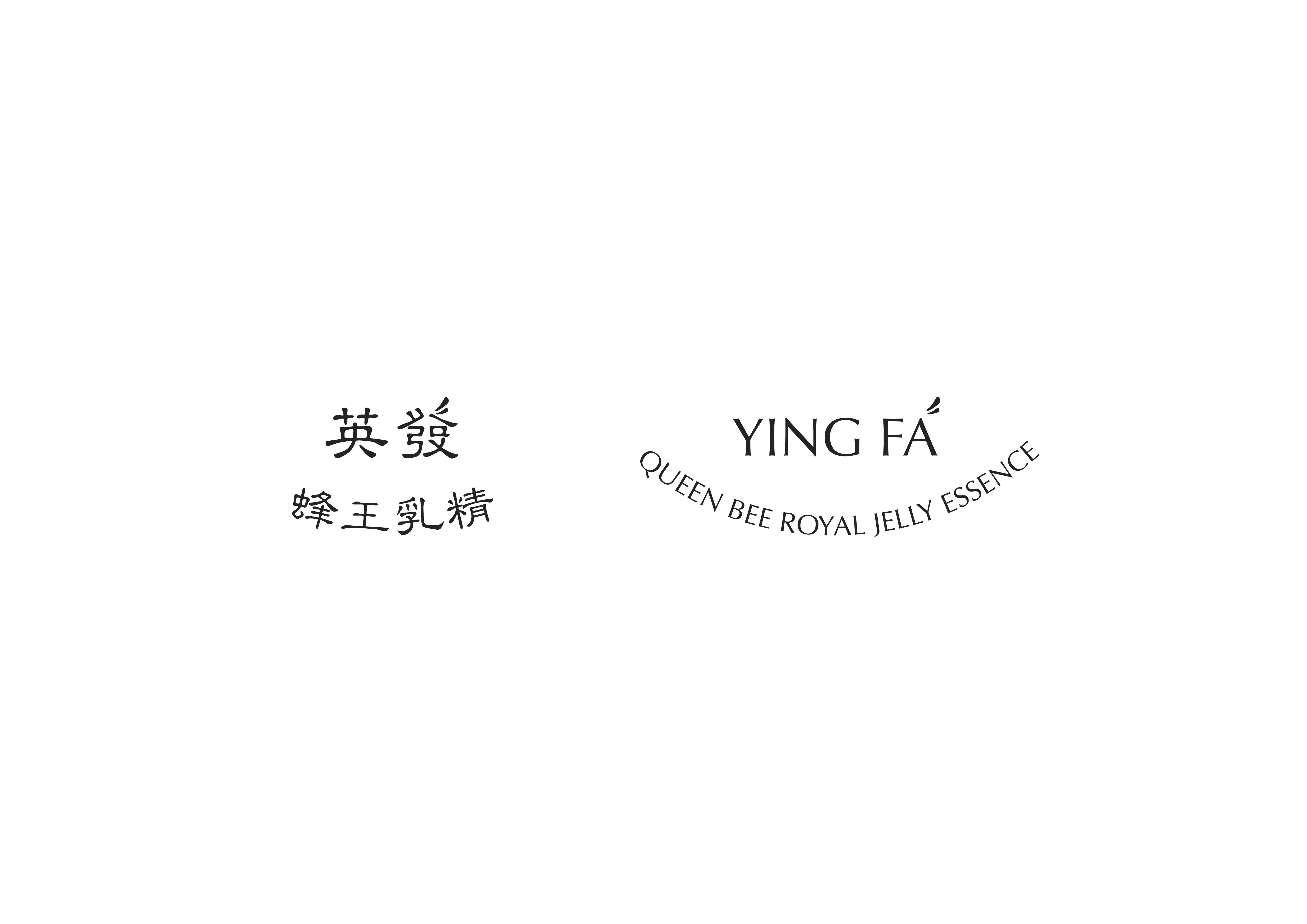
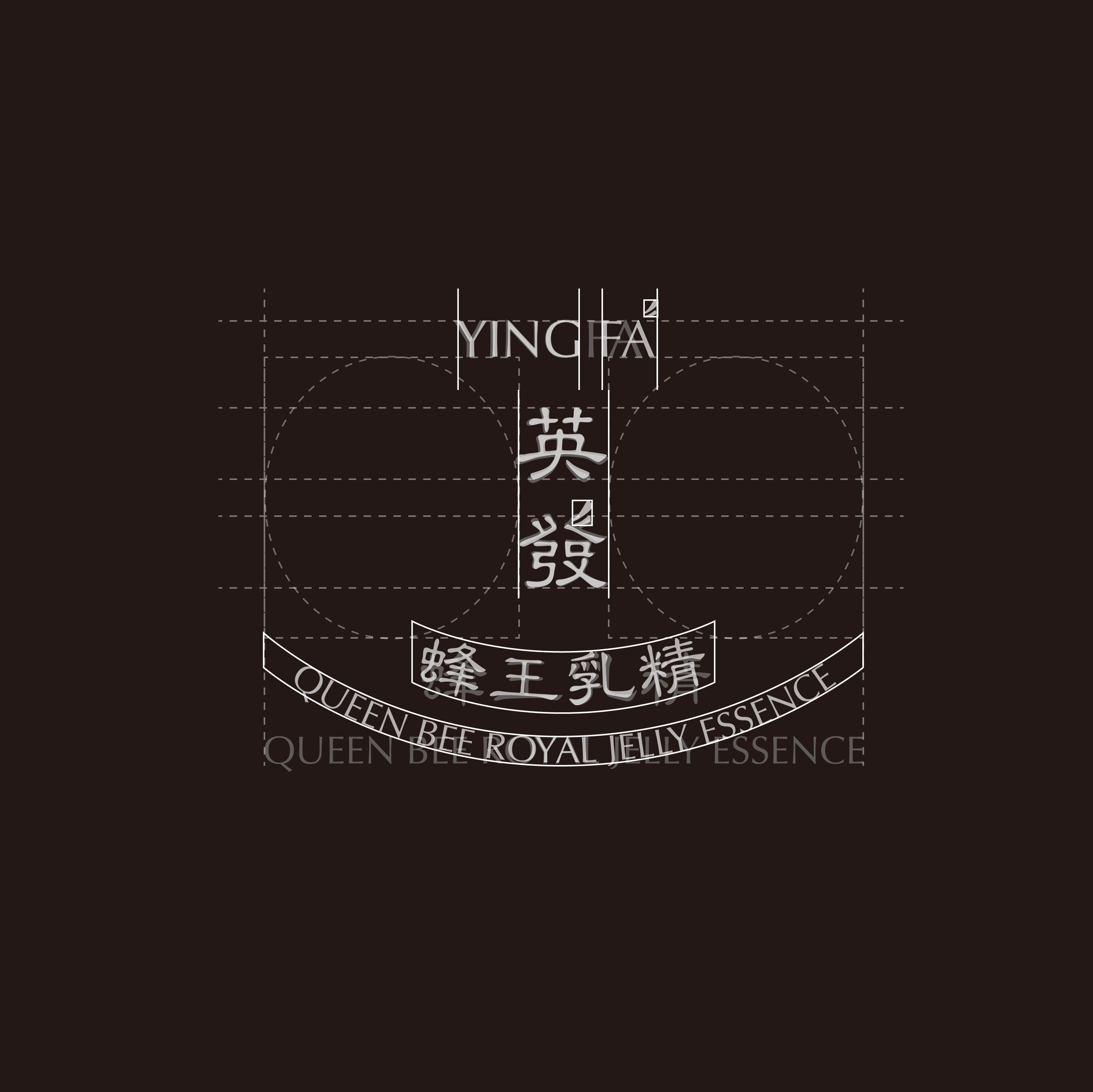
首先是 「英發 蜂王乳精」 的文字 標識。其安排按照中式傳統豎排作 基準,添加英文標識,加上細微調教的弧度以及絕對的對稱安排。
在中英的標識下均作修改「翅膀狀」, 其意義不僅使文字更為生動,亦帶有蜜蜂翅膀之含義。此舉更令日後 「英發」 及 「YING FA」可以單獨 作為品牌標識之用途。
The YINGFA Queen Bee Royal Jelly Essence project showcases a stunning brand redesign and innovative packaging design in 2021. Based in Kaohsiung, Taiwan, this graphic design masterpiece breathes new life into the product by discarding its pharmaceutical image and embracing a luxurious organic positioning. The typography balances traditional Chinese vertical arrangement with English branding, exhibiting subtle curvature and perfect symmetry. The redesigned logos feature wing-like shapes, adding dynamism and reflecting the essence of a bee's wings. This allows both "YINGFA" and "英發" to be used as standalone brand identifiers, exemplifying the power of creative graphic design.
Brand Redesign & Packaging Design 2021 | 品牌形象重塑 與 2021
Kaohsiung, Taiwan | 台灣,高雄
這次的包裝,為了拋棄其「藥品感」,以「Luxury Organic Product」(稍奢華的有機產品),傳統但不古板,作為定位來設計。
首先是 「英發 蜂王乳精」 的文字 標識。其安排按照中式傳統豎排作 基準,添加英文標識,加上細微調教的弧度以及絕對的對稱安排。
在中英的標識下均作修改「翅膀狀」, 其意義不僅使文字更為生動,亦帶有蜜蜂翅膀之含義。此舉更令日後 「英發」 及 「YING FA」可以單獨 作為品牌標識之用途。
The YINGFA Queen Bee Royal Jelly Essence project showcases a stunning brand redesign and innovative packaging design in 2021. Based in Kaohsiung, Taiwan, this graphic design masterpiece breathes new life into the product by discarding its pharmaceutical image and embracing a luxurious organic positioning. The typography balances traditional Chinese vertical arrangement with English branding, exhibiting subtle curvature and perfect symmetry. The redesigned logos feature wing-like shapes, adding dynamism and reflecting the essence of a bee's wings. This allows both "YINGFA" and "英發" to be used as standalone brand identifiers, exemplifying the power of creative graphic design.