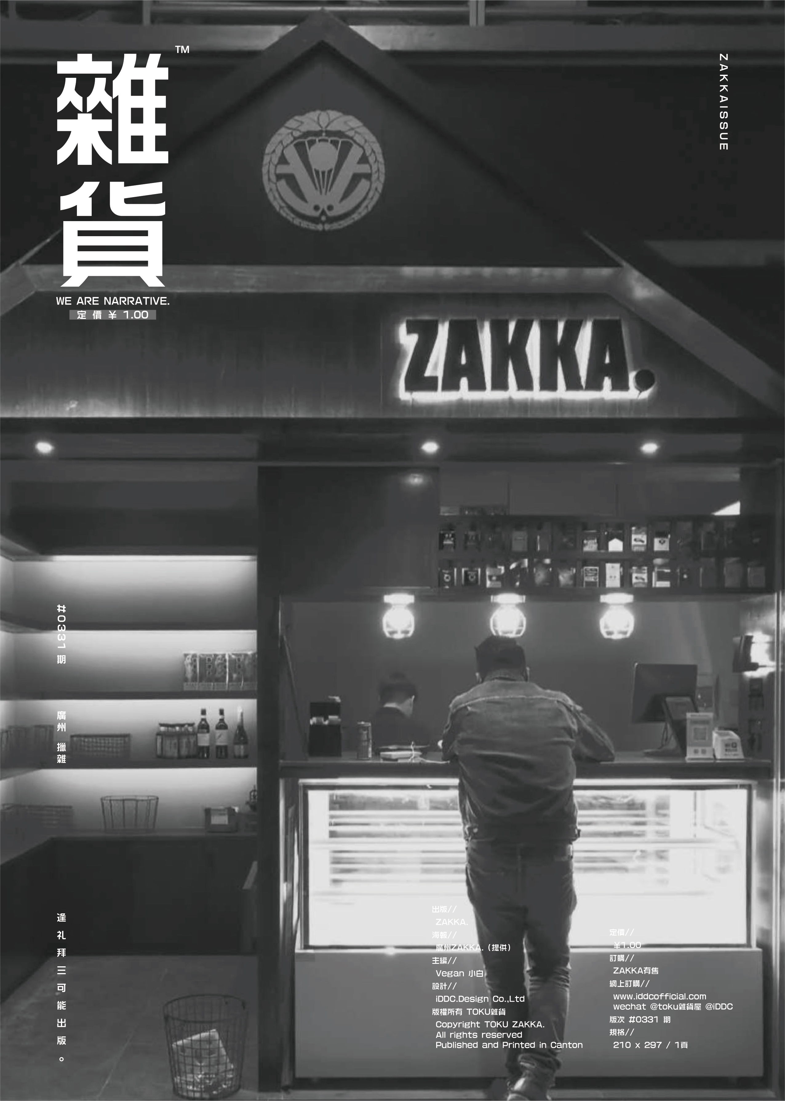
ZAKKA. | 雜貨.
Branding Design 2020 | 品牌形象設計 2020
Tin Ho, Canton | 廣州,天河
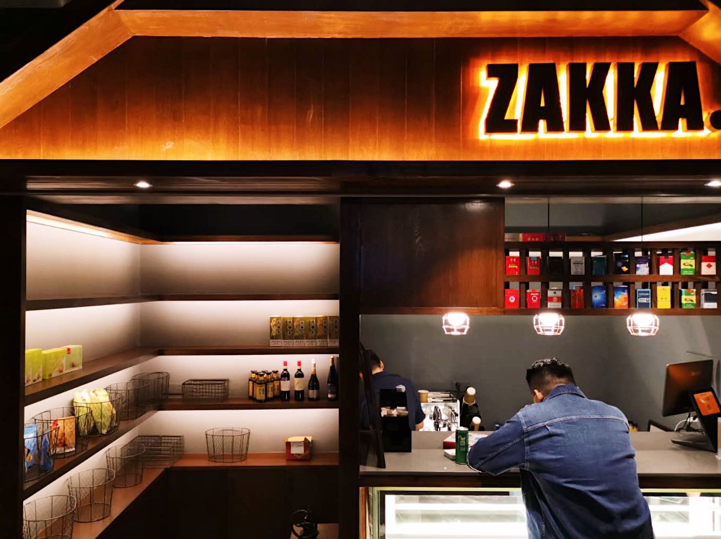
ZAKKA, a Japanese-inspired variety store, reimagines the traditional Chinese store into a contemporary and chic retail space. This graphic design project focuses on developing a versatile, minimalist brand identity encompassing various product categories, such as clothing, design items, and home essentials. Through skillful logo design, employing both "ZAKKA" and its abbreviation "ZK", the brand communicates its curated appeal while maintaining a neutral, sophisticated aesthetic. By utilizing a narrow impact font and streamlined design elements, the project successfully elevates ZAKKA into a modern and stylish destination for discerning shoppers.
日本雜貨店,傳統來說,與中式雜貨店/士多,其實無異,是一個充滿市井煙火氣的地方。
將如今混亂的中式煙酒店升級為日式雜貨店,趁這次機會,大可打造一個日式中性為主的品牌。令品牌不侷 限於煙酒,咖啡,三文治,更為未來可以囊括服裝,設計品,甚至家居用品做一個穩固的基礎(無印良品正 是如此起家),成為一間真正意義上的 精選雜貨品牌。
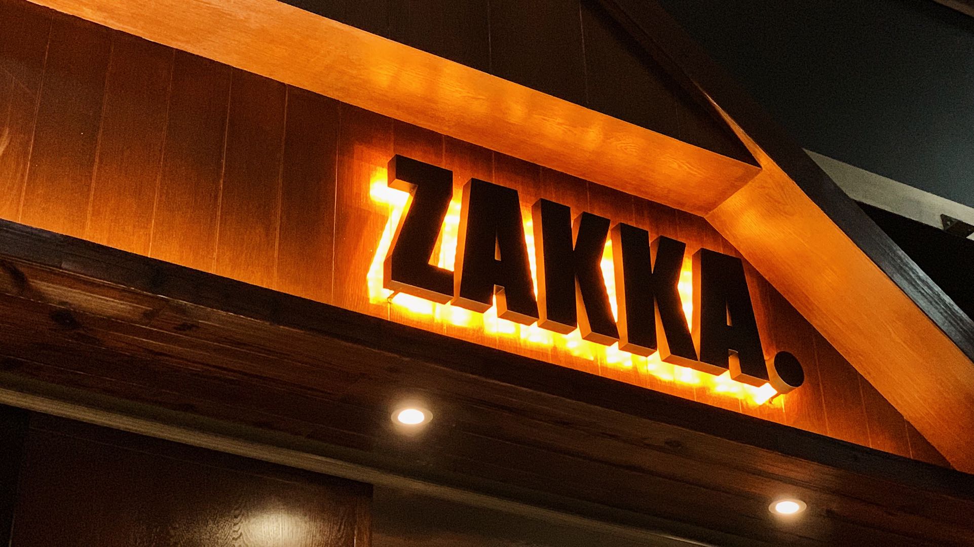
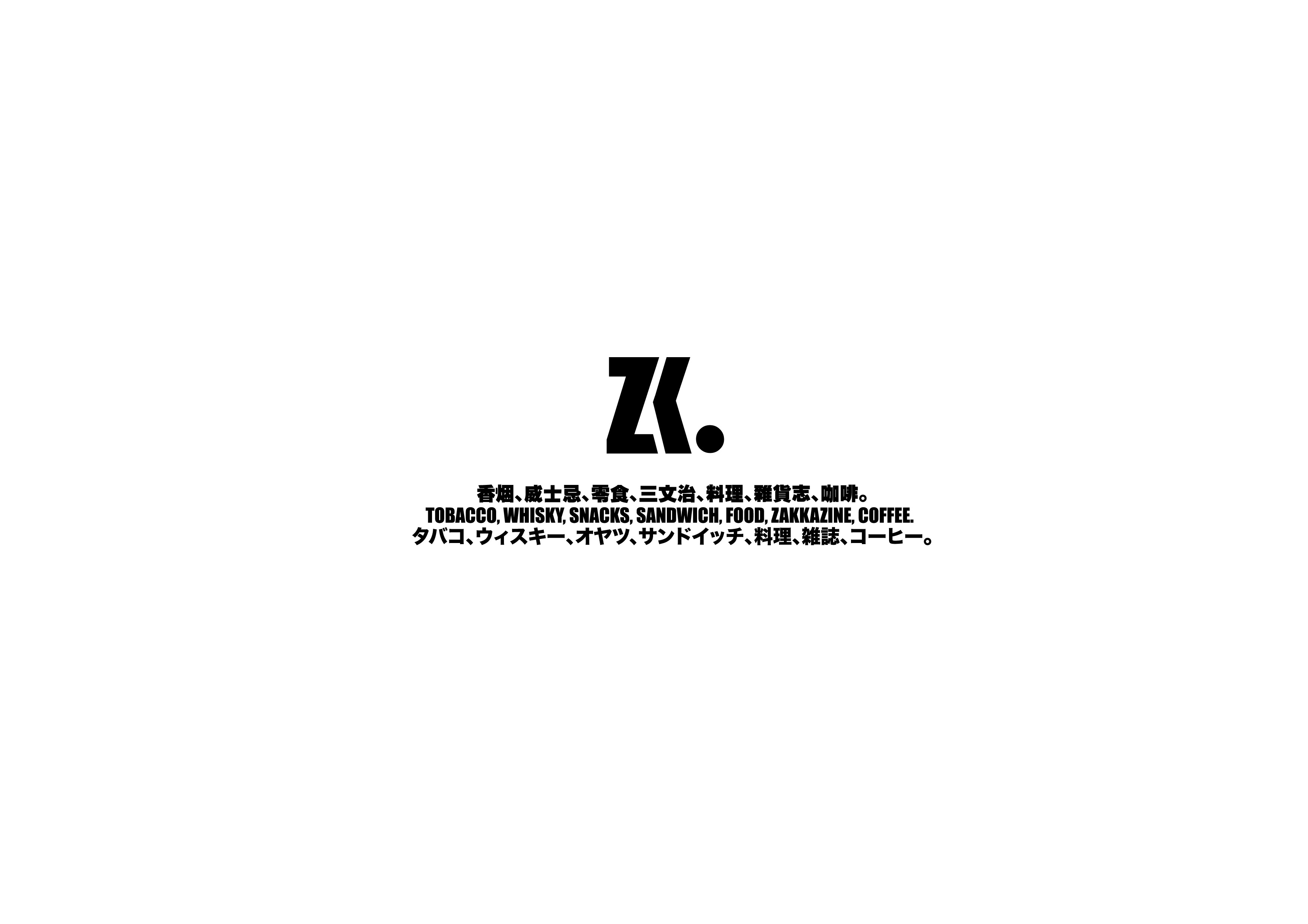
品牌 logo 用了兩種,一是 「ZAKKA.」 與簡寫 「ZK.」。
「ZAKKA.」可以令顧客清晰明白是雜貨店,而又保留顧客想要了解品牌的慾望。字體採用了較中性又窄身 的 impact ,令「ZAKKA.」這個詞顯得不會太長,加上一圓形的一點是為了令品牌更加幹練(令人回想起 寫完一個句子後瀟灑地加上一個句號的動作)。
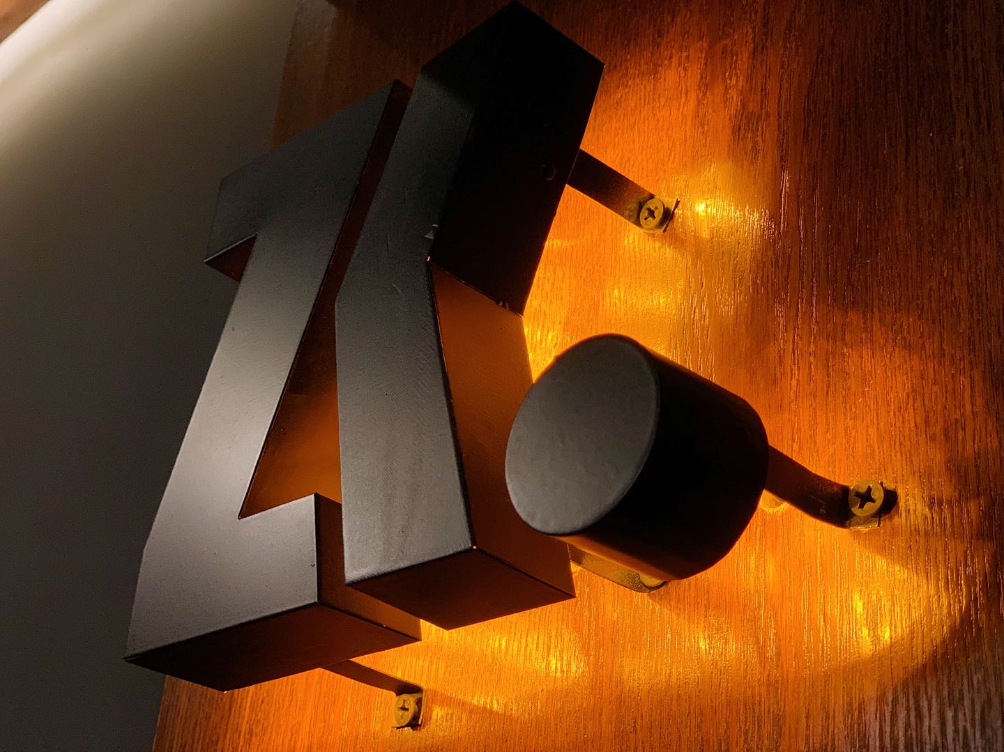
「ZK.」作為縮寫,更大機會可作為圖形化的 logo 出現在大眾眼光。取輔音縮寫 zk ,熟悉的顧客可以讀出 zakka 之餘,細節的調整令整體站得更加穩,不失日式優雅的幹練。