2018 珍香園 北魏真書研究
自 2014 安堂色彩集 在 TED演講 「都市共生」
2016 篤 · 元祖居酒屋 週年 古書排印研究
2018 Jan Heung Yuen BeiWei Zansyu Study
Since 2014 Ngon Tong Colour Collection with TED talk “Urban Symbiosis“
2016 TOKU GANSO IZAKAYA Anniversary Typography of Old Books Study
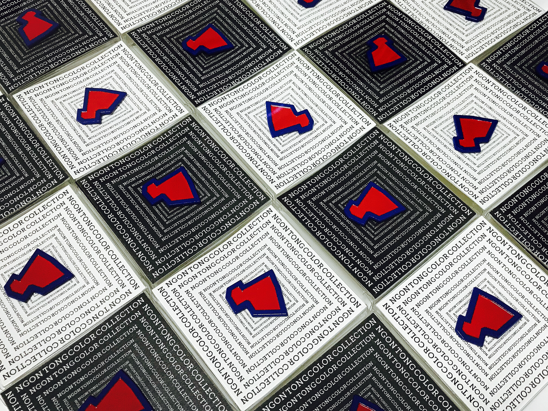
Ngon Tong Colour Collection is an experimental project that giving a ‘visual branding’ to the village called Ngon Tong(安堂).
「安堂色彩集」是一個實驗性的項目,旨於給安堂村製造一個視覺形象。
![]() Fig.1 2014 Google Earth
Fig.1 2014 Google Earth
安堂村無論從哪一個角度看,因為她複雜的人口結構,規劃結構,即使她鄰近於設計規劃良好的大學旁邊,作為大學外附近的唯一的商業區,她存在設計上的改進空間(Fig.1)。
![]()
Branding idea since 2014
![]()
![]()
Branding idea since 2014
![]()
Branding idea since 2014
「安堂色彩集」是一個實驗性的項目,旨於給安堂村製造一個視覺形象。
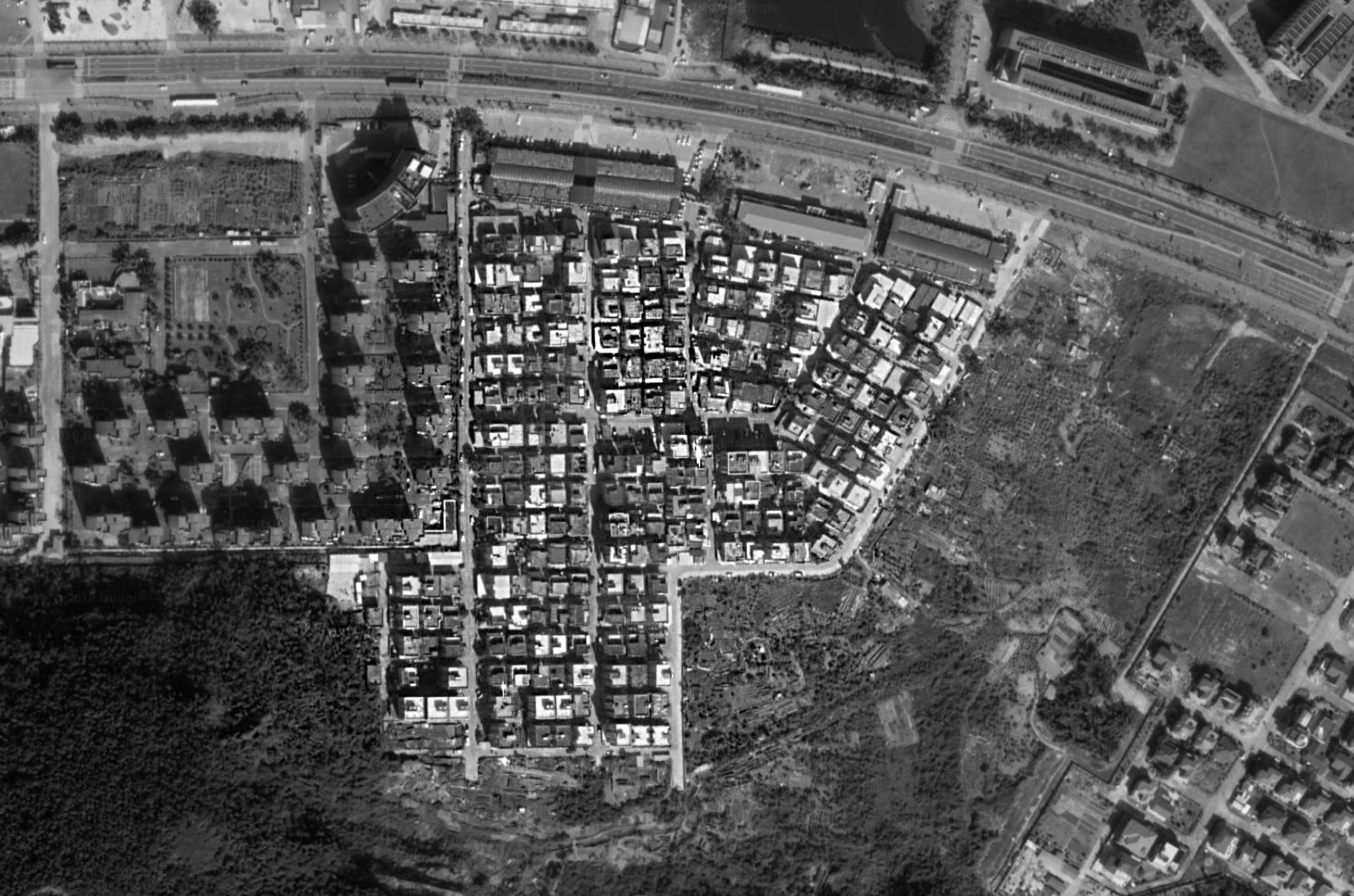 Fig.1 2014 Google Earth
安堂村無論從哪一個角度看,因為她複雜的人口結構,規劃結構,即使她鄰近於設計規劃良好的大學旁邊,作為大學外附近的唯一的商業區,她存在設計上的改進空間(Fig.1)。
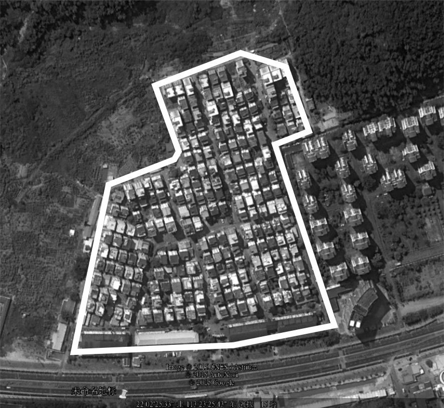
Branding idea since 2014

Branding idea since 2014
Branding idea since 2014
Our 18 people group took more than 300 photos.
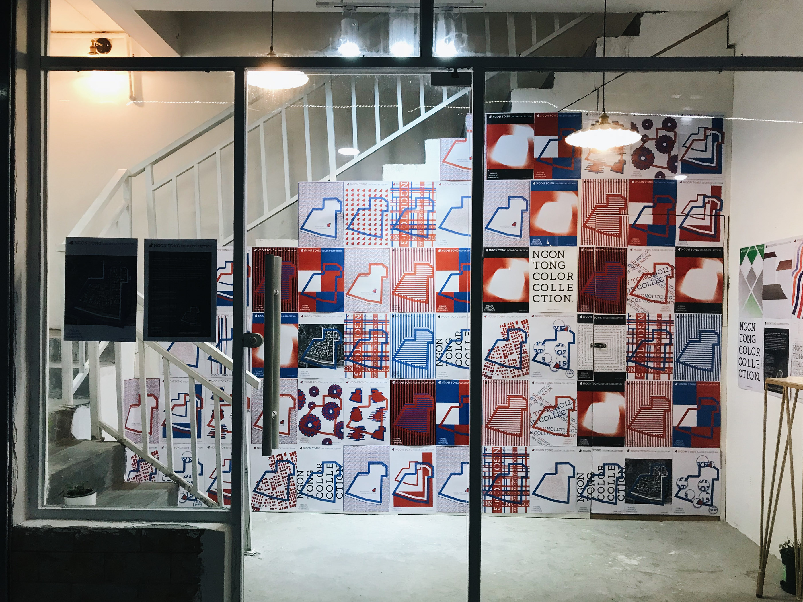
Ngon Tong Colour Collection has lighted up the village, this time we come back with an exhibition. By illustrating our enthusiasm for this village, people could know more about us and this village.
![]()
![]()
![]()
![]()
Ngon Tong, Zhuhai | 珠海,安堂
Updated (15 June 2018 ):
「安堂村色彩集」,自2015年來,凝聚著各界藝術工作者的結晶。我們不斷吸收著各國各地區的設計經驗,回到安堂村。用先進的設計方式,為安堂添上色彩。
Ngon Tong Colour Collection has lighted up the village, this time we come back with an exhibition. By illustrating our enthusiasm for this village, people could know more about us and this village.

Ngon Tong, Zhuhai | 珠海,安堂
Updated (15 June 2018 ):
「安堂村色彩集」,自2015年來,凝聚著各界藝術工作者的結晶。我們不斷吸收著各國各地區的設計經驗,回到安堂村。用先進的設計方式,為安堂添上色彩。
Ngon Tong Color Collection has been a combination of many art workers from various fields since 2015. We have been absorbing the design experience from various countries. The technics will be
applied back on the Ngon Tong village.
![]()
![]()
Invited by TEDx Antong 2015.
2015 受 TEDx talk (xAntong) 邀請演講。
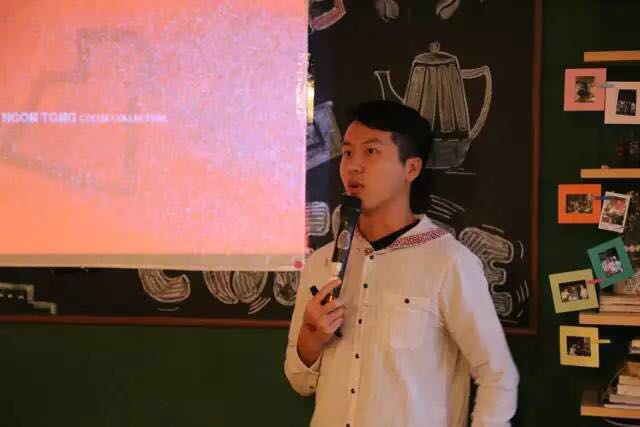
Invited by TEDx Antong 2015.
2015 受 TEDx talk (xAntong) 邀請演講。
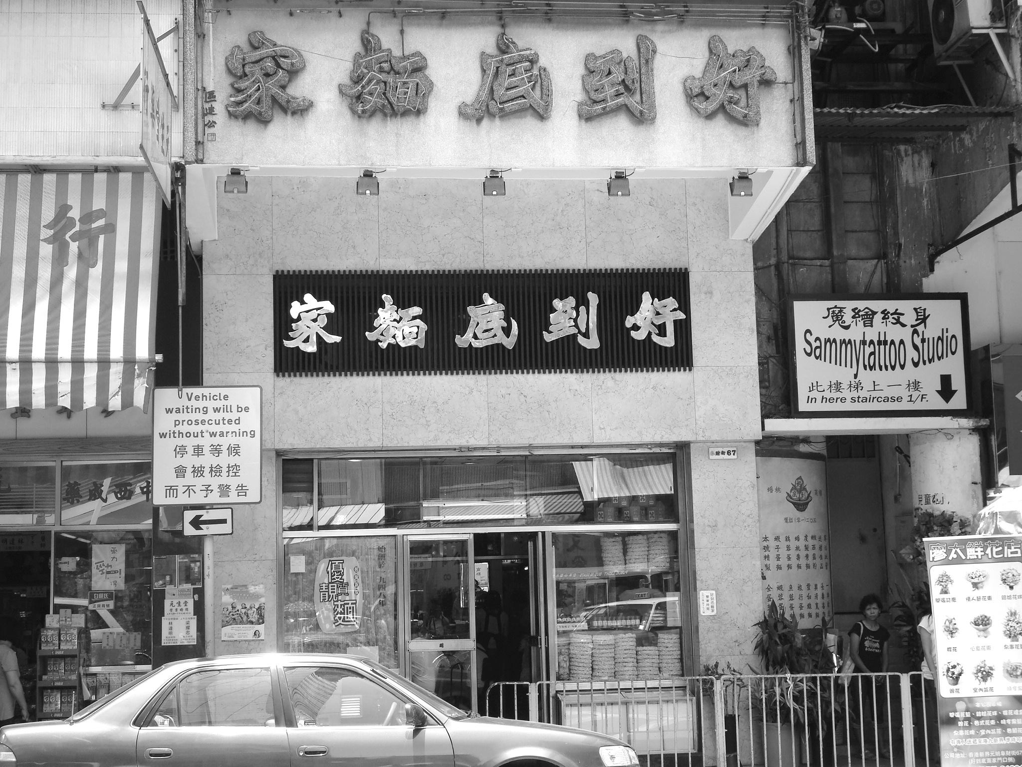
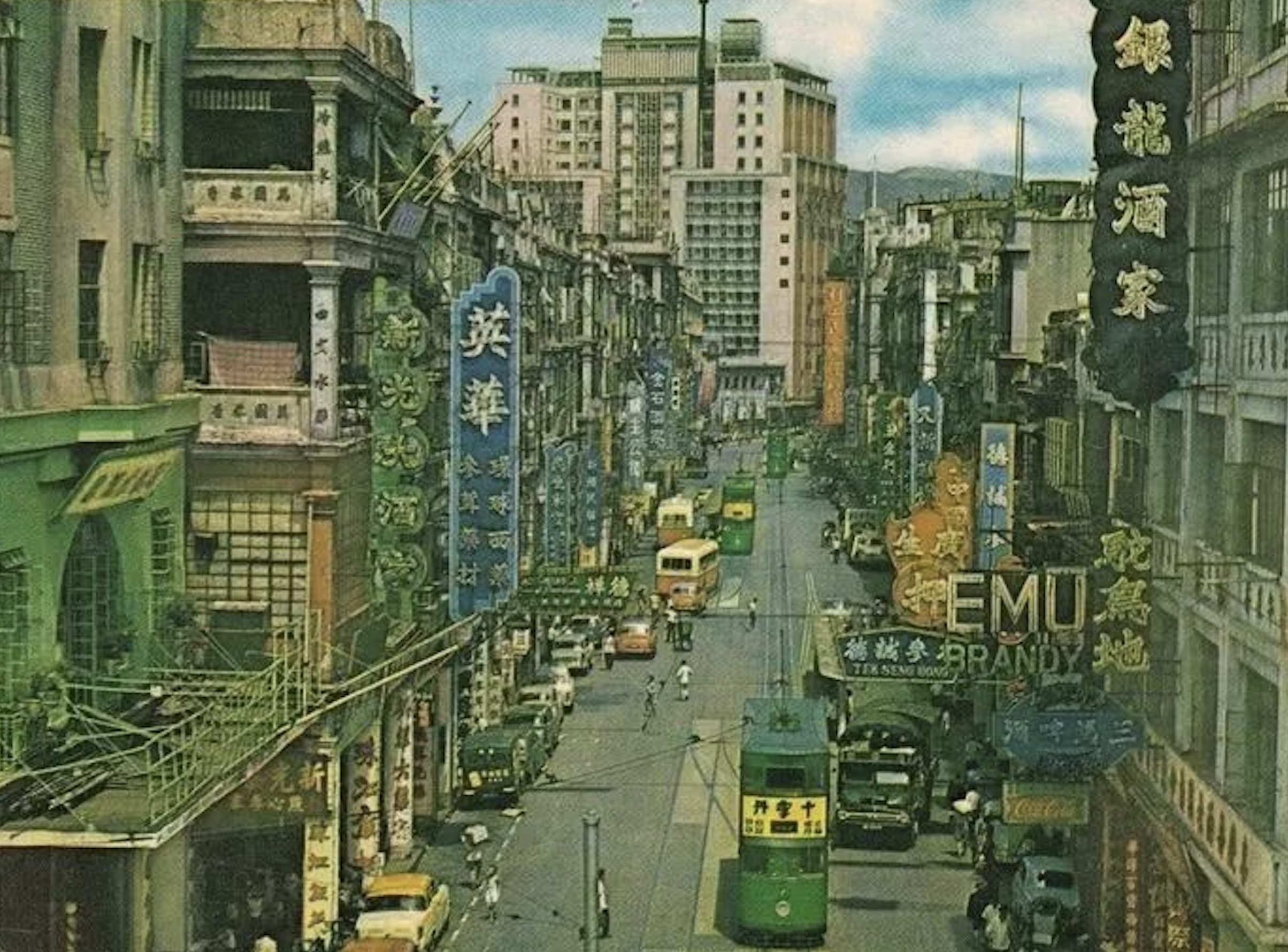 Beiwei Zansyu, shapes the city view of Hong Kong.
北魏真書, 塑造了香港街景。
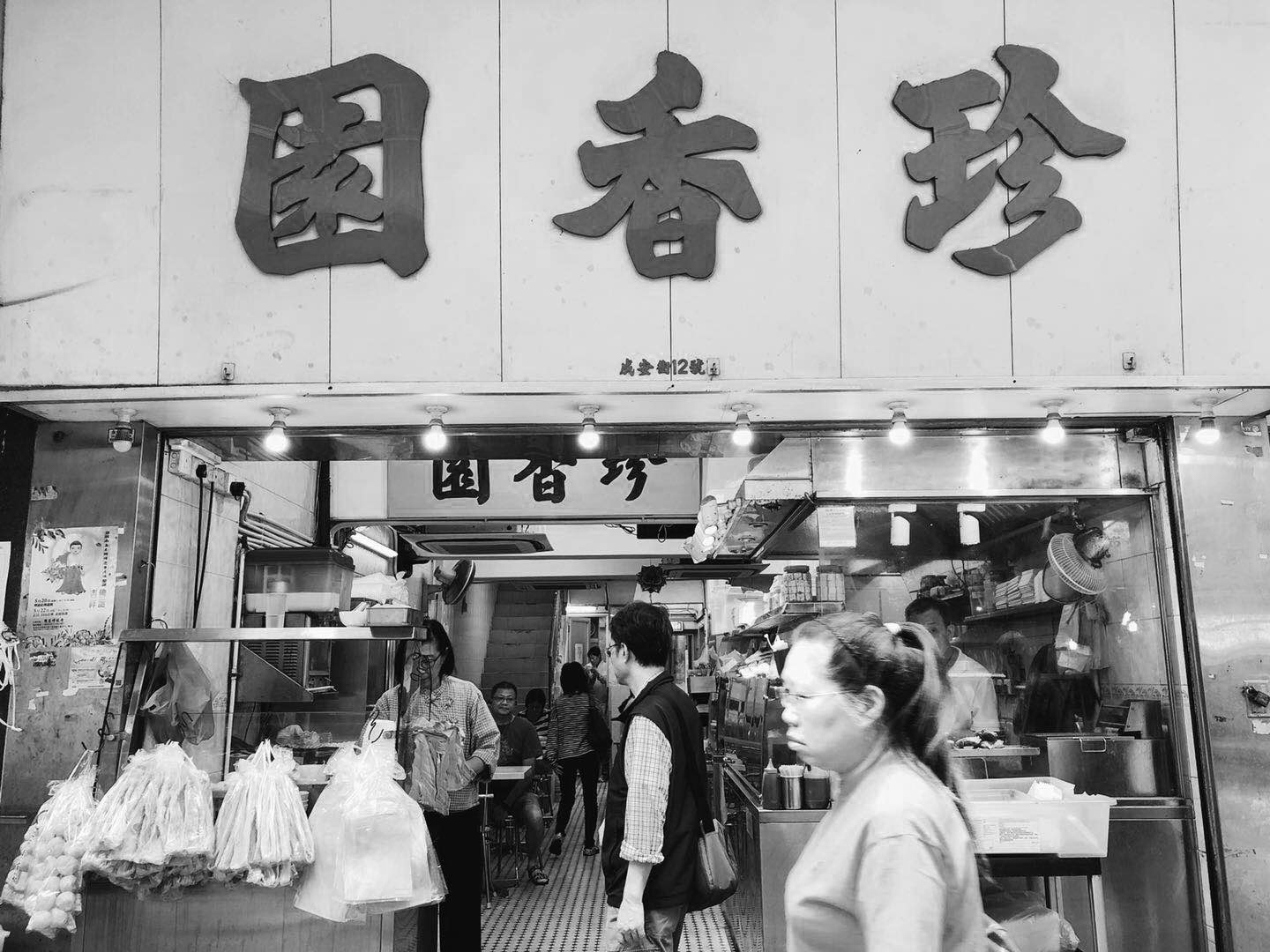 Jen Heung Yuen is a traditional brand with the typical BeiWei ZanSyu.
「珍香園」於上世紀60年代開張至今,傳統招牌是最經典的「北魏真書」。對於香港及南中國文化而言,是極具代表性的一種字體。
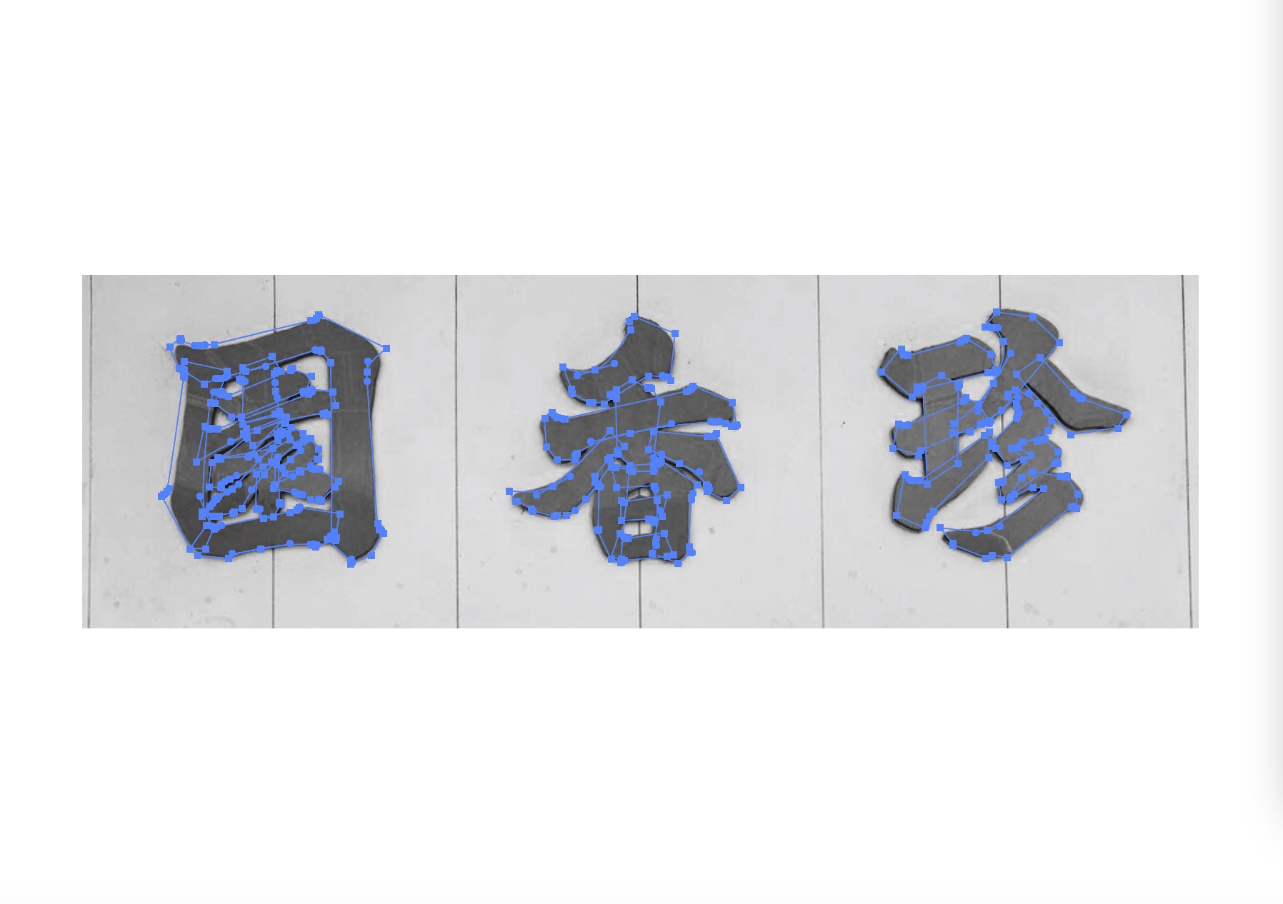
Translating the calligraphy to a modern style
對於傳統北魏字體傳承,電腦化是必不可少的過程。而將其「翻譯」成電腦字並不在於單純複製,要取其精髓,並不簡單。
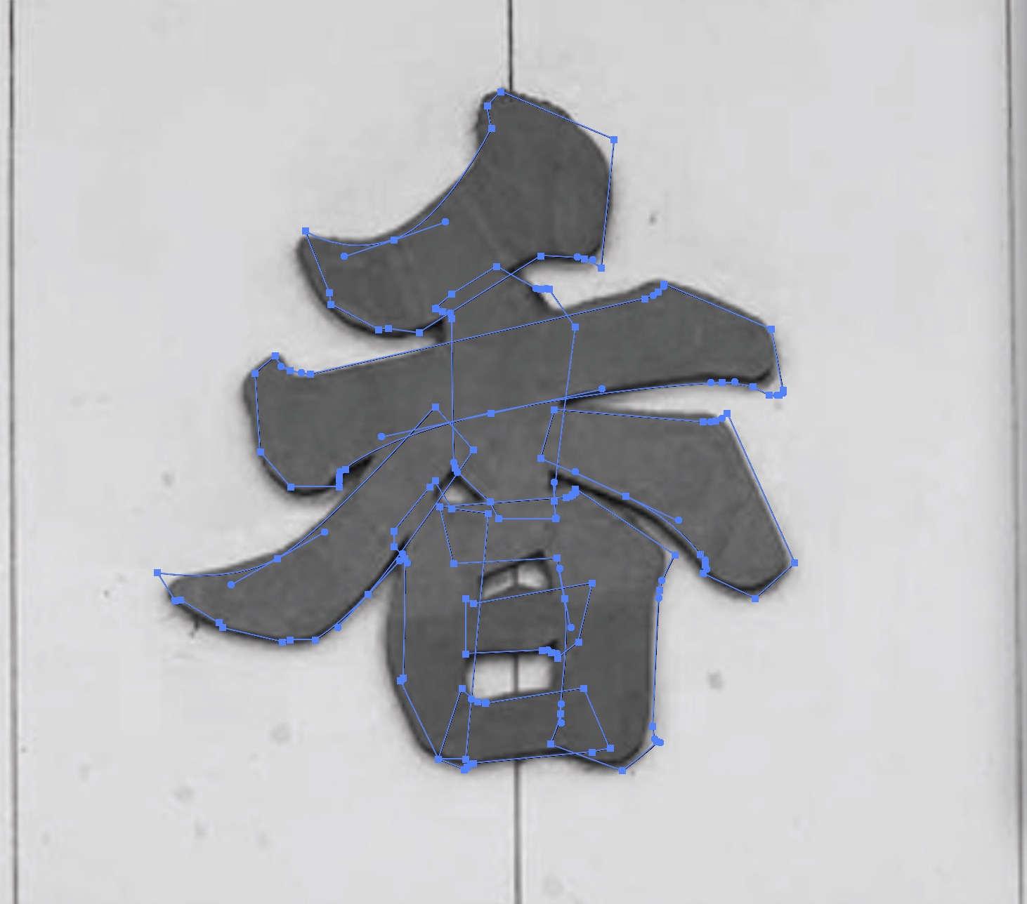
The Detail
正如「香」字,某些筆畫細節需要稍微脫離原本書法字的模樣。此處誇張了某些細節,令其字更顯「風骨」。

The Detail 2 針對細節修改
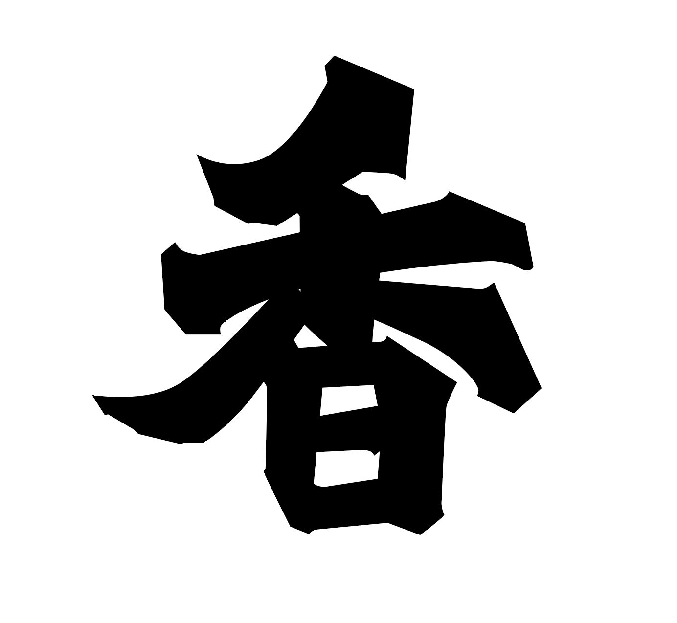
The Detail 3 初步效果
 Final 最後調整
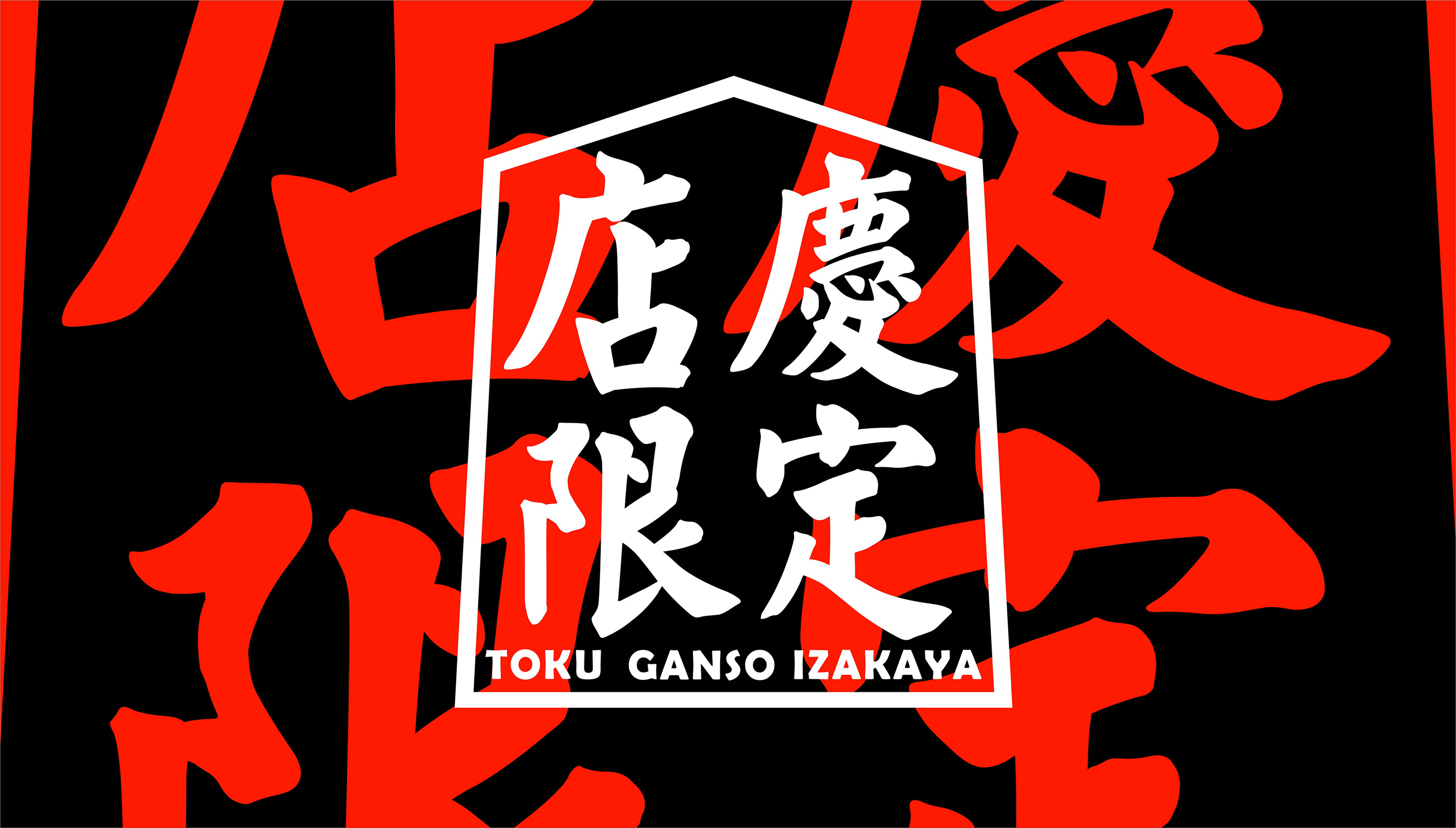
2016 TOKU GANSO IZAKAYA Anniversary
Our important client TOKU GANSO IZAKAYA has invited us on their 1st anniversary.
![]()
Referencing from “Old Book Shop/舊書店” in Yuet Sau, Canton. A rare book illustrated the real tradition of typography.
The style of ‘high density but well-ordered,’ is not only graphically looks good but illustrated the ancient intelligence.
Moreover, the tradition was lost very fast particular in this fast developing country, meaning that the tradition became valuable as a treasure.
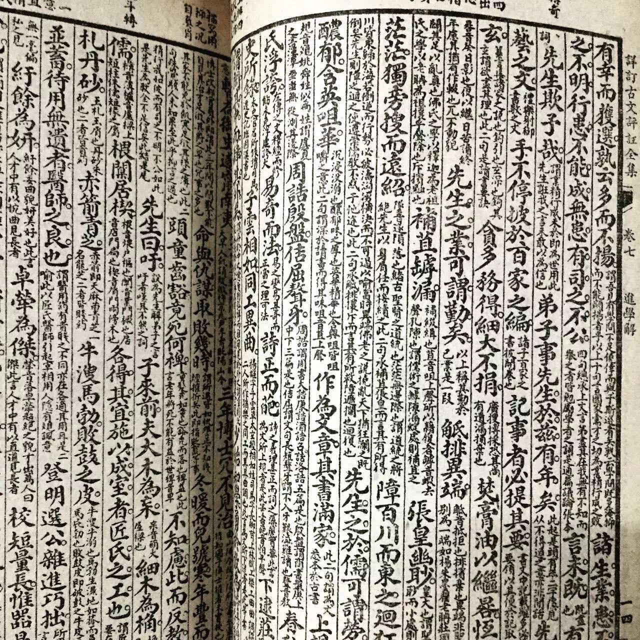
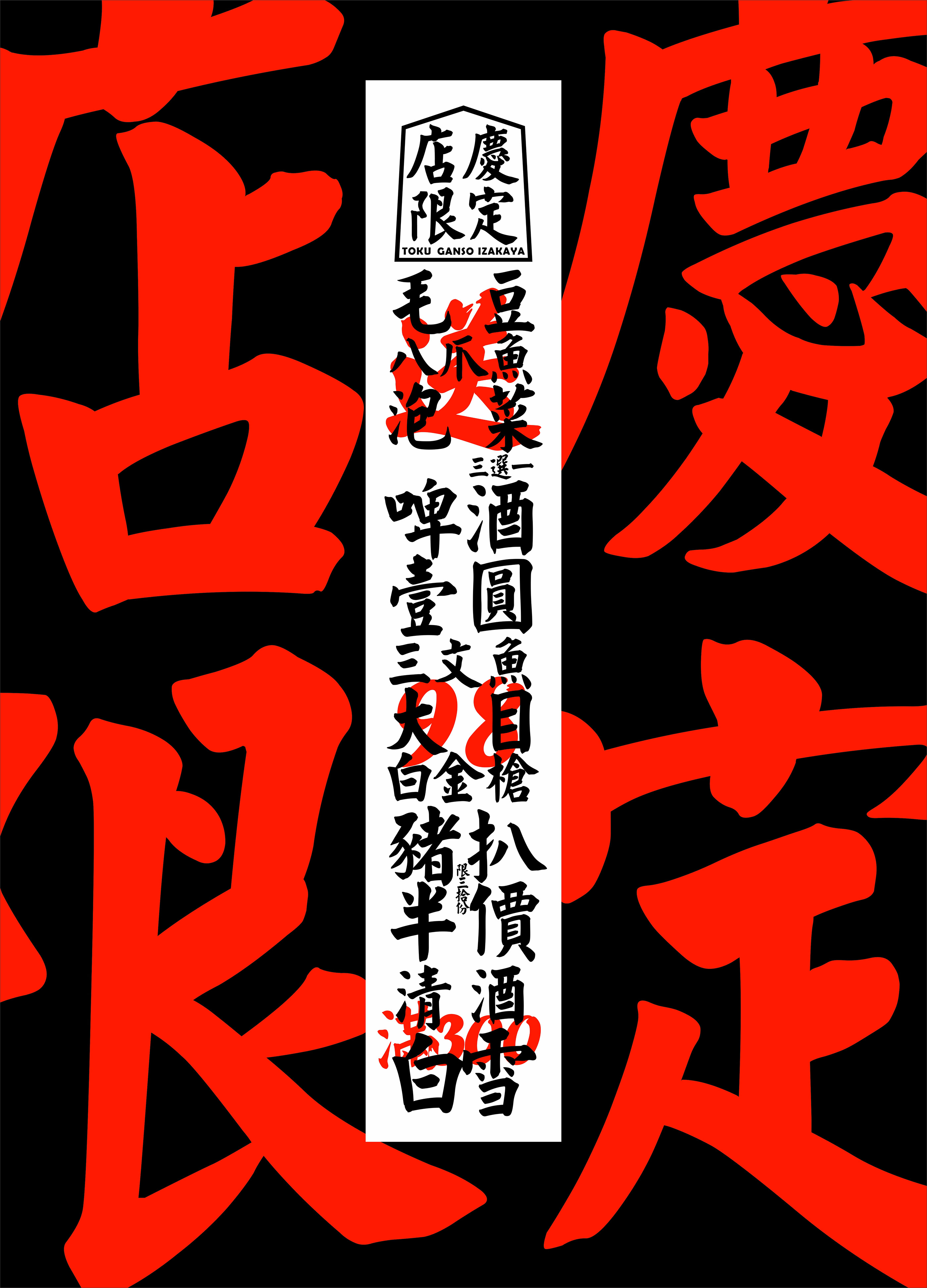
靈感來源於廣州越秀的“舊書店”中的一本頗有歷史的原版古籍。 書中使用了特定時代的舊式排印方式。
密而不亂的排印方式,在今天看來不僅極具觀賞性,並且延續著古人的智慧。
加上,在發展過於迅速的地區,這樣的文化顯得更珍貴。

2017 Mr. Point Dim Sum Leaflet
點先生是位於廣州大學城的新式茶樓。店家的宗旨是,以現代的方式帶出傳統風味。
點心,翻譯成 DIM SUM 是固有常識,但西方人未免會問到究竟 DIM SUM 是什麼意思。
The touch of your heart,是我認為最好的答案。美妙精緻的燒賣或蝦餃,觸動著食客的心靈。



 2018 The Exhibition in the Upcafe, Ngon Tong.